When we set out to create a list of ten historic Apple products that feature timeless design, it seemed a little daunting. The reality is that it was anything but.
Apple has been at the forefront of design and product design innovation since the Apple I in 1976. (Yes, Apple really has been making computers for 40-plus years.) There are so many products and designs that continue to shape the way we think about creating things today. Wikipedia has a pretty impressive timeline that shows every release – good and bad.
Let’s take a look at ten of our favorite examples that stand the test of time!
1. The Apple Logo
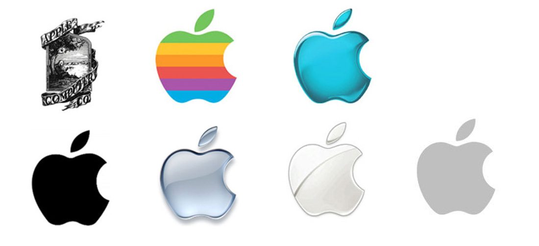
The iconic, and simple, Apple logo can be identified almost anywhere by anyone. It could be argued that it’s the most recognizable mark in branding (a close competitor might be the Nike swoosh).
Aside from the original logo, the mark has had a similar style throughout history and is a good lesson in design and branding. The shape has changed very little, although color and style trends have dictated the fill of the apple with one bite missing from the right corner.
What makes the logo timeless is that it’s still being used. The shape has stayed consistent over time even though the style and even major product lines and mission of the parent company have changed. At the root of the design’s timelessness are simplicity and minimalism.
2. iPhone
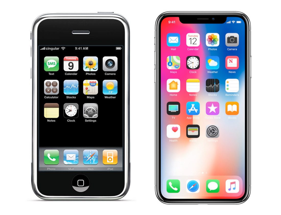
When the first iPhone came out in 2007, no one really seemed to know what it would do to the phone and computer industries. Now, everyone has a tiny computer in their pocket that they may (or may not) use to make calls.
The big feature of the design that has continued to shift the market – making it timeless – is the touchscreen. Can you even imagine a phone today without one?
The iPhone was the first device that really brought elements like tap and swipe to part of the common lingo. Almost every similar device you use today is rooted in that first groundbreaking option.
3. MacPaint
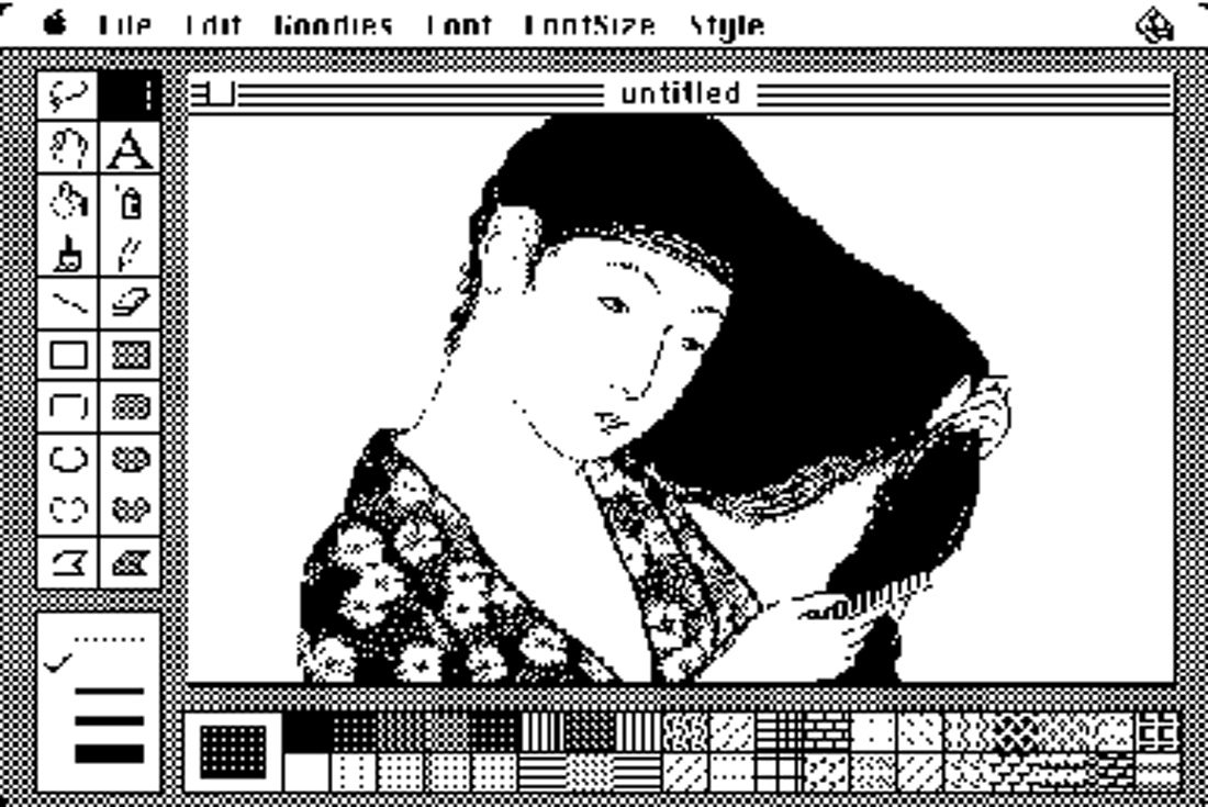
MacPaint was the first computer program that allowed users to create raster graphics and share them between different applications. It came with all Macintosh personal computers in 1984 and was available as a piece of standalone software.
While the original black and white drawing tool seems somewhat primitive, the timeless design is the basis for almost all computer graphics software today. Note how similar the toolbar menu is to modern software such as Adobe Photoshop.
You can still download the MacPaint source code from the Computer History Museum.
4. The All-In-One Desktop
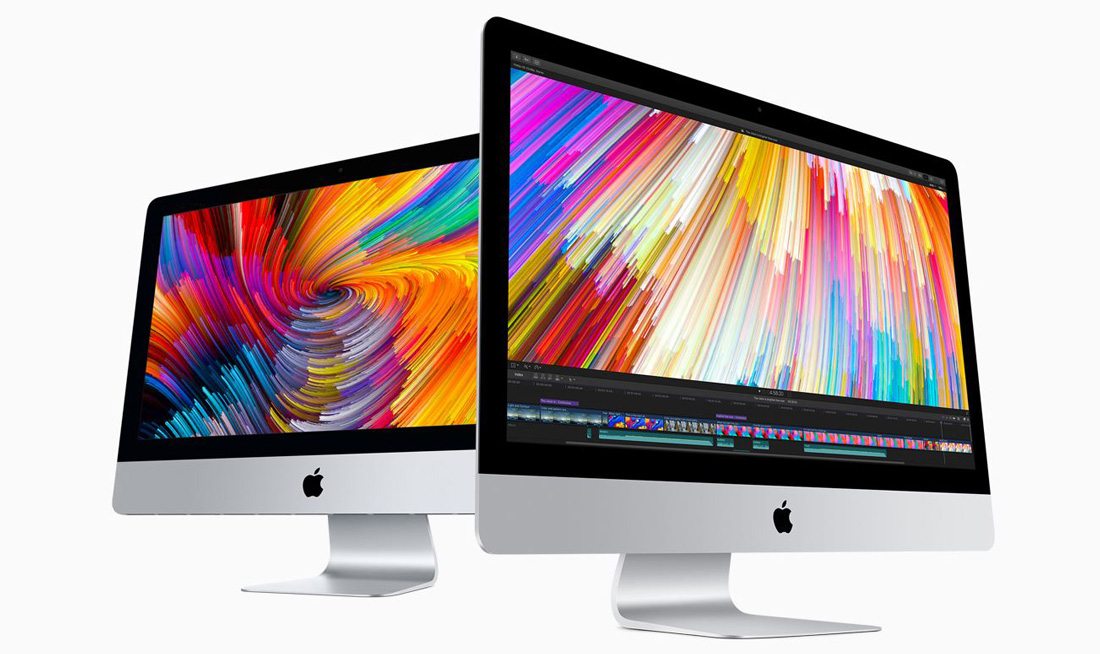
To this day, Apple still produces and ships all-in-one computer components and packages. (Just look at that iMac Pro on your desktop; it’s all one piece.)
Most Apple computer models have followed this design philosophy, which makes selecting, setting up and using a personal computer simple and easy. It’s all about usability. (You can see how that’s a timeless design concept, right?)
Even though some specific Apple desktop and laptop computer models have failed, the idea that a machine can be simple to set up and use has not. It’s an idea that you can apply to pretty much any design project.
5. iPad
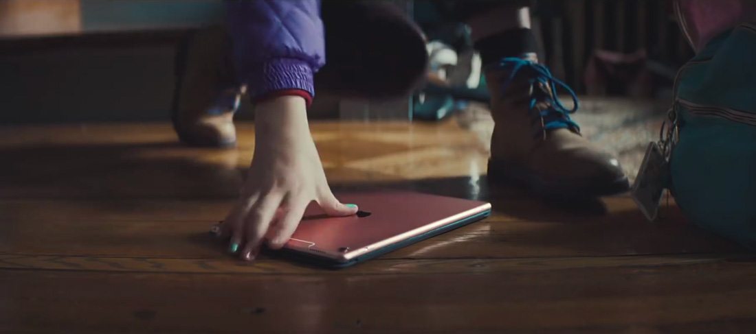
The latest iPad commercial features a kid that asks “What’s a computer?” while working on a tablet. While Apple wasn’t the first to build a tablet, the company designed one that people wanted to use and that shaped the design of other models to come.
Just like the iPhone, it has a touch screen and connected to the internet.
But what makes the design timeless is the device’s ability to adjust. Working on an iPad and turning the screen – and seeing the content shift to match – was a precursor to the common expectations we all have with responsive websites today.
6. MacBook

Power in a small package. Apple’s MacBook proved that you can pack a lot within a set of constraints.
This is a design philosophy we should all practice. Designing within constraints can test our boundaries and ability to create something in a specific way.
You don’t have to use a lot of tricks or break the rules to design something creative. And then Apple kept pushing those boundaries by making it lighter without sacrificing usability.
7. iBook Laptop
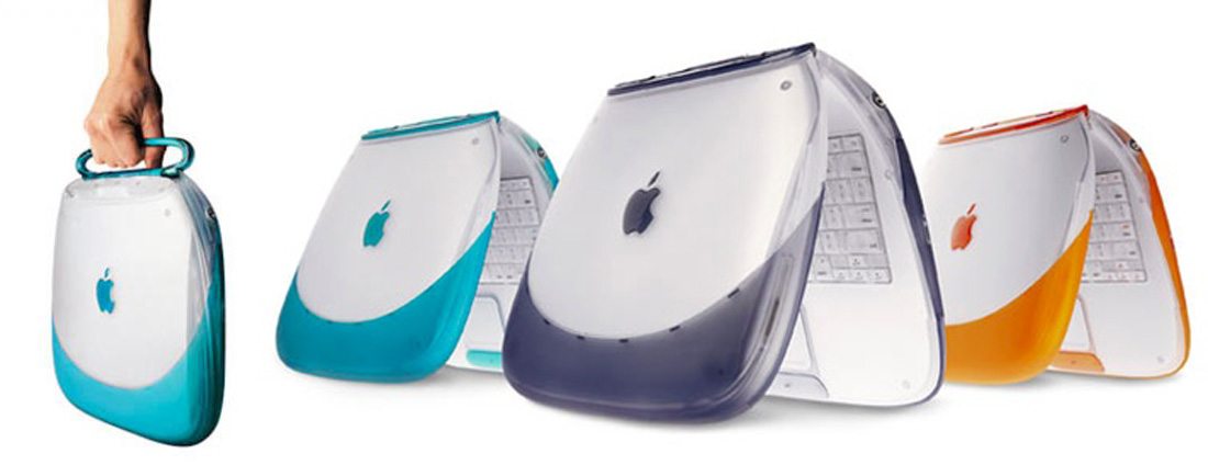
Did you have one of those candy-colored clamshell laptops at the turn of the century? The design of the iBook is very much like the design of accessories we buy for phone and laptops today with softer touch shells in colors that snap onto the outside of devices.
While the computer model itself didn’t last all that long, the classic timelessness of the style of a customized shell on an electronic device lives on.
8. iTunes Store
The iTunes store, which was first introduced in 2001, changed the way we think about music and buy digital products. (It even paved the way for those of you that make a living selling design items such as UI kits or website themes.)
And then there’s this little thing about iTunes that sometimes gets overlooked. The same website and store and design work everywhere, and still do to this day.
9. Apple Watch
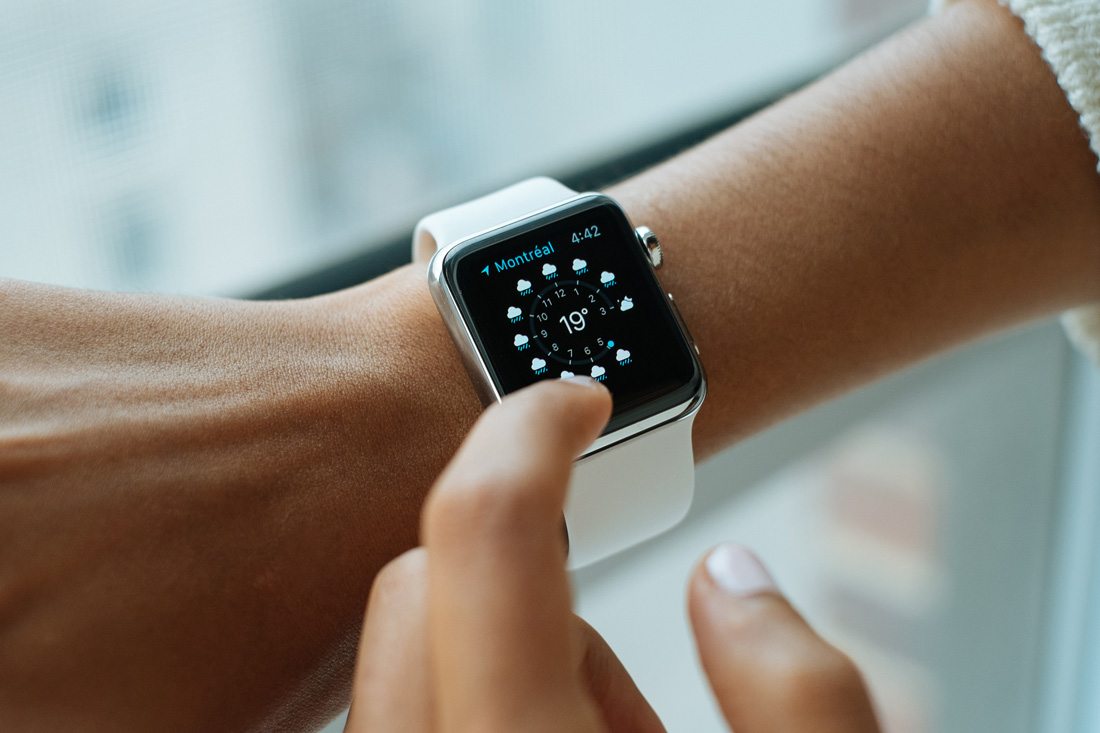
Design is more than just visual. It includes voice and touch as well. The Apple Watch broke through that barrier with its haptic functions, helping designers think about all the ways a user can interact with a web-based element.
The boundaries of design continue to come down. Did you ever image 10 years ago that you might be designing an app using bots or augmented reality?
The fact that Apple keeps bringing products like this to market shows a desire to keep pushing what designers can do with various canvases. And it should be an inspiration for your designs as well: What can you try to do that you didn’t think you could?
10. iPod
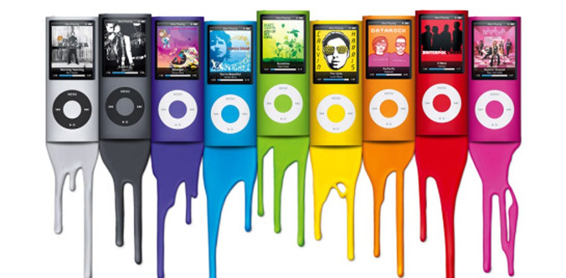
The iPod just kept making music easier to carry. From the classic model to the Shuffle to the Nano to the Touch (which you can still buy), this device prioritized usability and mobility.
These devices also pioneered touch screens, organization, and management of data and apps on small devices. And while there are pros and cons that come with each model, the timeless design lesson is this – the design can be something other than what you expect.
Look at the bright colored cases of the Nano and some Shuffle models. Apple proved that simple electronics don’t have to be black or white, but can showcase a design that helps users express themselves and show individuality. That design concept has shaped the way we think about personalization in website design and creating custom user experiences so that every user feels like the design is made just for them.
Conclusion
The thing all these Apple products have in common – and the company as a whole – is disruption. The design and shape of these products changed the way people thought about a product or how to do something.
That’s what a timeless design does. It takes what we know and grows it into something bigger. Something that will continue to have tentacles that reach beyond the original thing. That’s what makes Apple such an interesting case study for designers, and it’s why these timeless designs can still inspire great projects today.


