Creating a poster can be one of the most fun – or frustrating – design projects that you ever take on. Posters are a highly visible, public design project that can lead people to attend an event or generate buzz about something.
These designs are often large in scale and there’s nothing like seeing something you create in a physical form. Here, we’ve rounded up some great poster design ideas and inspiration to get you excited about your next poster design project.
1. Stick to “A Thing”

A good poster design should lead users to see and think about one thing. Whether it is an event, a merch item from a band or even a movie preview, a poster should include one thing for users to see and think about.
Don’t try to incorporate too many elements or mixed messages.
Think of every poster design as a road to an event (even if it isn’t event work per se). Include a strong visual to draw people in and one short, direct piece of messaging (such as a time and place or name of an event).
2. Think in Bold Color
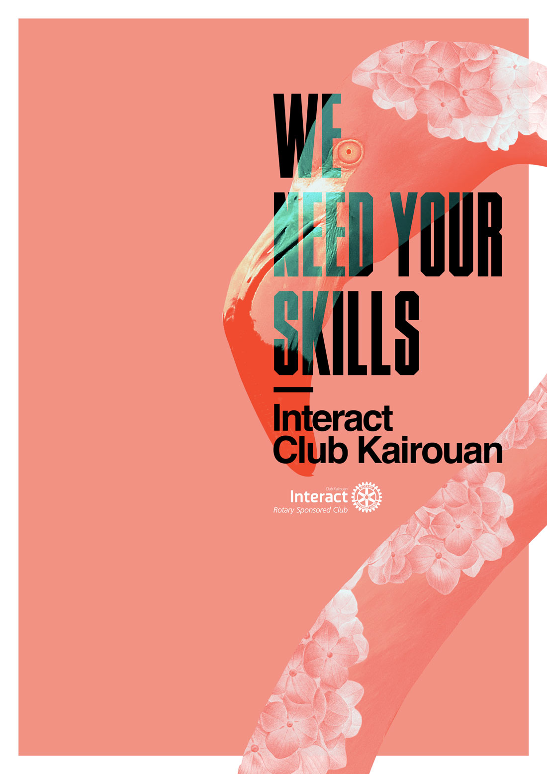
When working with an existing brand, start with a poster design that uses brand colors. (That’s not to say you have to stick to only those hues.)
If those choices aren’t establishing the right mood for the project, break the rules and pick a new color or two. The trend in almost all graphic design projects right now is to use bright, bold, highly-saturated colors. (You can even think in terms of the palette from Material Design for the poster design inspiration.)
3. Use Scale to Your Advantage
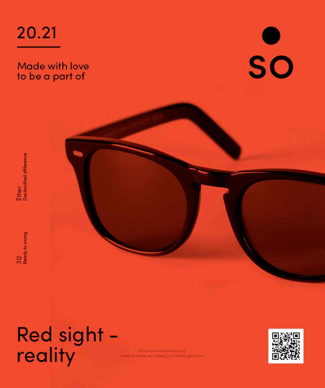
One of the things that’s most inspiring about poster design is that you can use techniques that don’t necessarily work in other mediums.
Try over and undersized elements together to create an impactful poster design. Large images paired with tiny objects can be an interesting combination.
The goal should be to grab attention and encourage people to move closer to the poster design to explore more.
4. Think in Fives
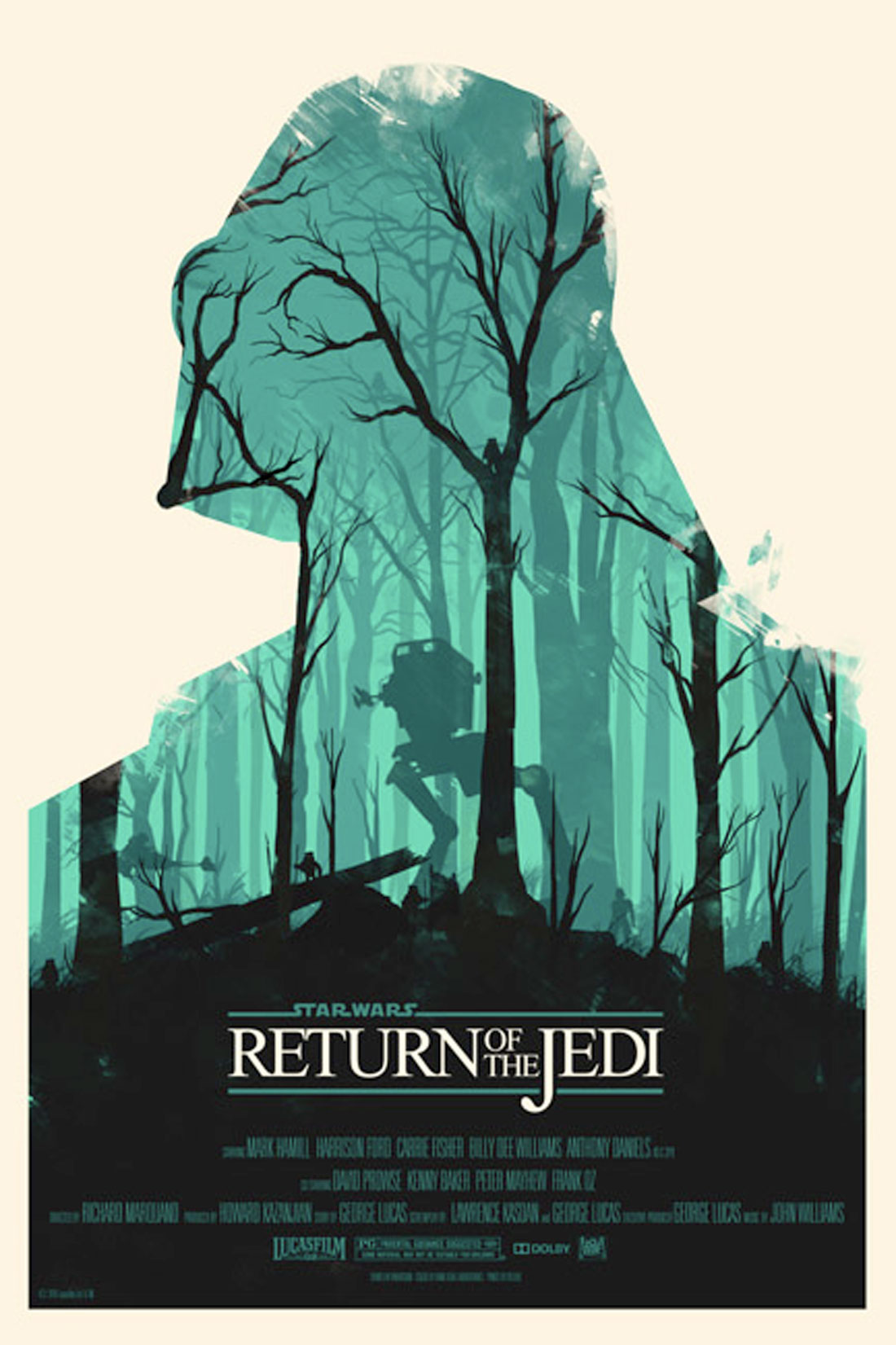
A good poster design has to be seen and understood at a variety of distances to be as effective as possible. You should be able to scan and understand it from 5 feet away or as much as 50 feet away.
The key to success at different distances is in special relationships and fine details. From a distance you might see an overall image or action happening; up close new elements that provide additional information emerge.
What’s somewhat trickier is typography at different distances. Make sure the main information or head-line is readable at a distance. Supporting details can be scaled up for closer reading.
5. Use Lines to Lead the Eye
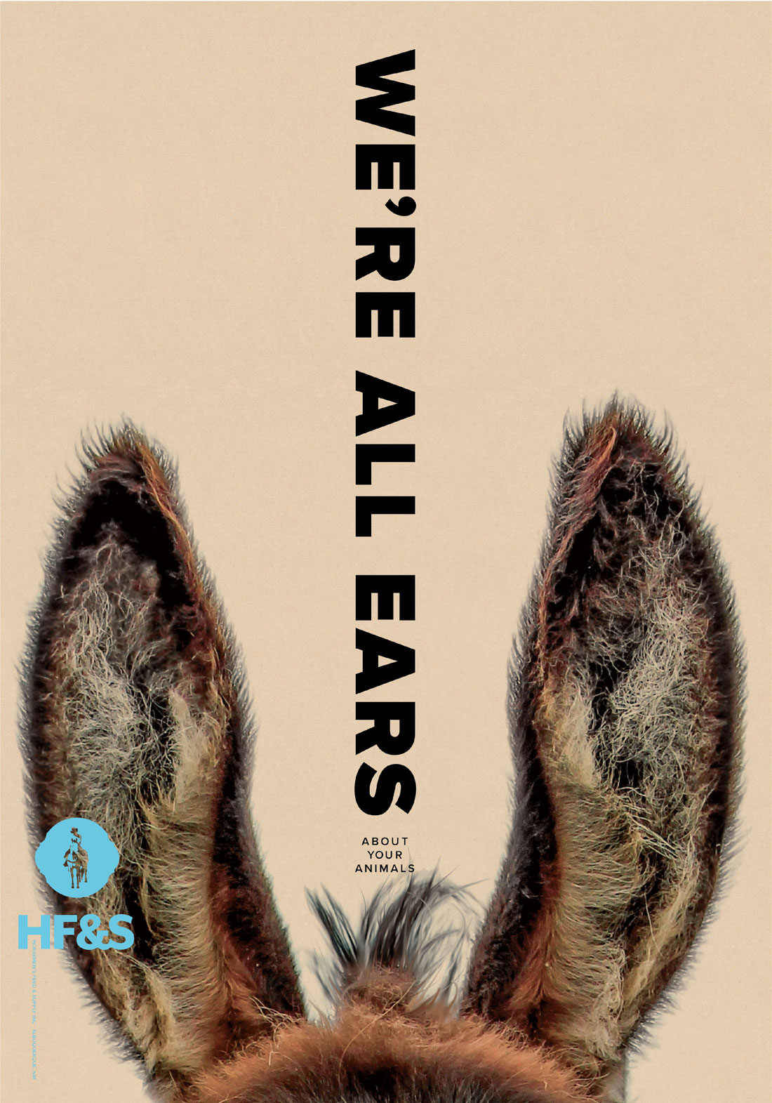
There are two sets of lines to think about when it comes to poster design:
- Invisible lines that break up the design or create visual harmony
- Lines that lead the eye to a certain element in the poster design, such as a text element
When it comes to those invisible lines, consider how a user will look at the design. As in photography, the rule of thirds can help you determine the placement of objects on the canvas and how that framing will impact view-ability. A poster design can often include panels or multiple parts that users look at in fragments.
Lines can also be directional tools in poster design that help lead the eye to the most important element in the design. Whether the lines are from nifty shapes or part of an image, they can be a powerful way to create emphasis and visual interest.
Horsemen’s Feed and Supply, above, uses text as a line that days you down the poster image. Not only is the message-image pairing clever, it also creates a distinct line to follow.
6. Pick Clean Typefaces
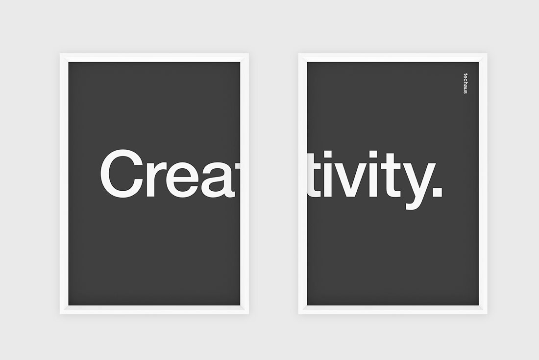
The most common mistake designers make when it comes to poster design is going over the top with typography. People aren’t going to spend a lot of time trying to decipher and understand the design.
Pick a clean and easy-to-read typeface for the main part of the messaging. This concept extends beyond just the font itself and is encompassing of how text is used. Create plenty of contrast between text and background elements so that lettering is readable. (And readable at a distance as well.)
With posters that will hang in outdoor space, take even more care in creating contrast. If colors fade, will the design still be understandable? Does it work in bright or dark lighting? Highly contrasting elements can solve most of these issues.
7. Create a Wide Margin
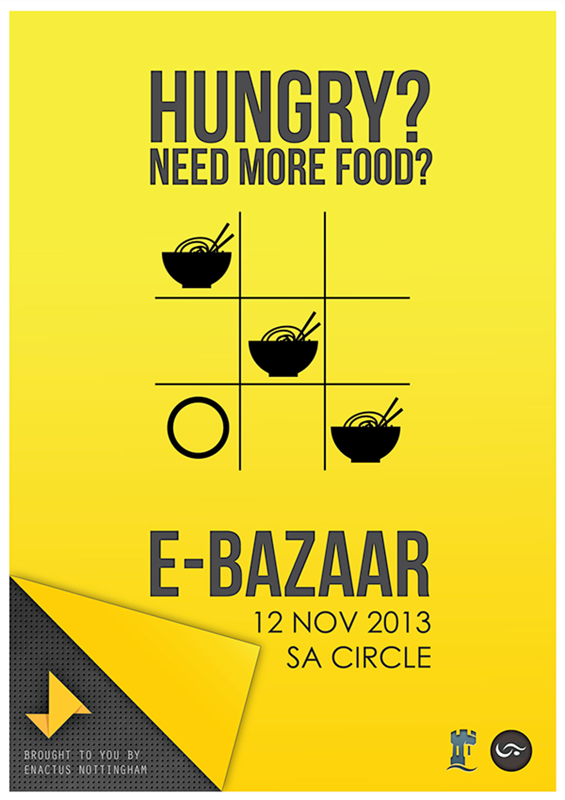
Unlike with smaller designs, where you might feel a need to use every inch of space available, leaving a wide margin might actually help draw attention to the content in a poster design. Use exaggerated space on the outside edges to create a more central focal point.
Not only will space create contrast, but it can help create a trendy design in a more minimalistic style.
Work with space in parts of the design other than the margin as well. Good use of negative space in the design can generate interest and clean use of space between elements can help establish a sense of organization and flow.
8. Mix Real and Design Elements
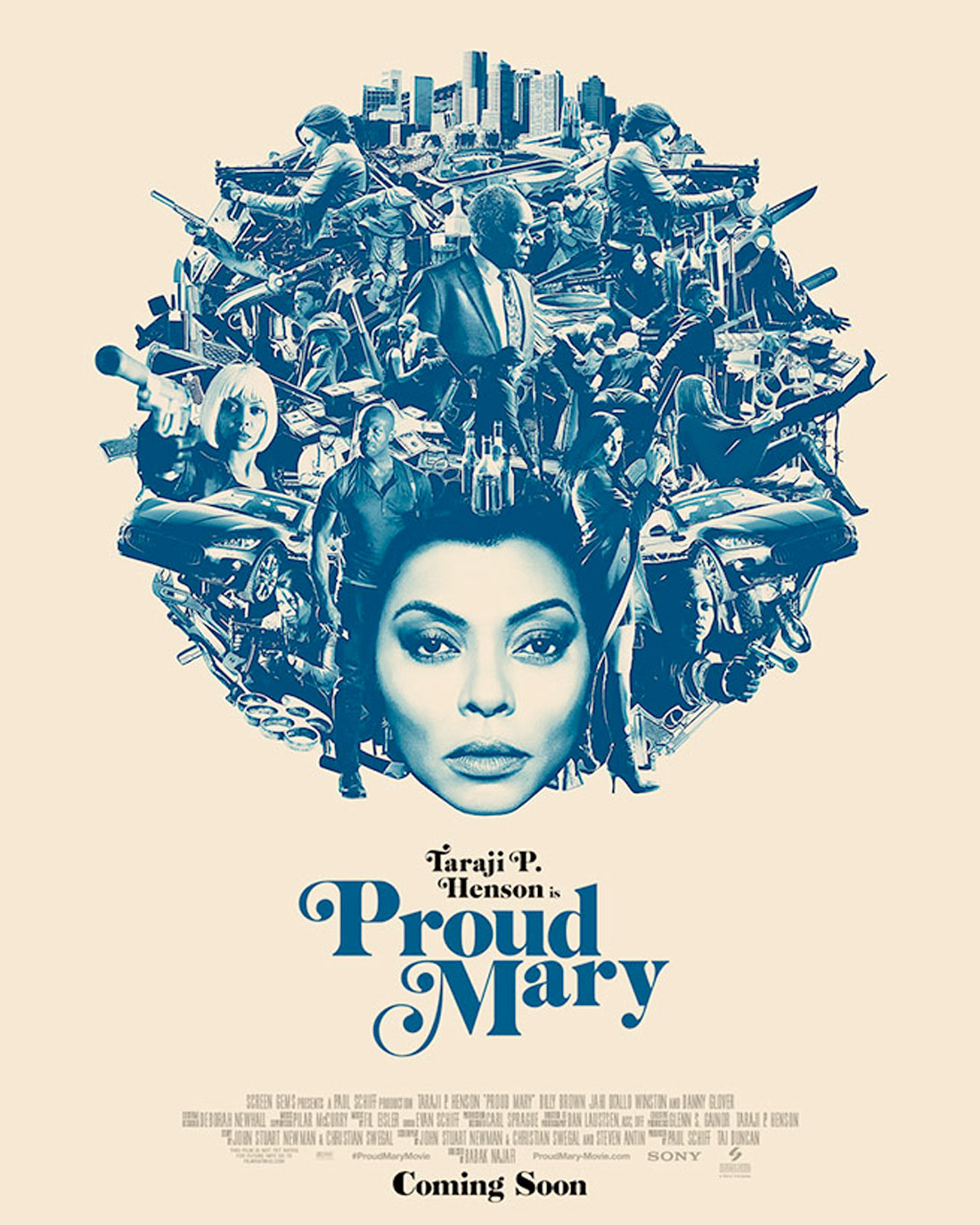
Some of the best – and most inspiring – poster designs are a mash-up of real and illustrated objects.
From text made from images and a bit of fantasy in the design, this medium is the perfect place to play with these kinds of juxtapositions.
It’s kind of hard to describe, but you’ll know it when you see it (like in the example above where lots of little images combine to make the hair on the woman in the movie poster).
9. Balance with Asymmetry
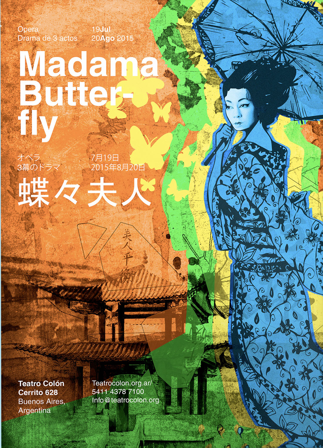
While symmetry can be awesome, don’t feel like a poster design has to split into perfect sides.
Balance the design with asymmetrical elements that lead the eye and have even more interest. Offset text and images, light and dark colors or full and open spaces to create visual harmony with an offset feel.
10. Push Boundaries
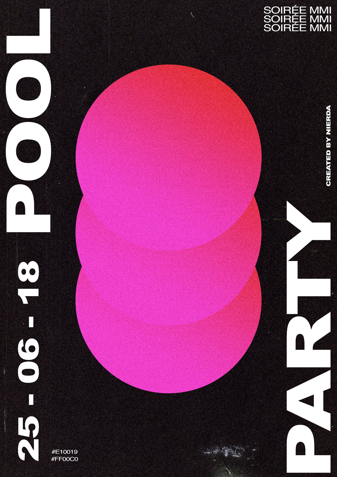
The best part of poster design is that it is often linked to a specific event or thing that happens at a specific time. That means most posters don’t have a very long shelf life. Unlike a brand design that will live on for years or decades, a poster probably won’t be displayed that long.
Be creative. You have a little more wiggle room with something that’s a little less permanent. Poster design is a great place to push your boundaries, experiment with different design techniques and be a little more daring than with other projects.
Conclusion
One of the most important elements of a good poster design might be quality. Printed projects require high-quality, high-resolution visuals to ensure that printing looks as good in real life as on the screen.
The size of your poster – standard sizes can be as small as 11 inches by 17 inches and expand to almost anything – can dictate what type of art elements are required. Work with vector elements when you can (it’ll make scaling up quick and easy), and invest in super-high quality photos for this application.
Poster design can be a lot of fun. Good luck with your projects.


