Earlier today, version 1.0 of 10up’s Publisher Media Kit went live in the WordPress plugin directory. It is a preconfigured set of blocks and patterns for jump-starting a media kit page for small and medium-sized publications.
When I first noticed the plugin, my mind immediately jumped to press kits and branding pages for businesses. Not enough companies within the WordPress space have such pages, and it can often be hard for journalists and other writers to find information. While this plugin is geared toward publications, small businesses can still get some use out of the plugin with a few changes.
Given that WP Tavern just launched its new design yesterday, this might be an opportunity for us to lead the way. The plugin does give me a few ideas on what we could do with a similar page here on the site.
Publisher Media Kit has been tested with Twenty Twenty-One, Newspack, and several Newspack child themes. I did run it through most of those to check for compatibility, and the plugin worked admirably. However, I primarily tested it with Twenty Twenty-Two, the upcoming default WordPress theme. Aside from a few layout alignment quirks, it worked well.
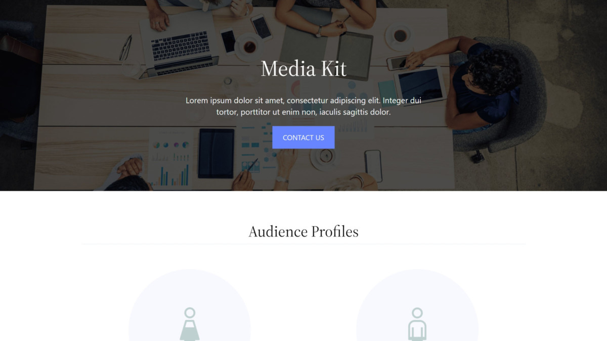
The plugin automatically creates a new “Media Kit” draft page on the website once it is activated. The content is a set of pre-defined sections built from eight patterns and an accompanying Tabs block.
 Partial screenshot of Media Kit page.
This allows users to quickly fill in their own content and make customizations. Once done, it is just a matter of hitting the publish button.
However, end-users can take things into their own hands by using the various patterns on any post or page of their site. The cover, stats, and questions/contact patterns work well as general-use patterns.
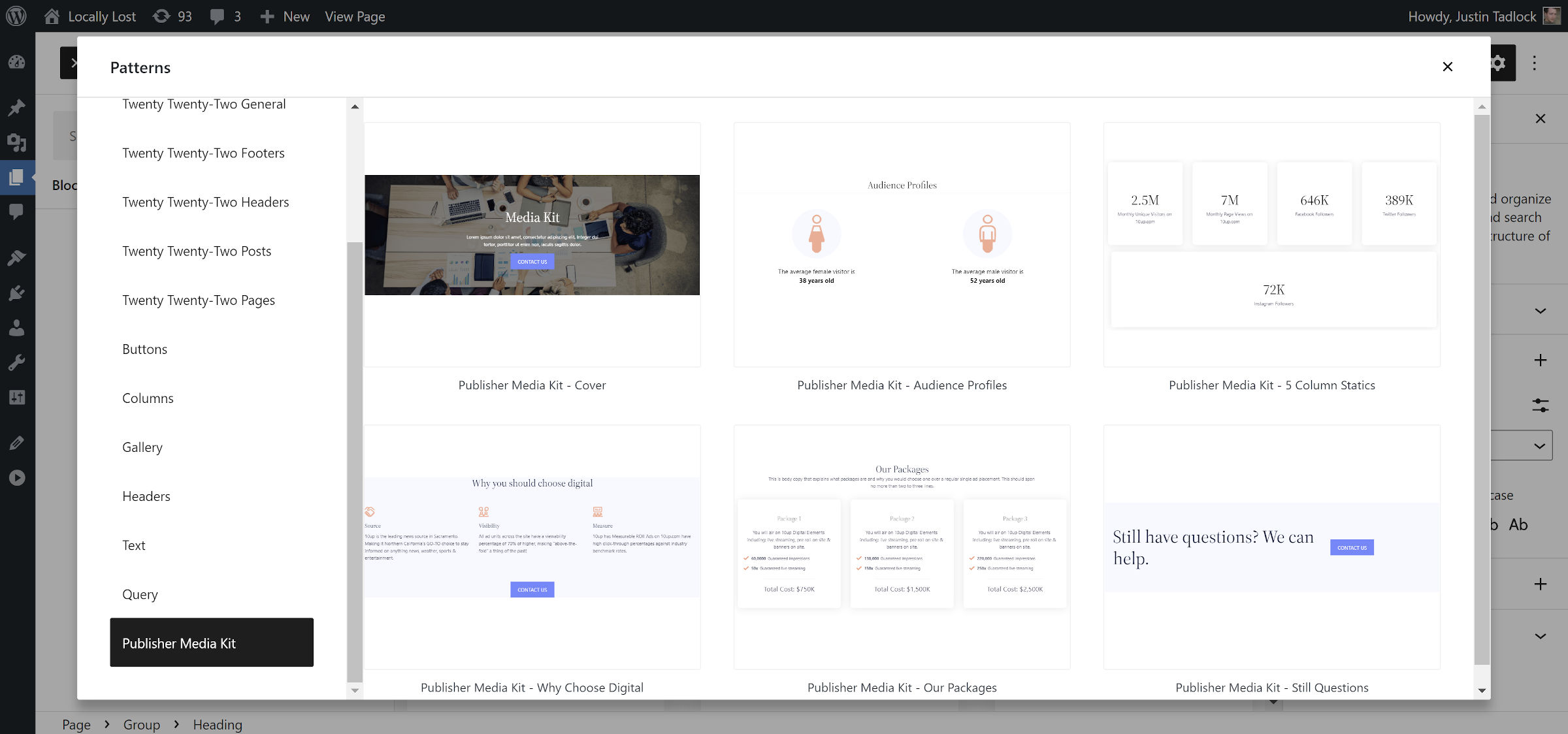 The plugin’s custom block patterns.
Note: I deleted a couple of the patterns from the screenshot above. For some reason, they were rendered invalid in the patterns explorer but worked fine when inserted into the content canvas.
I would love to see a standalone version of the Tabs block included with the plugin. It is showcased in the rates and digital ad specs patterns, but it is so easy to create new tabbed content that I cannot help but want to use it with other projects.
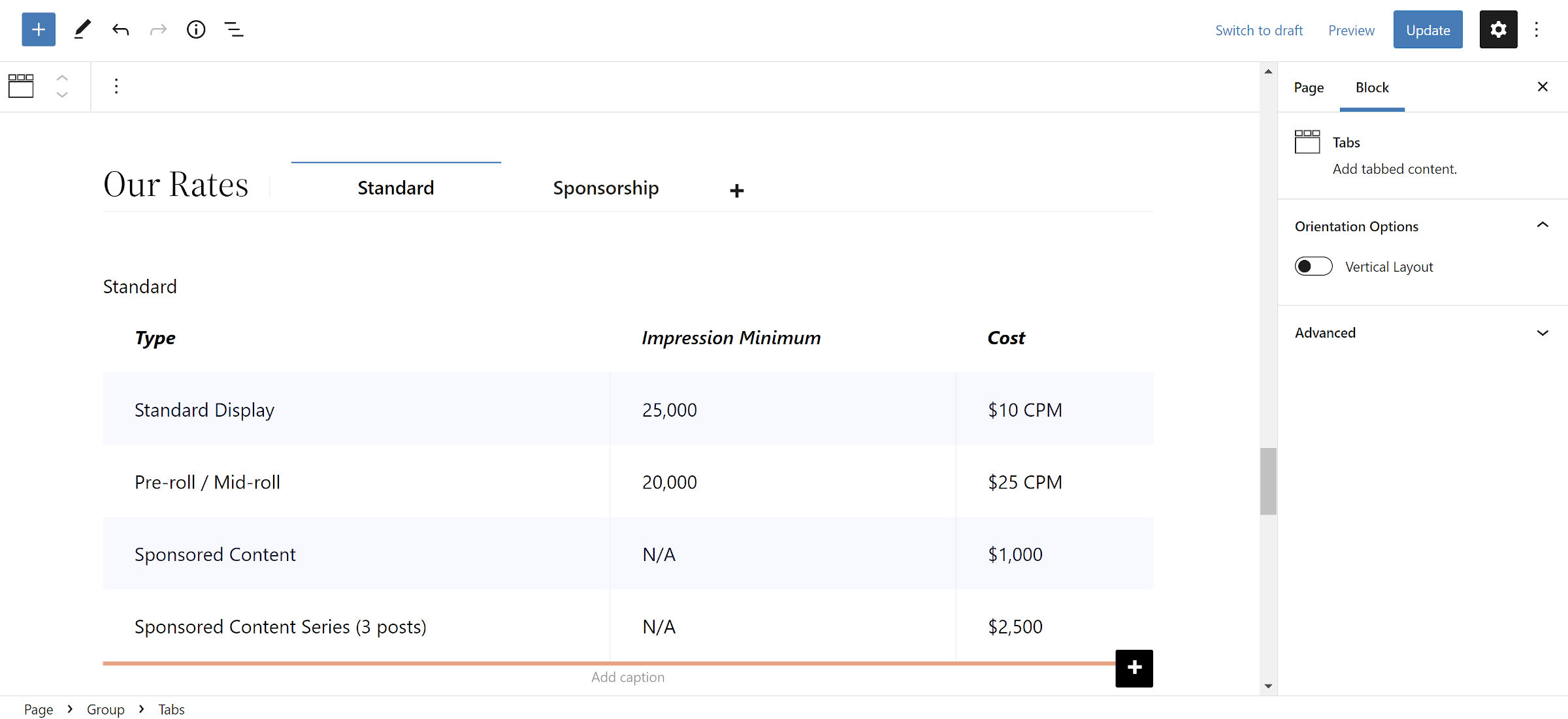 Tabs block in the editor.
It could become a popular tabs solution with a few design options like colors, borders, and typography. It is minimal at the moment, but its user experience would make for an ideal foundation for a single-block plugin.
One of my favorite things about the block system is that it makes plugins like Publisher Media Kit feasible. In the past, it was virtually impossible to ship a content-focused plugin and expect it to work with most themes, at least not without a lot of custom design work. That meant that solid solutions would often stay in-house with agencies with no ideal way of shipping them.
The standardization of blocks has bridged much of that gap. As the system continues evolving, especially with more design options, I expect to see similar plugins in the future.
Source


