When it comes to designing a poster, a stylish color scheme can go a long way to bringing attention to the design. From bright colors and unusual combinations, to subtle and understated, this is a space where almost anything goes.
Here, we’re diving into some super cool color schemes that you can use in poster design, sharing the hex codes for each poster color scheme to get you started.
Plus, each example is actually available as a template as well, if you want to jump start your design and use any of these specific examples!
2 Million+ Poster Templates, Flyer Templates, and Design Resources With Unlimited Downloads
Download thousands of stunning poster templates, flyer templates, and more with an Envato Elements membership. It starts at $16 per month, and gives you unlimited access to a growing library of over 2,000,000 poster designs, flyers, print templates, themes, photos, and more.
Bright Blue and White
#0099e5#ffffff
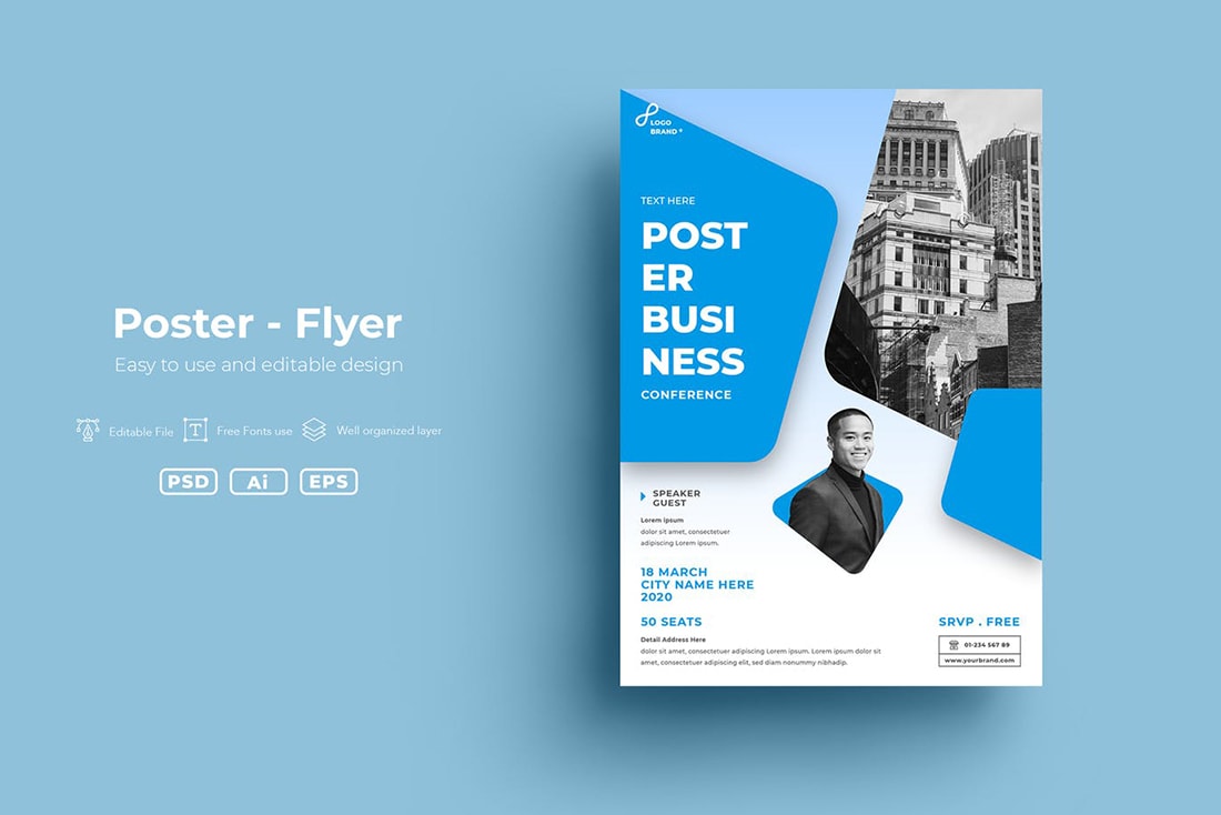
Bright blue and white is a classic poster color combination that works for almost any use. The blue color has a somewhat neutral feel that works with images or not as well as text elements. A white background is crisp and lends itself to ease of printing.
Black and White and Magenta
#000000#ffffff#e72178
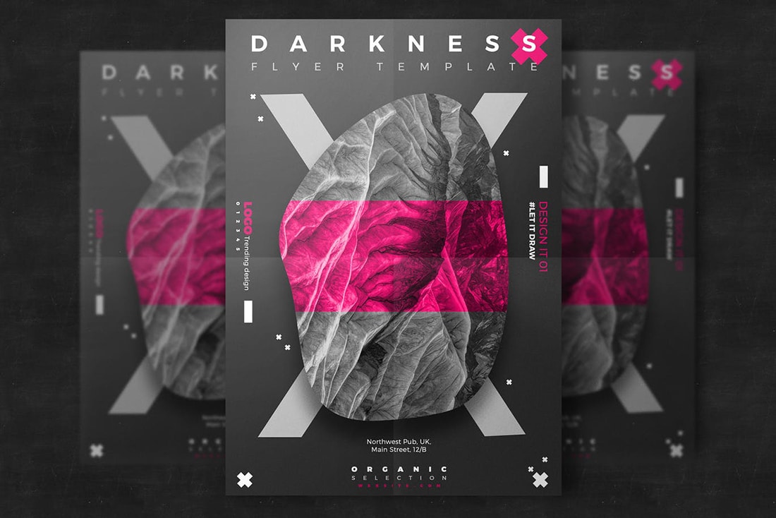
This color palette, featuring a black and white background with magenta accents, is simply stunning. The contrast of these colors creates a striking aesthetic that can have a charged feel to it. The color scheme can work great for imagery that’s a little different or when you want to jump out to people who see the poster design.
Blue, Red, and Gold
#354e6c#e64241#eaac31
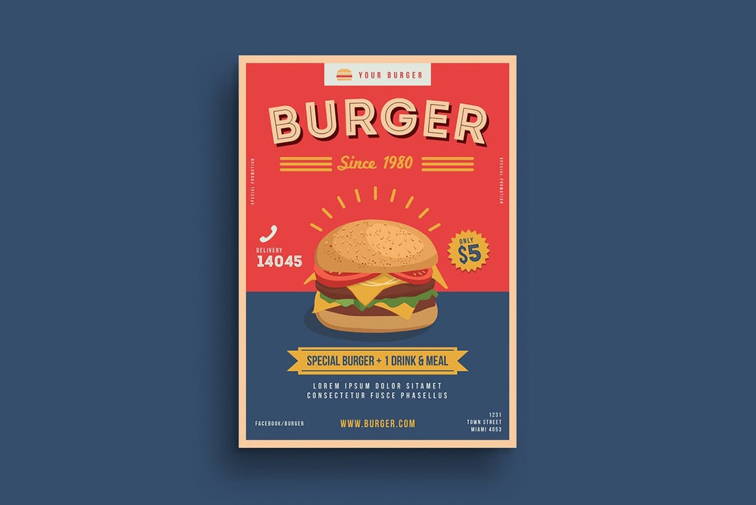
This color scheme is a classic when it comes to posters and food promotion (as seen in this poster design). Red is engaging to the appetite while blue and gold help create more of a sense of trust and calm. Overall the color combination is daring and warm.
Yellow and Black
#f8bd31#ead2ae#353b39
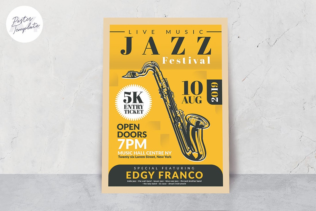
Shades of yellow and black can turn out one of two ways – looking like a bumblebee or with understated elegance. (Thankfully this design has the look of the latter.) Black and yellow create sharp contrast and the color pair works wonderfully with icons or non-photo art elements.
Emerald Monotone
#127678#30b5a4#b4d9d2
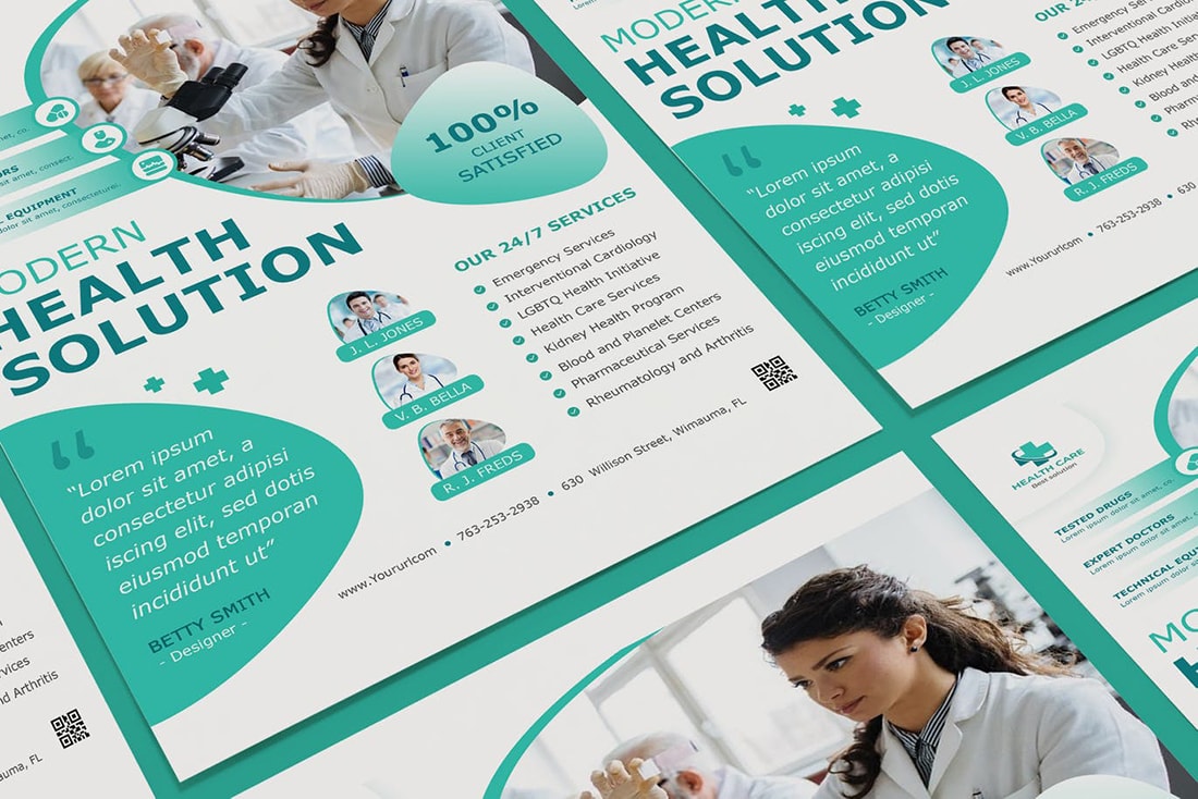
Monotone color schemes can be great for poster design because they create a unified look for the design from top to bottom of the printed piece. A strong color – and color palette – can help draw the eye to the design, such as this emerald poster color scheme. It’s inviting and easy to use thanks to a variety of green choices.
Bluish-Purple and Pale Yellow
#354581#ffe074

The bluish-purple and pale yellow combination in this poster color scheme is soft and inviting. The colors work well for a design that you really want people to feel welcomed into. The other bonus? The colors seem to work well with plenty of other color elements in the mix, from photos to icons to illustrations.
Pink and Mint Green
#e03c79#88c1b8
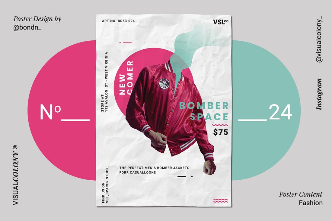
When you think of a pink and mint green color palette, your first impression might not be positive. But this is a trending color combination that’s popular for both poster and website design as many people continue to play with bright color options.
Orange, Yellow, and Green
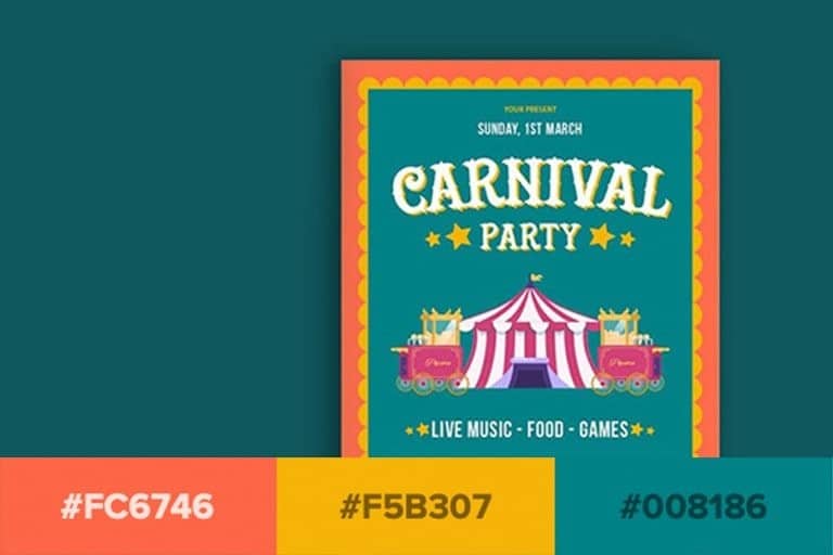
#fc6746#f5b307#008186
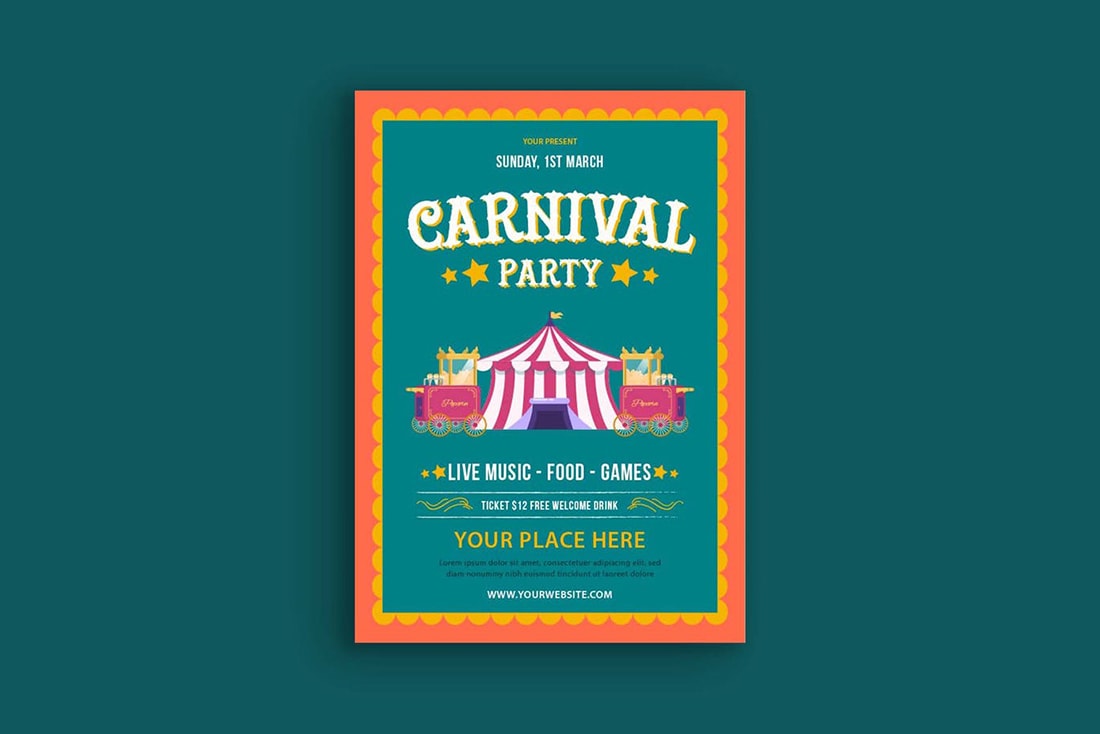
This is another highly engaging and visually interesting color combination – orange, yellow, and green. It’s one of those color schemes you might not use for anything other than a poster, but it works for attracting attention from a distance.
Navy Monotone
#0f053a#ffffff
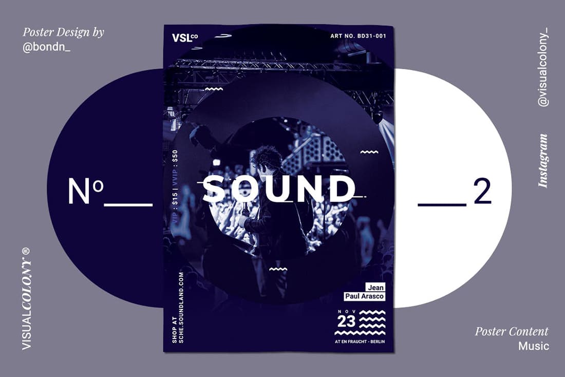
A navy monotone color scheme is moody and classic. With so many variations of navy to work with this color palette can work with almost any other design elements to create an inviting poster.
Pastel Violets
#967f9b#ece0ea
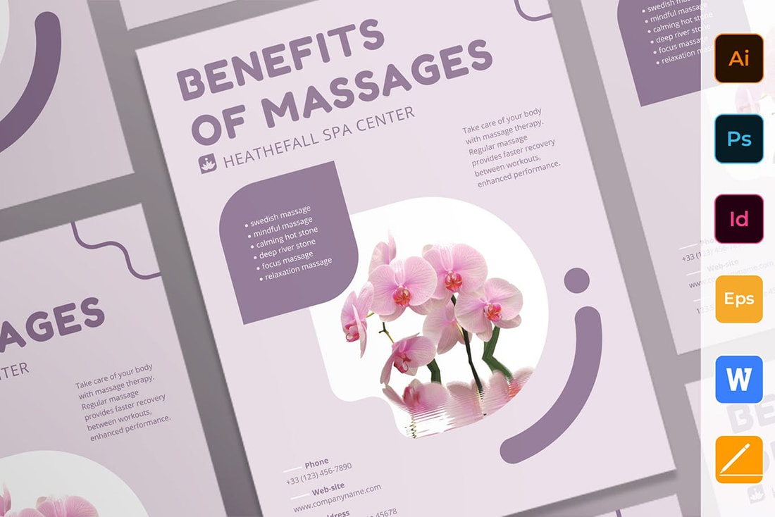
Another monotone color palette with violet hues creates a soft and appealing poster design. This color scheme is nice because it’s simple and doesn’t create too much of a mood. The colors work well if you need to use an image and the deeper violet color is great for text elements.
Purple, Pink, and Sky Blue
#372869#d50a80#37b0c3
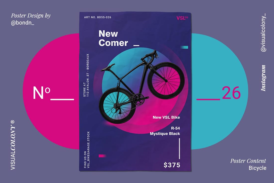
This might be the most “Material” of all the color schemes in this roundup with a trendy palette that looks like it fits right into Google’s design framework. The trio of colors blends well and creates a striking visual element that can be combine with images, icons, or other graphics.
Red, Navy, and Gold
#ce2625#18152a#dd9d39
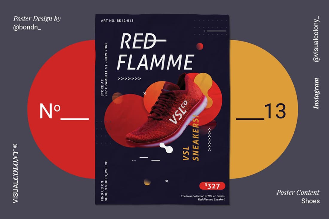
This color scheme is similar to one above but with deeper, more saturated colors it takes on a more serious feel. Deep red and gold almost seem to jump off a navy background. But what’s even nicer is that you can use those colors with a white background as well for a different feel.
Light Blue and Gray
#a2c0e2#4a434a#9c96a4
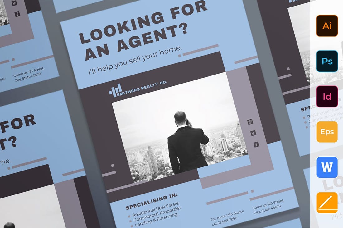
Light blue and gray create an almost timeless aesthetic that works with almost any content. It’s simple and inviting.
Bright Blue and Gold
#4a57a5#f99935
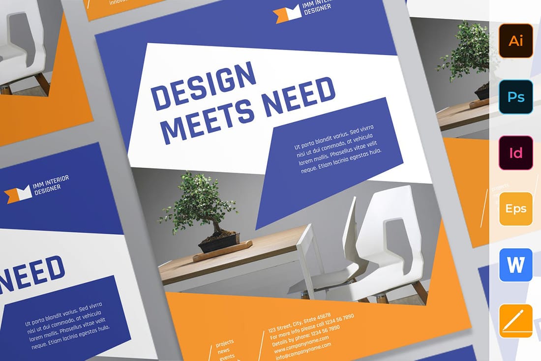
Bright color combinations are among some of the most popular in poster design because they do grab your attention from a distance. This bright blue and yellow combination is no exception. It’s also great that both colors have enough saturation to allow for reversed out (light color) typography if you like.
Teal and White
#297c8c#ffffff
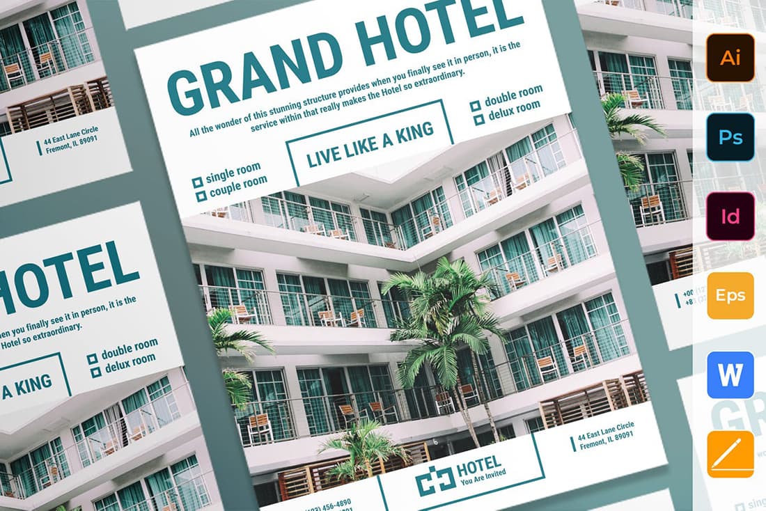
Teal and white is a modern take on using blue and white for a poster design. Teal is just a little bit less mainstream and has a nice appeal. A deep teal works great for accents and lettering and a lighter teal can help secondary design elements stand out.
Bright Green, Black, and White
#0db24c#000000#ffffff
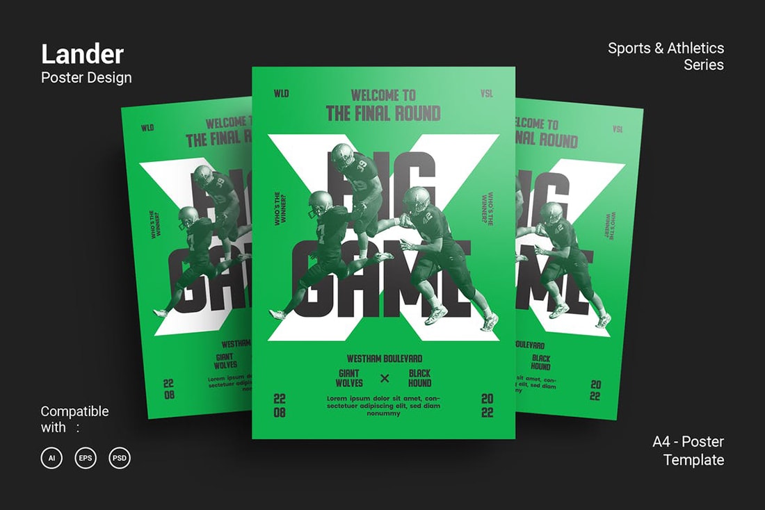
Are you sensing a commonality here? Many poster color palettes use black and white. This color scheme is no exception. Black and white help make green a focal point but ensure content is easy to read.
Orange and Yellow
#f48647#f7dd32
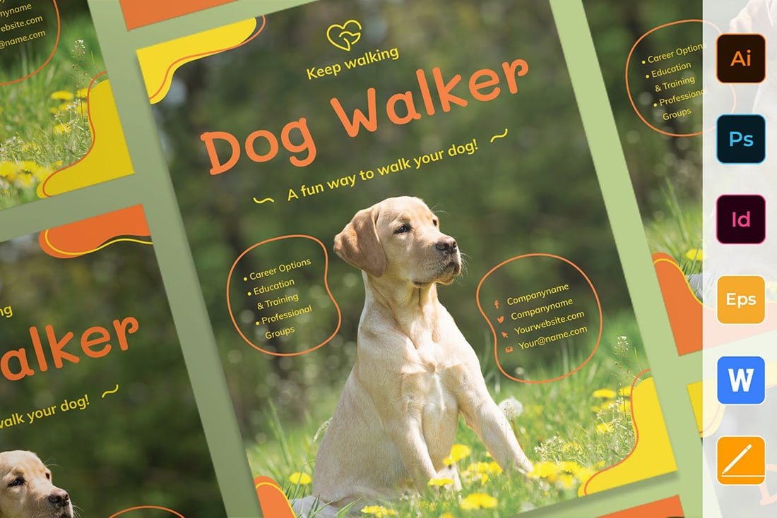
Orange and Yellow make fun accent colors for a poster design that is image based. Often these colors aren’t the focus of an image and can have exceptional contrast to create an interesting design. They also have a light, inviting feel to them.
Warm and Cool Color Overlay
#e7584a#342260
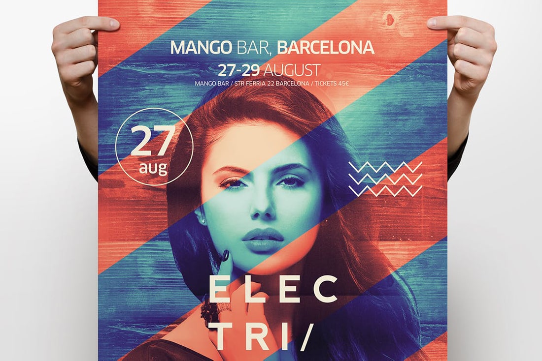
A combination of warm and cool colors – here red and blue – make a great color overlay. Play with the saturations and color mixes to achieve the ideal look for your background image.
Dark Green and Gold
#112629#17343a#ccb57f
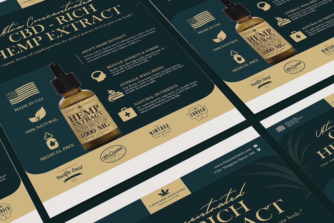
If you are looking for a touch of elegance, try a dark green and gold color scheme for your poster design. With a lot of contrast, this duo pops right off the paper.
Purple and Blue Gradient
#7272b2#4ac2da
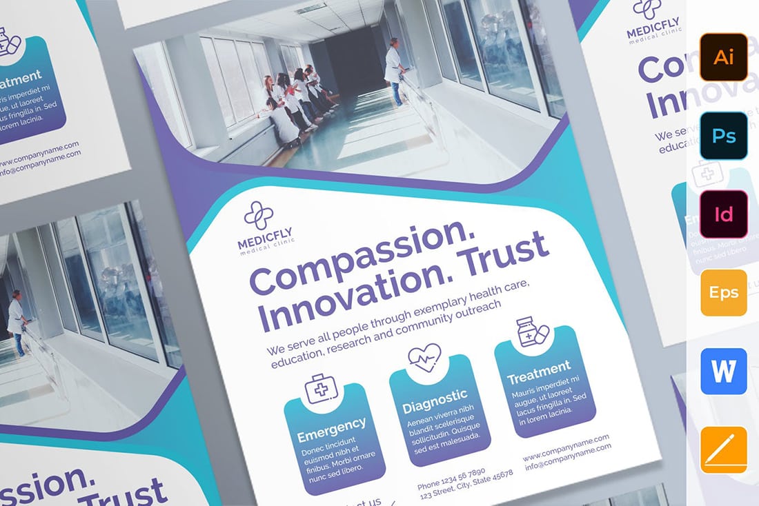
We can’t talk color schemes without including a gradient (one of the trendiest color options out there). This purple to blue gradient is simple and easy on the eyes.
Conclusion
What’s great about all these different color schemes is that they can really set the mood for events or anything your poster is promoting.
Just remember when picking out a color scheme for a poster that you want to ensure that everything is readable in the environment where the poster will be placed and for the size of the printed piece. That can make a big difference when it comes to what colors you choose. And have fun with picking colors for your poster projects!
Poster Design
Whether you’re crafting your own poster design or looking for a poster template to get started fast, this series is the perfect place to start!


