Picking the right font for your presentation is probably the most important part of designing a PowerPoint slideshow. If your font isn’t readable, you’ll have a confused audience. We explored the web to find this collection of the best fonts for PowerPoint presentations to help you choose the best font for your slideshow design.
When designing a PowerPoint presentation it’s easier to just pick a font from the default fonts collections installed on your computer and just finish making the slides. But, a unique, custom font can help you create a winning presentation that shows off professionalism.
Choosing a unique font with the right weight and creative design will allow you to not only design a presentation that looks more original, but also to quickly attract the attention of your audience.
In this collection, we’re featuring some of the best fonts you can use to design professional slides for all kinds of PowerPoint presentations from business to startup pitch decks, school presentations, and much more.
We’re also featuring a few helpful tips for choosing a presentation font to help get you started.
2 Million+ PowerPoint Templates, Themes, Graphics + More
Download thousands of PowerPoint templates, and many other design elements, with a monthly Envato Elements membership. It starts at $16 per month, and gives you unlimited access to a growing library of over 2,000,000 presentation templates, fonts, photos, graphics, and more.
Unlike most other font families, Config is a complete font family made just for professional designers and creatives. This font family comes with a total of 40 fonts.
Config includes 40 fonts in 8 different styles and in 10 weights. You also get italics, ligatures, alternatives, and much more with this font pack.
Why This Is A Top Pick
This is truly a special font pack that will help you design not only professional presentations but also many other types of print and digital designs. With 40 fonts, you’ll have plenty of options to choose from.
Indigo is a modern and creative font that features a bold and thick character design. This font is ideal for designing titles and the headers of your presentations. It comes in both regular and outline styles.
If you’re creating a business explainer PowerPoint presentation, Maximum Profit will help you hit a home run. It comes with a full set of uppercase and lowercase letters, numbers, punctuation, multilingual support, and more. Try it out today!
Looking for a typeface that feels right at home on virtually any kind of PowerPoint presentation? Mosra is a solid font choice that will help you create a presentation that stands out from the pack. We recommend you choose Mosra for your upcoming pitch deck or add it to your shortlist at the very least.
Say hello to Cornerone, a simple, round typeface that will add a vintage flair to your presentation, and take it to a whole new level. Available in bold and regular styles, and cyrillic, and latin alphabets, Cornerone provides a surprising amount of creative control in your hands.
Modern, and classy, Cholens is a rounded sans-serif font that can be a solid choice for PowerPoint presentations of any kind. It contains uppercase and lowercase letters and is available for you to download without spending a penny. Get it now.
Mike Sans is a sans-serif font family that features a unique square and slightly rounded character design. The font includes 8 weights ranging from thin to heavy. It’s ideal for both title and paragraph text designs of presentations.
Metropolis is an elegant serif font family that comes with a mix of modern and vintage design elements. It features a design inspired by the 1927 Fritz Lang movie of the same name. This font is perfect for crafting business and professional presentation slideshows.
RNS Miles is a modern sans-serif font featuring an attractive design. It’s been crafted with a combination of “geometric shapes, open forms, and grotesque mood”, which gives the font a unique look. The font includes 7 different weights with 7 italic versions of the font.
Texteron is a professional font that comes in 6 different weights, including bold, heavy, and small caps font styles. The font features an elegant design that makes it perfect for designing the paragraph text of your PowerPoint slides.
Peace Sans is a bold display font with thick character design. This font is most suitable for designing titles and headers of your presentations. It’s free to use with your personal projects.
Univia Pro is a family of sans-serif fonts that features multiple font weights ranging from thick to bold designs. You can use it to design both titles and body text of your presentations.
Italo is a creative sans-serif handwritten font that comes with a unique design. It’s most suitable for designing PowerPoint slides for entertaining, fun, and creative presentations. The font also includes lots of glyphs and alternate characters as well.
Brother is a yet another creative font that comes with a bold design, making it best for using to design the titles of your slides. The font comes with both uppercase and lowercase letters, numbers, and punctuations.
Vistol is a free font family that features a set of clean and minimalist sans serif characters. The font includes 9 different font weights ranging from thin to extra bold and black.
This font is ideal for designing both titles and body text of your presentations as it includes both uppercase and lowercase letters.
The simple and attractive character design gives this font family a special place on our list. It’s also completely free to use with your personal and commercial projects.
While you’ll find a number of freebies on our list, when it comes to choosing the one that we like the most, Cansu definitely takes the cake. With an air of minimalism, the font is perfectly suited for a variety of presentation formats.
Addington is a family of serif fonts that feature a very formal design. It’s perfect for designing PowerPoint slides for business and professional presentations. The font comes with 7 different font weights including roman and italic sets.
Avera is a unique family of sans-serif fonts that comes in 3 different styles, a brush font, a handcrafted style font, and a sketch style font. This font family will come in handy when designing many different types of slideshow presentations.
Calama is a free font that comes with a narrow condensed design. This type of fonts is best not to be used as your body text font. But it will make your titles look great.
Mathison is a free serif font that has a unique design of its own. This font is perfect for crafting unique headers and sub-headers in your presentations. It’s free to use with personal and commercial projects.
Cormier is a creative font that comes with an art deco inspired design. It includes 3 styles of fonts: Rough, Double, and Regular. The font features all-uppercase letters, numbers, and punctuations.
Metrisch is a minimalist sans-serif font that features an elegant design. The font comes in 7 different weights to match both the titles and text in your slides. It’s most suitable for making slides related to business and professional projects.
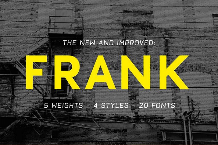
Frank is a bold font that comes with a modern design. It includes 4 different fonts, including oblique and rough styles. And the fonts are available in 5 different weights, making a total of 20 fonts.
Bistro is a creative font with a handcrafted design. This font is perfect for designing slides related to creative work, kids, school presentations, and more. It comes with 3 different weights and in both serif and sans-serif versions.
This cute and adorable font features a fun and quirky design that makes it most suitable for designing presentations related to fun events. It will especially help get the attention of children.
Mosk is a modern sans-serif font family that comes with 9 different font weights. You can use this free font to design both titles and paragraphs of your PowerPoint presentations.
Manrope is a unique sans-serif font that comes with 7 different weights. It features a geometrically accurate design that makes it perfect for all kinds of business and professional presentations.
Venice is a serif font with an elegantly thin design. The font comes in multiple weights, including light, bold, and italic versions. It also includes 195 glyphs and it’s best for fashion and luxury presentation designs.
Granite is a creative brush style font you can use to design bold and creative PowerPoint slides. The font includes lots of swashes and glyphs. It’s perfect for slides with colorful images and graphics.
Bison is a bold font family that comes with several unique font styles, including regular and outline versions of the font. It also features italics, numbers, and punctuations as well.
Frosty is a creative font you can use to design the titles of fun and attractive slides. The font features a quirky design that will work well with colorful and minimalist PowerPoint presentations.
This sans-serif font is ideal for designing creative and business slideshow presentations. The font features a design inspired by a font released in the 20th Century and it comes in 3 different weights.
4 Tips for Choosing a Presentation Font
If you’re new to creating presentations, follow these tips to find the best font for your design.
1. Choose Fonts That Improve Readability
Most PowerPoint presentations include two different types of text titles or headings and paragraph text. When designing both types of text, you need to take readability into account.
Where are you presenting your slideshow? Will it be at a big conference for a big crowd? Or a small team meeting at the office? Depending on the situation, choose a font and a font size appropriately. For example, if you’re presenting the slideshow to a crowd at a large hall, you may want to use an easy to read sans-serif font with larger font size for paragraph text to let people in every corner read the text more easily.
2. Use No More Than Two Fonts
It’s best to use two different fonts for your titles and paragraph text. But, avoid using more than two fonts. Some people actually use one font for titles, one for bullet points, one for paragraphs, and another for sub-headings. This is a mistake that only creates confusion and destroys professionalism.
Use two matching font pairs for titles and paragraphs, preferably sans-serif fonts.
3. Keep Consistency
One of the biggest mistakes people make when using fonts in presentations is choosing different font styles that ruin readability. For example, using a script font for paragraphs is a terrible choice.
When choosing different fonts, also remember to keep consistency. Don’t use different fonts for each and every slide in your presentation.
4. Avoid Using All-Caps Fonts
Some fonts only include uppercase letters and doesn’t come with lowercase letters. When choosing a font, remember to check whether your font includes both sets of letters.
While all-caps text is suitable for designing titles and headings, it’s not a good choice for body text. You should try to avoid using all-caps fonts altogether especially when designing professional and business presentations.
PowerPoint Templates
Microsoft PowerPoint (PPT) is the go-to choice for creating presentations. This series shares tips and ideas for working with PowerPoint, as well as beautiful PowerPoint templates and themes to make your presentations look stunning.


