An injection of realism can take a design project to the next level. With so many VR and realistic style effects gaining popularity, it is no surprise that 3D typography is part of this design trend.
Three-dimensional typography has extra depth and can be a great display option. While 3D type isn’t necessarily made for readability, it is a fun design trend that is worth a try. Here’s a look at how to get started with 3D typography (with some pretty cool examples for inspiration).
3D Typography 101
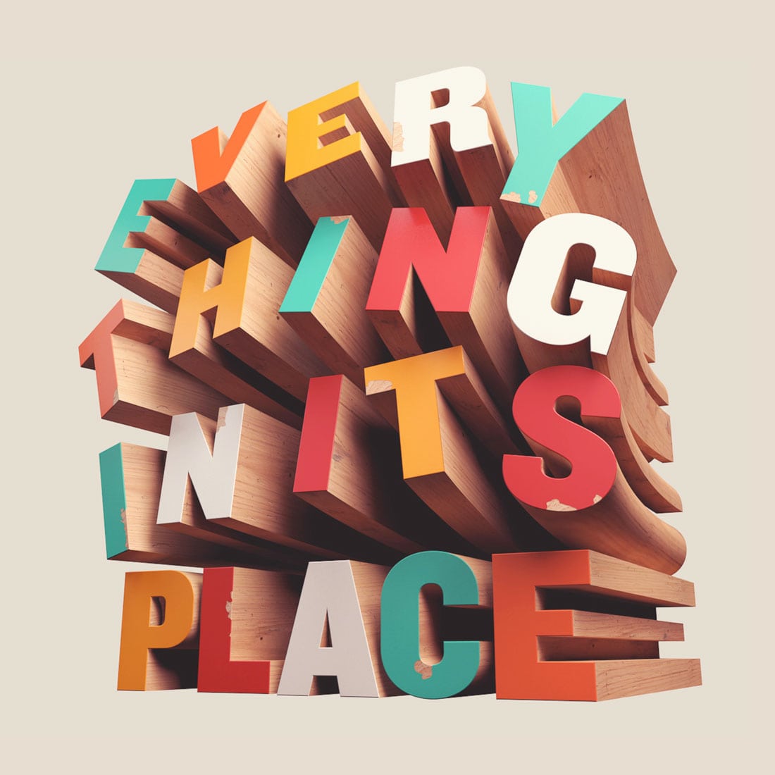
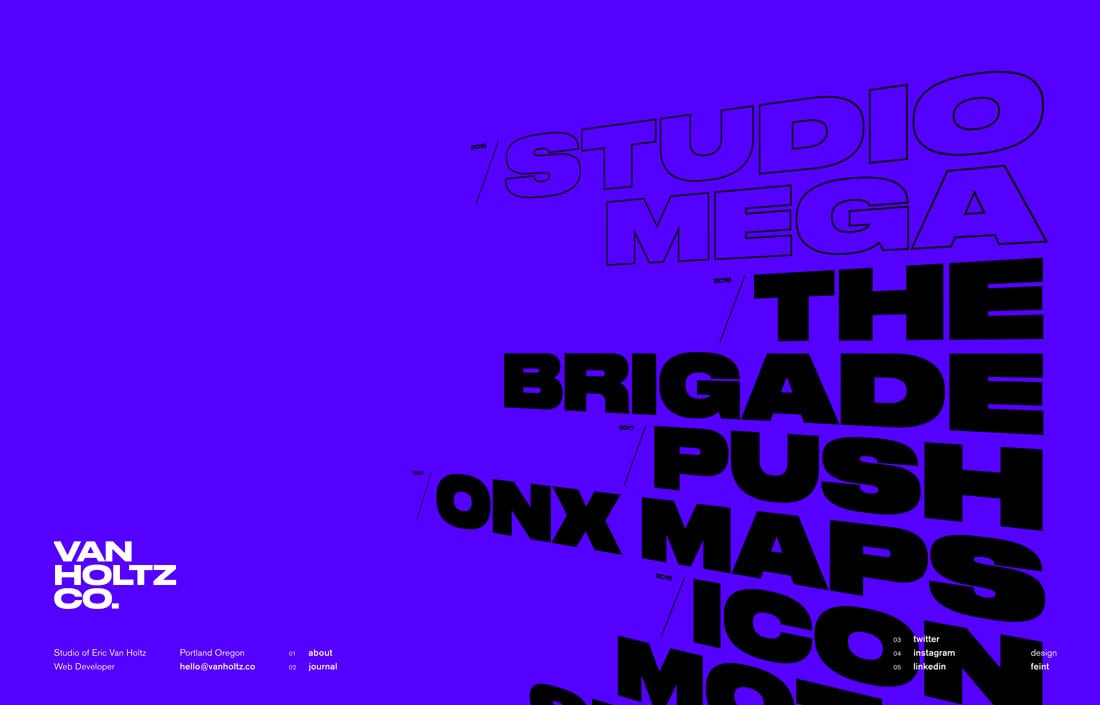
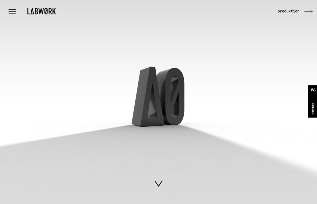
Three-dimensional typography is a design trend that adds a realistic effect to type. It makes typography on a screen or printed element “lift” off the canvas for a look that’s almost like a sign.
These effects can be applied to almost any font in editing software such as Adobe Illustrator or Photoshop. You can also use a 3D font.
When it comes to variations of 3D typography, there really aren’t a lot of rules to follow. Lettering can be of almost any style or typeface and feature a more straight-on and readable design or feature stacks and combinations of letters that are much more artistic than informational.
This style of creating type has been around for a long time but is starting to emerge as a popular option in digital design. We can thank the popularity of virtual and augmented reality for that.
3D Typography Styles
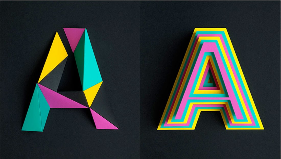
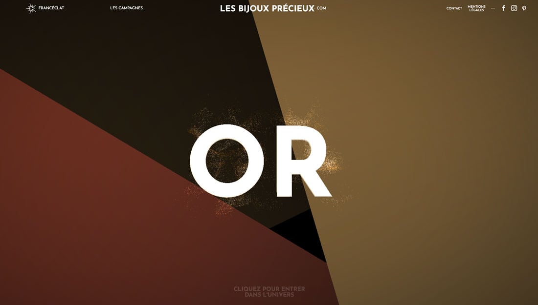
Just as typography styles vary, so do 3D typestyles. These typefaces might be big and bold (a highly popular option) or feature a more script or bubble design. The use of 3D type can include color, or not, and there are huge variances in how dramatic the effect can be.
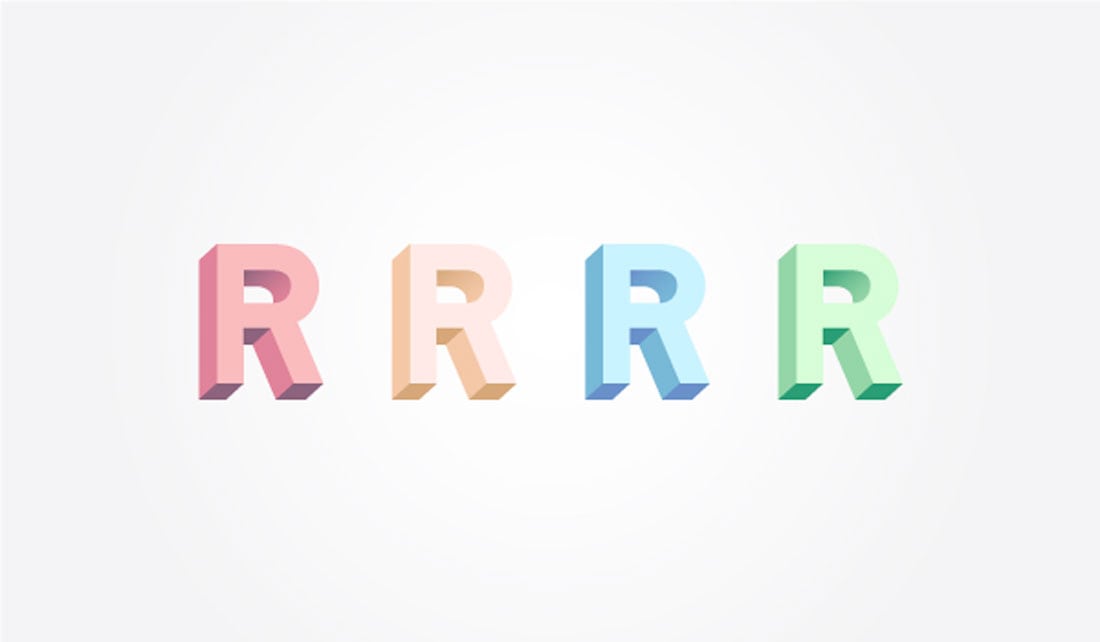
Personally, I find subtle 3D effects to be the most appealing. I like the gentle separation of the typeface from the background canvas, such as in the example below.
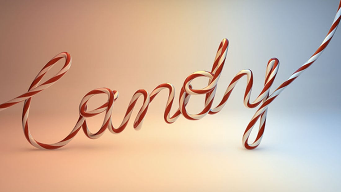
These typefaces can look like type – with simple lines and features – or have a more cartoonish effect, such as the example below from Digital Arts (which also includes a tutorial on how to do it if you like this effect).
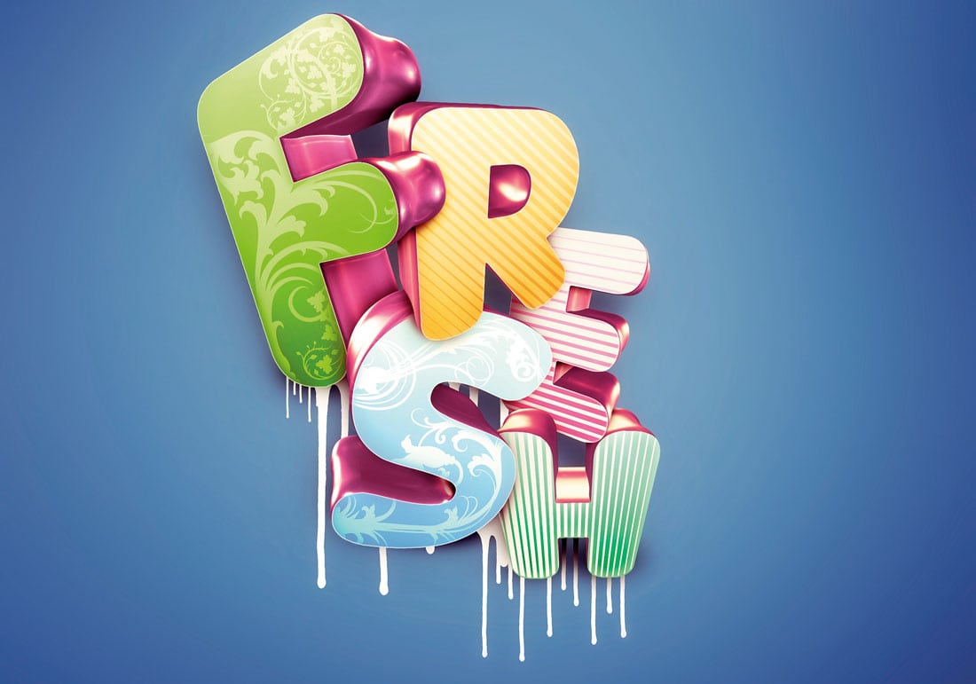
The identifying style of 3D typography is that lettering has depth. You should feel like you can reach out and touch the letters and feel the variances in shape or curves or hard edges.
Characteristics of 3D Type
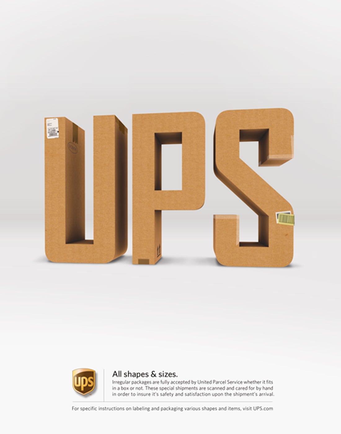
So what makes something on a flat canvas or screen take on a three-dimensional feel? The characteristics of and techniques used to create 3D typography include:
- Use of shadows
- Titling
- Changes in perspective for letters such as some being upright and some laying down
- Embossing or lighting changes
- Use of sharp text on a blurred background
- Adding textures
- Photographing objects to create text (example above)
- Distinct layering of text versus background
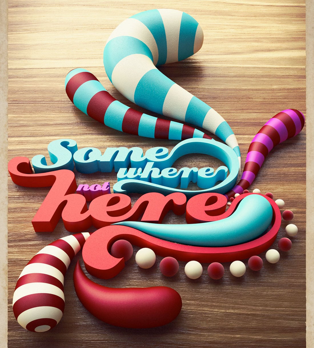
- Solid long shadows (example below)
- Animation
Opt for Display
Because of the nature of this style of typography, it is best suited for display use only. Stick to only one or two words and a handful of letters for maximum impact.
3D typography can pose some serious readability issues. The more stacking of words you attempt in this style, the more troubling readability can be. Think of it as more of an art element than as a readable, messaging part of the design.
Use this technique sparingly. It should not be part of a header or something that appears on every page of a website. Even the use of 3D typography for a logo can get overwhelming pretty quickly.
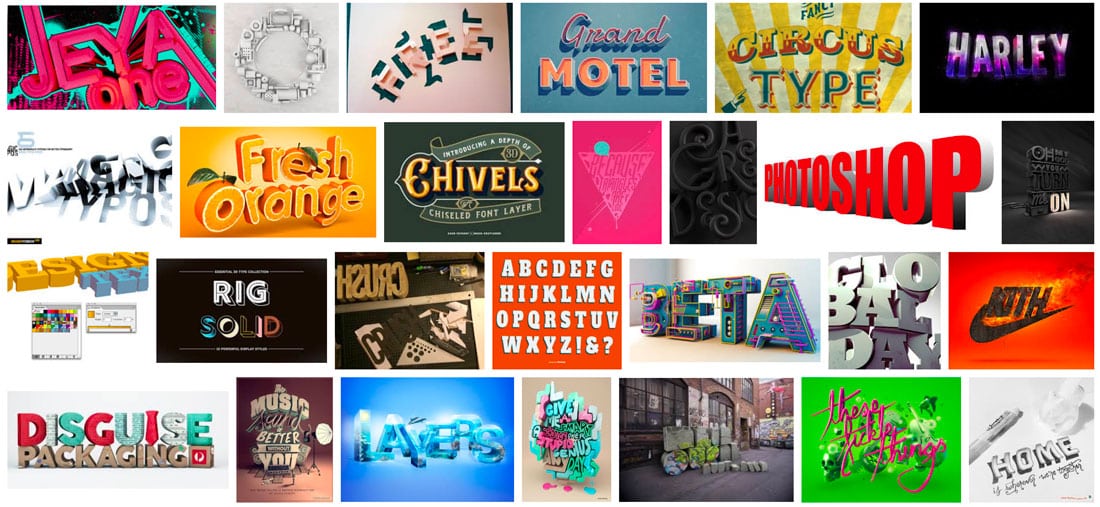
Look at the collection of 3D styles above from Google. Note how tired your eyes start to get after looking at multiple 3D options. Most of these styles look pretty neat in isolation but can get overwhelming when combined. That’s why this design trend should be used only for special projects.
Create It Yourself
So how do you find (or create) 3D typography for projects?
The answer depends on how complicated of a 3D typeface you have in mind. Most of the more elaborate styles are created by piecing together hand-created elements. You can create a simple 3D type design using a generator online, such as this one from Sculpteo.
Another option is to do it in Adobe Illustrator—this might be one of the most popular ways to create 3D text. Note that when you turn text into a vector image, it isn’t “readable” online and you have to treat it like an image using alt text attributes.
Adobe has a quick tutorial here with a video to help you create a simple 3D text element.
Tuts+ also has a great, detailed tutorial to walk you through creating a trendy text element. If you have a good idea of what you want but aren’t sure how to create it, this might be a better place to start.
Use a 3D Font
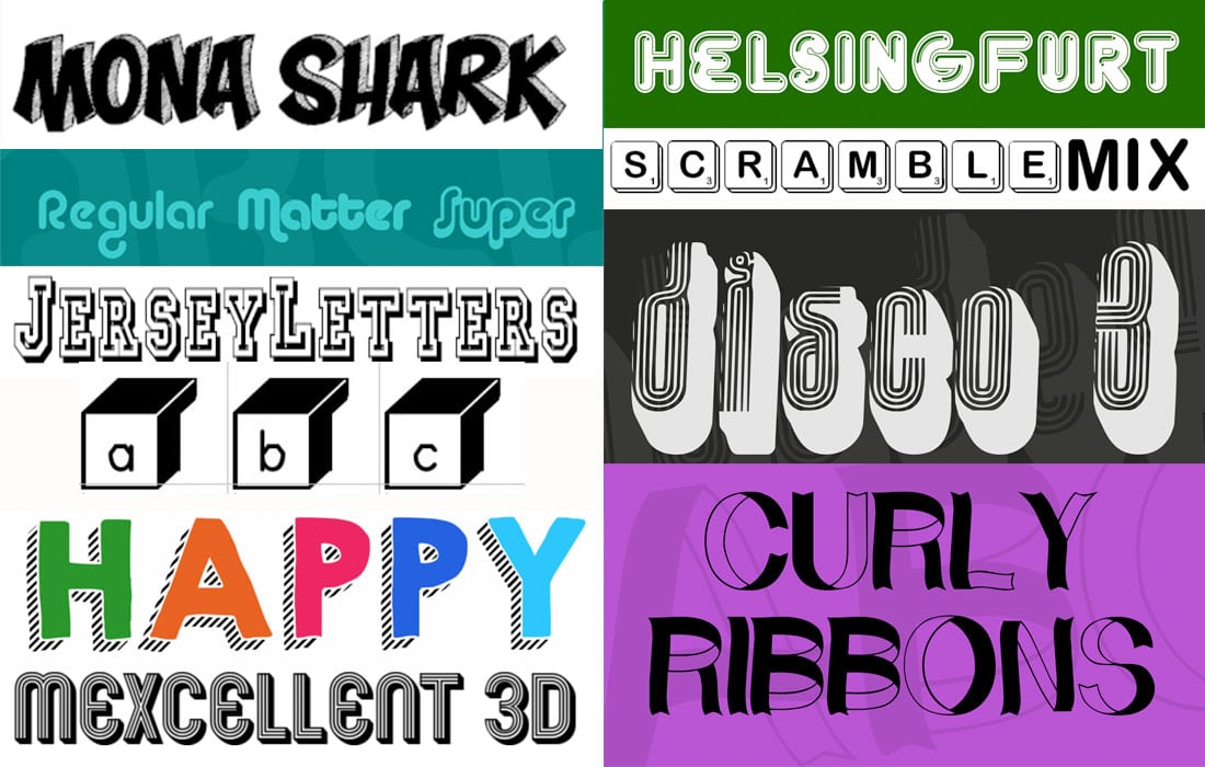
The 3D typography design trend is so popular that there’s actually a category of 3D fonts available to help you use this style with ease. Look for fonts with keywords such as inline, outline, shade, extrude or shadow when searching typefaces.
These styles don’t always have the same panache as typefaces you create yourself, but can certainly work in a pinch.
Here are 10 free 3D fonts to try:
- Boxing Brophius
- Mona Shark
- KG Happy
- Curly Ribbons
- Mexcellent 3D
- Scramble Mixed
- Disco 3
- FT Helsingfurt
- Jersey Letters
- Alba Super
Conclusion
Three-dimensional typography is definitely not for every project. But it can be a lot of fun.
Use 3D type for web or print projects. Just make sure to keep the rest of the design fairly simple and pair it with techniques that are easy to read. Most of all have fun. That’s what the 3D typography design trend is all about.


