How many times have you walked into a project where the logo is a mess? Bitmap designs. Poor color choices. Lack of contrast. Inappropriate typography. A shape that doesn’t work anywhere. Here’s how to fix a bad logo design.
There are so many issues when it comes to bad logo design. And you’ll know one the minute you see it. These poor instances of design tend to stick out like a sore thumb.
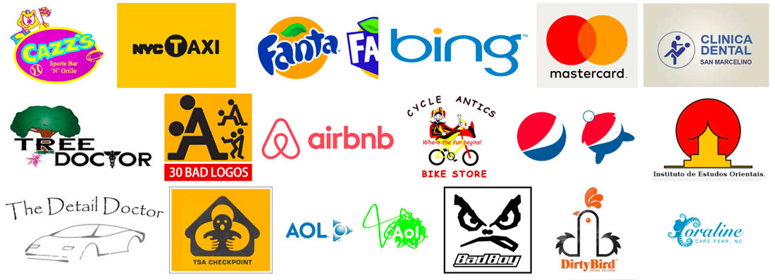
But is there anything you can do? If the client isn’t in love with the miserable mark, you can make some quick fixes to at least turn the logo into something a little more usable. Here are a few tips (starting with a collage of bad logos!) and examples of quick fixes that can help improve a logo.
What Does a Bad Logo Look Like?

You can’t always define a bad logo, but you’ll definitely know one when you see it.
1. Redraw It

One of the most common “bad logo” problems is inappropriate filetype. There are still people buying $5 logos online and ending up with… well, a $5 logo!
These logos are mostly unusable for anything other than small digital applications because they are often small bitmap images. (There’s no way you can use this on a print project or on a large high-resolution screen without it breaking down.) It’s not ideal in any sense of the word.
But you can pop that logo in Illustrator and redraw it so that you have a usable vector version to work with. Here’s how I do it in a jiffy:
- Start with the biggest logo file you have and separate the text from the mark. (You can just crop it out.) Ideally, you will have a single color version to work with here.
- Trace the design in Illustrator. Use the highest resolution setting or for simple marks without many colors, use the appropriate color setting.
- Expand the trace and delete any negative space.
- Clean up curves and rough edges manually.
- Add color back to the logo if you used a one-color mark.
- Add the text back, matching fonts as closely as possible.
While this might seem like a lot of work for a bad logo, it will turn the design into something usable. This can be useful if you have a client with a poor-quality mark that they don’t want to completely overhaul.
2. Introduce New Typography

Another common logo problem is the typography. Sometimes the tone of the lettering and mark just don’t match.
A simple tweak to the typography can make a big difference. (Sometimes just kerning a couple of letter pairs can fix a jarring logo design.)
When selecting typography for a logo make that you are fixing, it’s usually best to stick to simple, readable typefaces. If you are fixing a logo, it probably already has a lot going on. Your goal is to make it less busy and a little sleeker.
Experiment with title case and uppercase options until you find the right fit.
3. Tweak the Color

A dated color palette or one that lacks appropriate contrast can break a logo in an instant. If the mark and typography are sound, consider a palette revision.
Most logos only need a couple of colors. Look for options that are rooted in color theory and even science to get something that will appeal to users. (We have our own guide to the science behind color.)
The other option is to strip out color altogether. Think about how the logo is used. If it is primarily used with other high-color elements such as photos or bright backgrounds, a black or white only logo might be a better option.
This allows the logo to fall into the rest of the design, it helps create visual cohesion and will eliminate that jarring feeling that happens when you force design choices to make multiple high-color elements work with each other (such as dark shadows or boxing).
4. Strip Out Elements

Many amateur logo designers try to put too many things into the mark, resulting in a bad logo design. The easiest way to fix this type of bad logo is to start stripping elements out.
Stick to one iconic or artistic element and one block of text for the logo. Avoid mixing icons into the typography – a way too common mistake – and don’t use clipart to represent your brand. (That’s the quickest way to scream “I have no idea what I am doing.”)
When in doubt, a simple logotype can be enough. Use the brand name to create a simple text representation of the brand. Think of how many major companies that you know by a text style – Disney, Coca-Cola, Gap. Don’t force an image element when there’s not a natural solution.
5. Iconize It

Oversized icons are a fairly trendy design element that can help you streamline a logo. Rearrange the parts in a badge style element with an icon and text.
What’s nice about this treatment is that it will force you to think about how to simplify the design. Using a badge-style design will also get the logo into a container of sorts, which can make it easier to use across projects.
When fixing a bad logo with an icon style, think about how to make it work as a shape in places where it will be commonly used. Square and round logo shapes are the easiest to work with online since they fit right into the profile image areas of social media pages. This shape can be a little trickier for websites with shallow header areas.
With that in mind, you might consider creating a squarish stacked logo and a more horizontal version so that you have options for usage.
Conclusion
While there’s not a set of defined rules that make a good logo – tastes and trends can vary – most people can spot a bad brand mark. And while you can’t make these marks perfect, a few quick fixes can make them more usable.
Work with clients on projects to make the most of what they have, and maybe you can sell them on a brand or logo refresh down the line.


