Not all website footers are made equal. While footer design might not be a sexy part of the web design process, a great footer can help users find information, contact you, and better engage with a website. Here’s how you design one that’s functional, and beautiful.
A large footer can also help organize information and make navigating a complicated website that much easier – think about the massive, multi-layer footer on Amazon’s website.
The trick to a large footer is content organization. Once you figure out what the footer design should help users do, it is easier to design a bottom-of-the-page element that you can be proud of. Let’s dive into some footer design tips.
1. Give It a Purpose
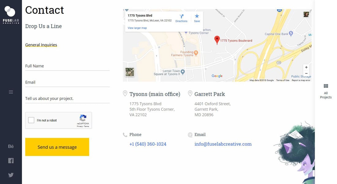
Before you can actually design a large website footer, decide how users should actually use it. A good footer design is not a place to dump all the links and information you don’t know what to do with. (Although way too many websites use it that way.)
A good footer design has an intentional purpose, just like every other part of the design.
Common footer uses include:
- Sitemap or list of most popular pages/links
- Contact or other submission form
- Social media hub with previews and links to social accounts
- Call to action, or last chance to act
- Map to show your location (important for brick and mortar businesses or eateries)
- Related content (great for blogs)
2. Make It Responsive
Use a column-based format so that your footer easily collapses and stacks in a responsive format. This becomes more important as the size of the footer increases.
While a one-column footer might look nice on a desktop device, it can turn into somewhat of a mess on mobile. Don’t forget to take care with the responsive look, feel and interactions of this website design element.
Remember, you don’t have to include different content types in a multi-column format. The design is mostly to help you organize what might be a large number of elements in the footer.
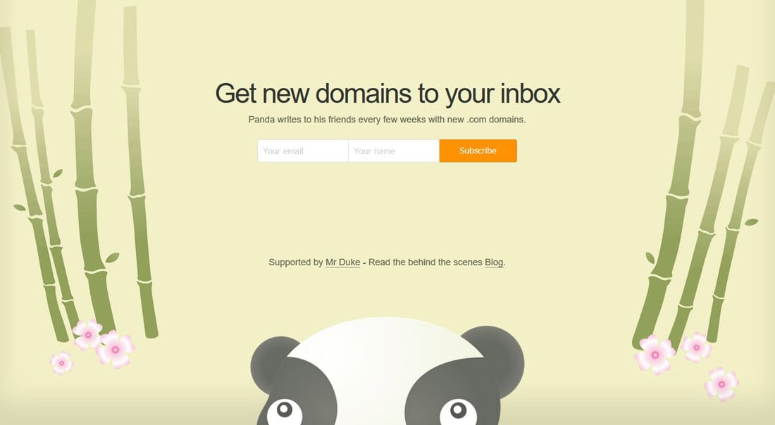
Unless … you are taking another approach altogether with an oversized footer for a single element. This can be a popular option for a big contact form or call to action, such as Hustle Panda (above). In this instance, the content area is so big that a single column option can collapse nicely to smaller sizes. (Just make sure text and CTAs are still large enough to read with ease.)
3. Include Information Users Expect
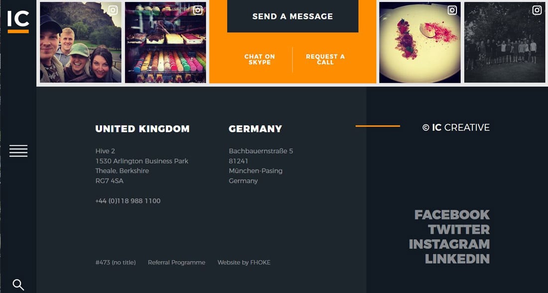
Most users expect to find certain types of information in a website footer. Including things in a location that users expect can make the design that much easier to use.
While not all of these elements need to be in every website footer, here are some of the common things that users will scroll to the bottom of a page to find:
- Sitemap or expanded navigation
- Contact information, address or map
- Social media links or widgets
- Email or newsletter signup
- Search
- Mission or about information
- Testimonials
- News, recent blog posts or event listings
There are also a few tiny elements that can fit in the footer easily as well. Not all users seek these elements out, but they are often more of website housekeeping items.
- Copyright information
- Link to terms or a privacy policy (great for GDPR updates)
- Professional affiliations or associations
4. Organize Links
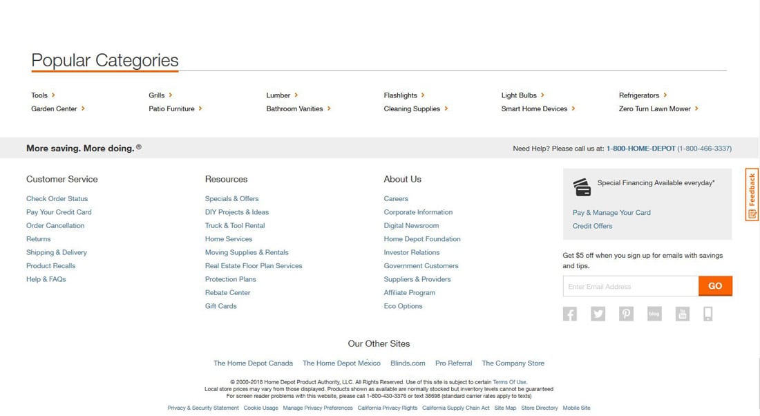
Websites with lots of content or varying types of information should consider a large footer with links grouped into categories of resources. By organizing links, you can help users find the part of the site that’s most relevant to them. (Think of it in the same way as those old-mega menus that were popular in the main navigation for a while.)
This is a pretty common technique for large-scale projects and can be quite helpful for users. Online retailers do a great job of organizing information for large footers.
The footer for The Home Depot, above, includes multiple levels of layered information in the footer. The top row includes popular categories (this is the “did you find everything you were looking for?” element for online retail), then groups of links for customer service (based on what the user needs to do), resources, information about the company and a call to action. Finally, the footer includes links to other brands within the company, copyright information and terms and agreement links.
5. Maintain Voice and Branding
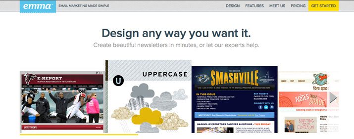
Don’t treat the microcopy in the footer as an afterthought. (This is a common flaw.)
The voice and style of this content should mirror the tone of the rest of the website design. Include the same color scheme, design elements and unique voice that are used in the rest of the project. Users shouldn’t have to guess or think about where they are on the web when in the footer.
Email provider Emma, above, includes a call to action in the footer with faces and the same friendly attitude as the rest of the website design: “Say hello to your new marketing team.” The tone is light, there’s plenty of space between elements (visually emphasizing that light feel) and happy faces to draw in users, making the company feel like someone you know.
6. Give It Plenty of Space
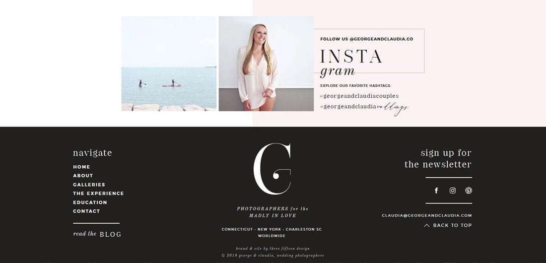
Small text and a tight space can be a recipe for disaster. Make sure that elements have plenty of room to breathe in the footer so that information is still easy to scan and click.
The same principles you apply to space, readability and scanning apply to the footer as well. (The larger the footer is, the more important these elements are.)
Remember, if it’s not usable, it’s not good. (You can get a good idea of what is and is not working using analytics information and following click paths. What links in the footer are actually getting clicked?)
7. Keep It Separated
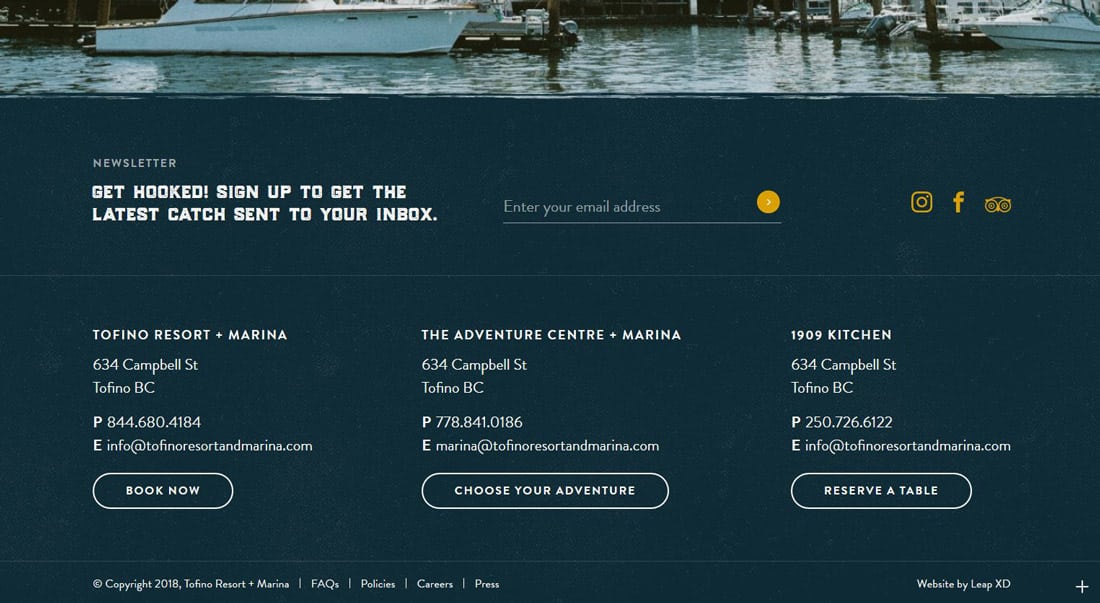
To make the most of an oversized footer design, make sure it stands out from the content above it. While a footer should look like it is part of the overall design, it should also include enough contrast so that the user understands this is the bottom of the page where key (and expected) information is located.
A common technique to help establish this contrast is to put the footer in a container element – such as a colored box – that is a different color from the rest of the background. (If the website design has a mostly light background, for example, the footer might be contained in a dark background.)
This additional contrast is a visual cue that this part of the design is different. It makes the user pause and think about the information on the screen. A change in contrast can be a strong visual cue that establishes a sense of place in the design, as well as a usability tool.
Conclusion
But when is a footer too big?
While researching this article, I came across a lot of great footer designs. More designers are creating large (and even oversized footers) than I thought when I started down this path. But there’s one type of big footer that I found annoying – footers that scroll.
While the footer is a great place to organization a lot of information, as a user, I wanted to see it all at a glance. So keep this in mind when building your design as well. (Or maybe it’s just my pet peeve after look at so many footer designs.) Good luck with your large footer projects!


