When it comes to selling online, you probably know that security and quality items are key components of your shop. The design of your online store can matter too.
You want to create a design aesthetic that’s easy to navigate and leads users to items they want to buy with the ability to check out quickly.
A solid e-commerce website design can actually help you increase sales because it makes shopping easy. Here are seven tips to help you create an even better online store, with examples of online stores that rock.
1. Make How to Purchase Obvious

Have you ever tried to make a purchase online and found it difficult?
Sadly, this is a real problem that happens way too much.
Common issues include buy it or add to cart buttons that aren’t clearly identified or visible. Too many options for purchase which makes decision making hard (or limits the ability to put an item in the cart), or even challenges with finding items in the first place.
Your goal is to make how to make a purchase obvious. This is one time where making the button just a little too big is just fine. Make sure the button clearly states what will happen next, such as “add to cart” or “buy it now.”
The path to getting to an item from the shop homepage should be equally clear. Do you have a shop element in your navigation menu? If not, you should.
2. Show Items with Great Images

Online shoppers are used to seeing a product from almost every angle before making a purchase.
They want to see colors and sizes and comparisons and even dimensions before committing to buy. Great product photography can provide the answers to many of their questions and help them make a decision that will stick (meaning fewer returns or unhappy customers for you).
So, what makes a great product image?
- It shows one thing without distractions such as a busy background
- It looks exactly like what you will get if you order
- Colors, shapes, and sizes are representative of the actual item
- Images are clear and high resolution
- Images represent different product options (if applicable), such as color options for a shirt design
- Additional images show practical application or how to use (if needed)
3. Make the Cart Easy to Find

Where is your cart button? What does it look like?
Make it easy for shoppers to check out and make a purchase with a cart button that’s always in the main navigation (bonus if it is also in the footer) with an icon that looks like a shopping cart.
There’s no need to try to be different here or try something cute. A simple cart icon and the word “cart” are enough. Make it easy for users to understand. And even easier for them to make a purchase.
One more bit of cart advice. Don’t enter a step between the cart button and the shopping cart. Some sites offer bonus deals or related items at this stage. If a shopper is on the fence about a purchase or in a hurry, adding an extra step here might be the things that make them abandon the cart.
You can offer these things, just not on the path of accessing the cart.
4. Use Transparent Pricing

Is it clear how much an item costs in your online store?
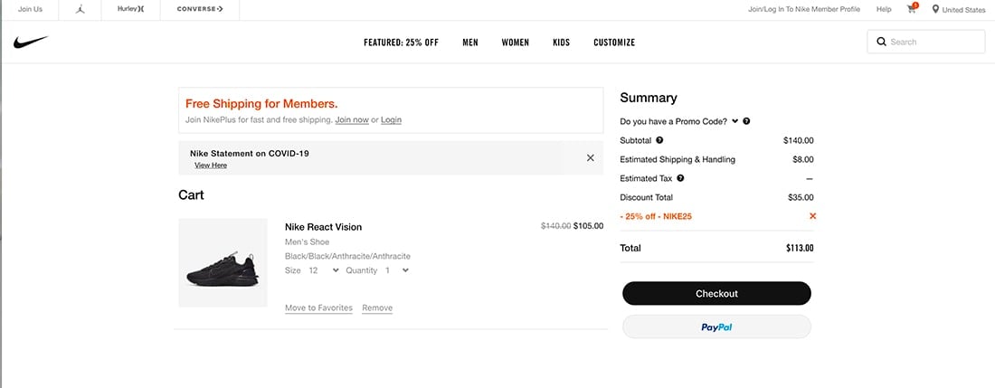
Use transparent and easy to understand pricing. Shoppers are accustomed to taxes and shipping being calculated at the end. But don’t sneak in other fees or options that aren’t clearly visible on the product page.
Make sure to show discounts as well. This includes discounts that are automatically calculated or those that are the result of a promo code.
Use shipping and tax calculators to ensure that options are presented for the shopper (not just your business location). Another option is to offer free or flat-rate shipping (with those costs figured into product pricing) to make prices more transparent.
The offer of free shipping makes people feel valued and can help push a purchase. Inflated shipping costs can have the opposite effect and cause shoppers to abandon carts and look for a better deal elsewhere.
It might seem like a game when it comes to pricing, but these little things can have a huge impact on conversion rates. A study by the National Retail Federation showed that many consumers actually expect shipping to be free on orders less than $50.
According to the study:
“Many consumers now consider shipping costs even before getting to the checkout page, with 65 percent saying they look up free-shipping thresholds before adding items to their online shopping carts. Consumers also want their products fast, with 39 percent expecting two-day shipping to be free, and 29 percent have backed out of a purchase because two-day shipping wasn’t free.”
Something to think about when determining an online pricing strategy.
5. Optimize for Mobile Shopping

Making a purchase should be just as intuitive and easy from a mobile device as from a desktop computer. (Nothing is more annoying than clicking an ad on social media from a phone and then not being able to make the purchase.)
If optimizing your website design for mobile shopping seems intimidating, consider using a third-party tool to help. There are plenty of e-commerce platforms (WooCommerce, Shopify and even payment tools such as PayPal and Square) that can help you sell online and in a mobile environment with ease.
You might not get the design control you would like, but you will get full e-commerce features that users and online shoppers expect.
6. Offer Related Products

Some products just go together like peanut butter and jelly.
Don’t miss the opportunity for an upsell. Offer related products throughout the website design. Show them in a sidebar or popup or even at the bottom of product pages (such as a “shoppers also bought” section).
Consider showing related products in the form of a question. We see you are planning to buy Product X, would you like to add Product Y for just $$ more?
By offering a helpful pairing of suggestion, you can delight shoppers and make the experience more valuable to them.
The risk comes in trying to upsell too much.
A few tips when it comes to upselling:
7. Show Item Reviews or Social Proof

Reviews and photos of others using your product or service can help provide extra value to shoppers.
Enable reviews on your website for individual products. (You can choose to only let verified purchasers review.) Even just a simple system of one- to five stars can encourage purchases if a product has high ratings.
Create a campaign from social media using a hashtag and bring images from users into your website. This social proof of product use and value can further entice shoppers. It can also show how to use a product or create a desire for users who are on the fence about making a purchase.
Both of these design elements help show the value of a product without using a lot of additional copy or words, going back to an adage of design: Show, don’t tell.
Conclusion
Take note of the shopping experiences of places you go back to time after time. What about their store brings you back? How can you incorporate that into your design?
It seems like it is getting easier almost by the day to make purchases online. It is your job to continue to evolve and change your e-commerce website design to meet the changing needs and expectations of online consumers.


