If you aren’t using responsive mockup templates to showcase your website and app design projects, you’re missing out! A mockup template provides a realistic or stylized shell to highlight a design, and choosing a responsive template can beautifully show your design’s versatility.
Most designers use a mockup template to place a website design into a computer screen, tablet, or phone to give clients or other stakeholders a preview of what a finished project will look like. The result is polished and easy for users to understand.
If you haven’t ventured into the world of using one of these tools yet, here are five reasons to use a responsive mockup template. All with some great examples to show you exactly how they work.
1. Show a New Website or App Design
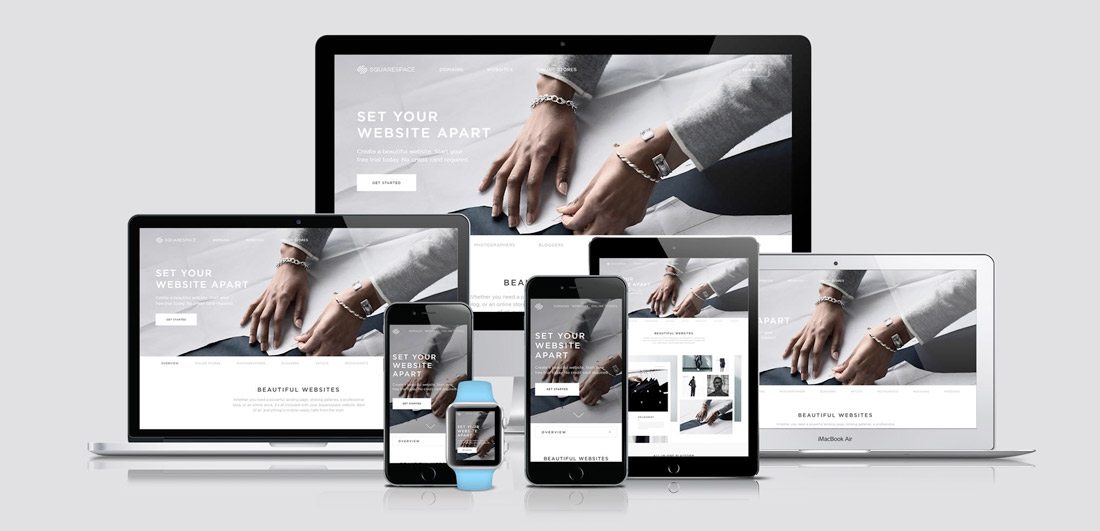
The top reason to use a responsive mockup template is to show all device iterations of a new website or app design at once. This allows clients and other members of the team to see how the design will look across devices.
Not only can it help you spot design flaws between devices before you present the design, but it can also help everyone else envision the final design. This can be a great step early in the design process or provide a quick look at the design once it is finished.
Featured mockup: What’s nice about 62 Responsive Mockups is that it includes a complete collection of devices to work with and you can stack add or remove elements as needed. There are also multiple orientations and views for the device types in this robust responsive mockup template.
2. Feature Different Screen Sizes
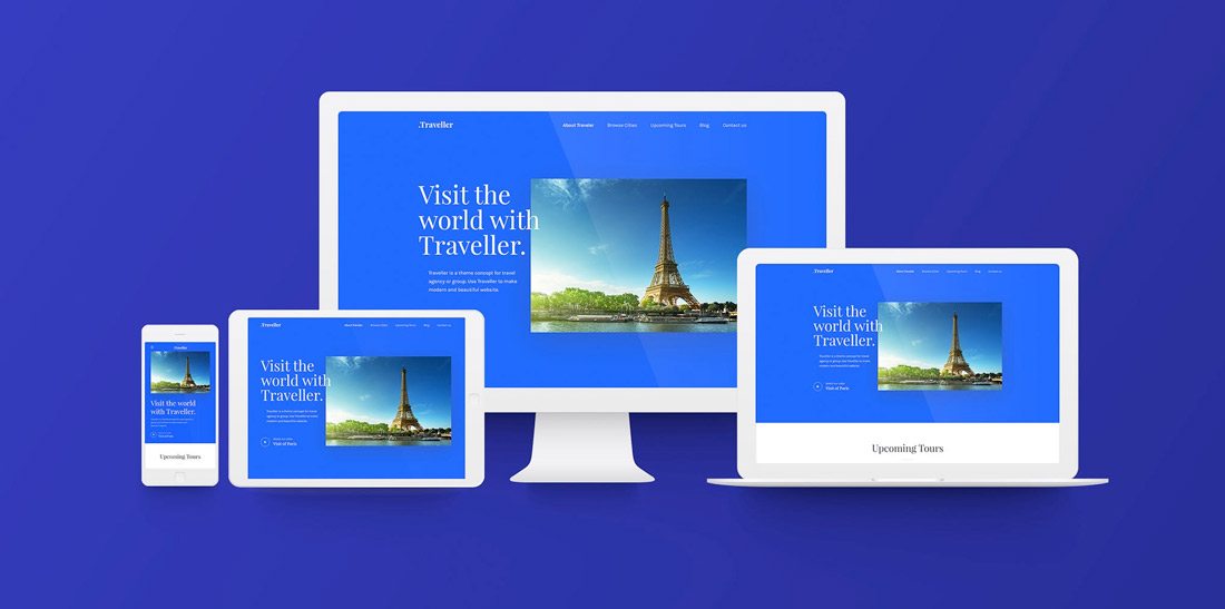
A responsive mockup template allows you to show off the design in plenty of different screen sizes and orientations. From desktops to phones to watches, it’s important to know what the design will look like for every user.
With a mockup, you can present all of these options at a glance. This can save time in design meetings because you don’t have to pull each homepage up individually by device type.
The other bonus here is that you can show an overview of the design before a project is actually finished. A mockup provides a sleek presentation option for visual designs that aren’t ready for interaction yet.
Featured mockup: Responsive Device Mockup v1 is a simple kit with a flat style and less realistic look that you can use pretty much anywhere. Some projects just don’t work with style scenes and this responsive mockup allows the design to be the only true element. The straight-on orientation is easy for beginners to use as well.
3. Quick and Easy Presentation

While most of the reasons to use a responsive website mockup template center around clients and users, there’s a distinct benefit for designers too. They are easy and quick to use.
It will take you more time to browse all the options available and find a template you like than to actually use it.
With a high resolution, customizable template, you can paste in screengrabs of your design in seconds, save and use. That’s it. Using a high-quality template, such as those from Envato Elements, could not be easier (or faster).
Featured mockup: Responsive Display iPhone Macbook Device Mock-Up is a photo-style mockup kit with close-ups of the designs in real devices. This type of mockup is great for impressing clients and can set a different tone than a plain mockup design. (It’s particularly great for collateral pieces showing your website.
4. Highlight Design for Print/Flat Display
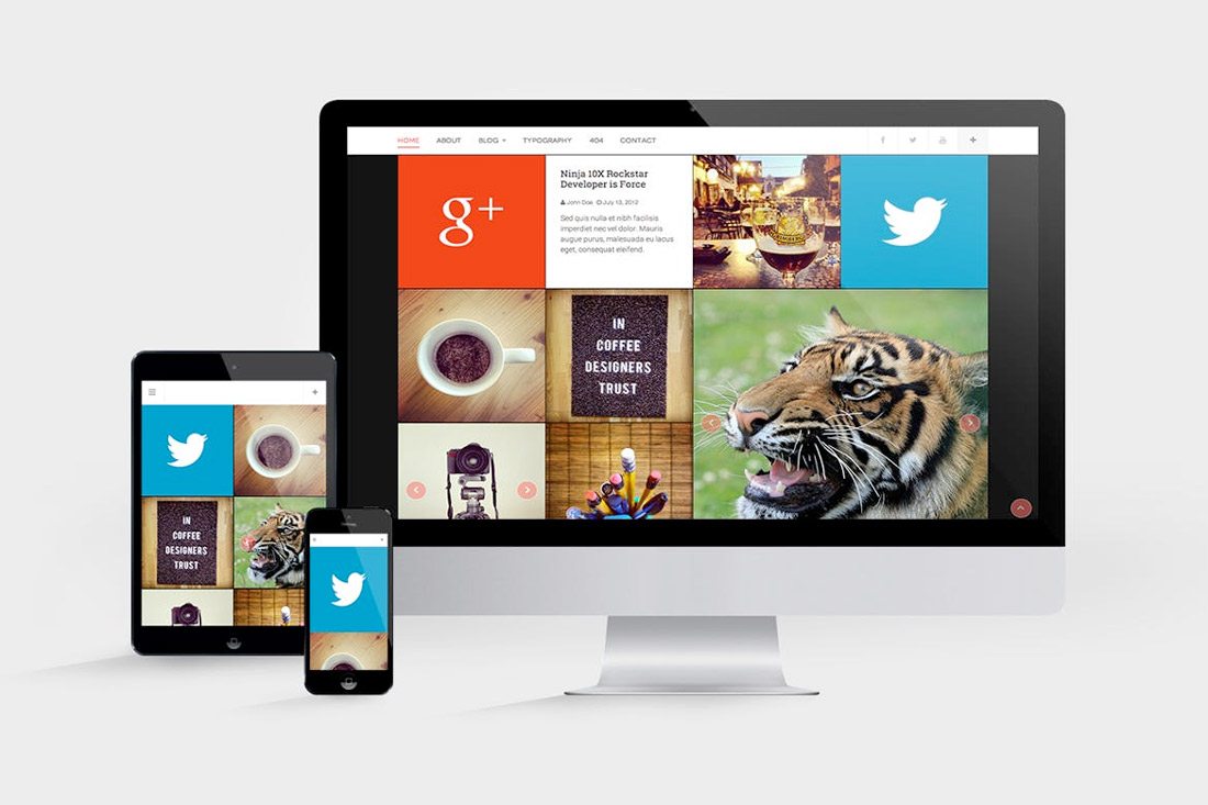
Many designers find that there’s promotion or publicity surrounding a new website or app launch or redesign. And often this involves needing a print or flat display of that design to distribute.
A responsive mockup template provides a way to do this that’s a little more polished than just providing screen grabs. By placing the design inside devices to show actual use, most people can visualize the project more fully and understand how to use it. (A small screen grab might not look like anything to the average user, but placed inside a phone element, they know exactly what is being communicated.)
Featured mockup: Multi Devices Responsive Web Mockups Pack is a simple, but realistic kits of display options in a variety of devices. The simple background with multiple orientations to choose from allows the design to really stand out in this responsive mockup template.
5. Professional Way to Show Projects
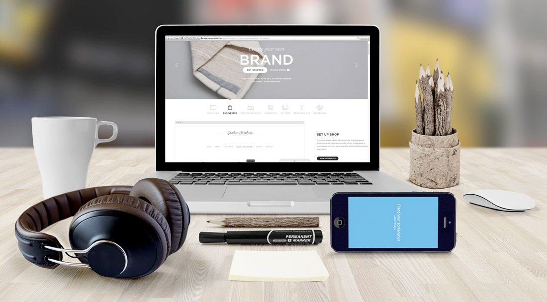
Finally, using a mockup provides a more professional and polished way to showcase a design. It can help users visualize the final product more fully.
A mockup provides a visual method of communication with an accurate display of a design. It allows clients and non-designers to see the project in a way that makes sense to them and can help bright design conversation gaps between designers and clients.
If you haven’t tried using one of these templates, you might be amazed at how much clients like seeing their website with this kind of presentation. (And it’s not a lot of extra work for you!)
Featured mockup: Responsive Web Display Kit Mock-up is made for showing off websites with plenty of room to make customizations. What’s nice about a kit like this is that the design is shown in a real environment, which has a nice presentation with a polished feel.
Conclusion
Finding a good responsive website or app template will make your life easy. Once you find one you like, you can use the same template for multiple projects. (Maybe even consider adding branding or a watermark to the mockup design so that clients will be able to easily identify your projects.)
The best part about using a mockup is that they are easy to work with. Most kits get refreshed or updated with new or modern devices as well—always make sure you are displaying current tech!


