Stylish geometry is a design trend that keeps coming back around. This time the new twist is that shapes and design elements include touches of animation to bring shapes and patterns to life. It’s easier than ever to implement animation on the web, in a simple and widely-supported way.
It’s also a nifty little design technique that can add visual interest to almost anything and works for all types of elements, from logos or icons to backgrounds to hero images.
Let’s take a look at this website design trend in action.
2 Million+ Digital Assets, With Unlimited Downloads
Get unlimited downloads of 2 million+ design resources, themes, templates, photos, graphics and more. Envato Elements starts at $16 per month, and is the best creative subscription we’ve ever seen.
Animated Geo Background
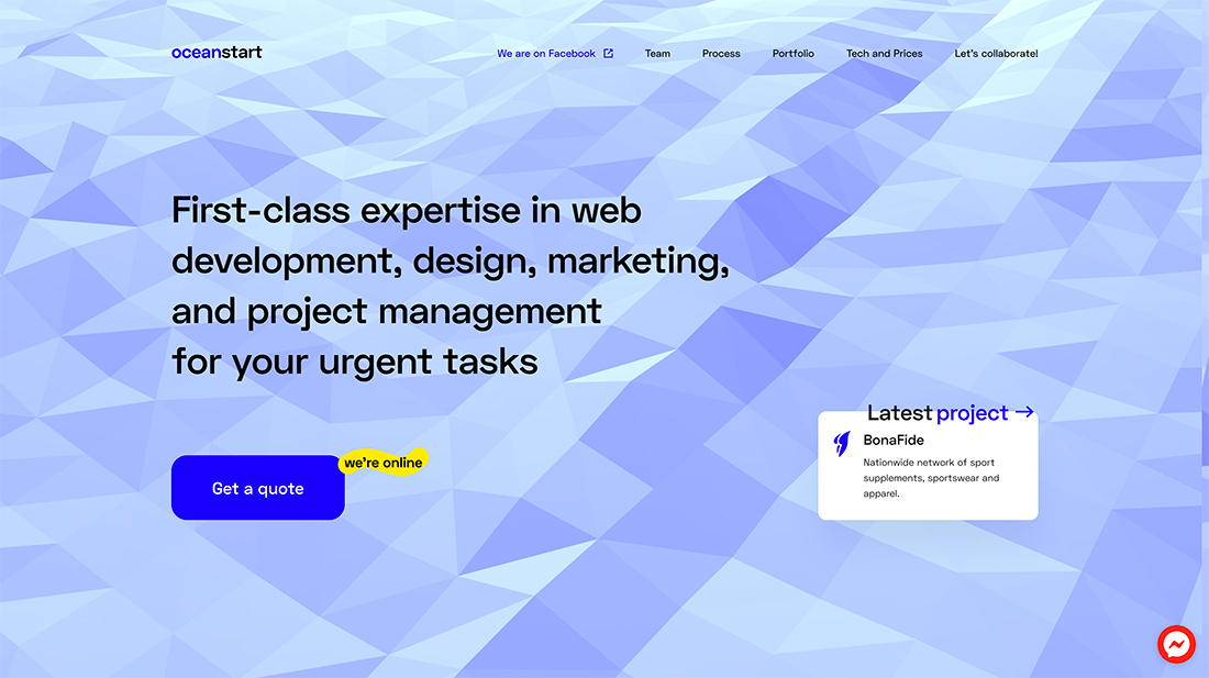
The wave effect in this background animation compiled of geometric shapes is brilliant.
It provides soft, subtle movement while keeping the focus on the words, maintaining readability, and ensuring the call to action is prominent.
The combination of geometric shapes and animation works because of color, timing, and simplicity. The animation looks and behaves like a real thing. It’s not annoyingly zippy and doesn’t get in the way of content. (These are common mistakes with background animations.)
The best part is that while geometric shapes are trendy, here they go with the brand and content. The “wave” background is a creative take on “ocean” in the brand name oceanstart. It’s subtle and pulls everything together for a trendy design that’s on point.
3D Shapes and Animation
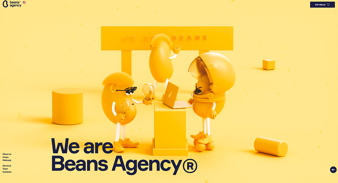
When you think of geo shapes as a design trend, what comes to mind is probably a lot more like the example from oceanstart, but the trend isn’t limited to the two-dimensional space.
Bring shapes to life with a 3D animation. Here, the Beans Agency does it with a combination of monotone coloring, geometric shapes, and bean characters.
It’s simple, weird, and highly engaging. The trend works here because that is the design thread that pulls everything together. Shapes in the scene help make the characters look and feel more realistic.
That’s the beauty of something as simple as a geo shape, they are elements that you can grab ahold of visually and that feel real in a design.
Tactile Motion
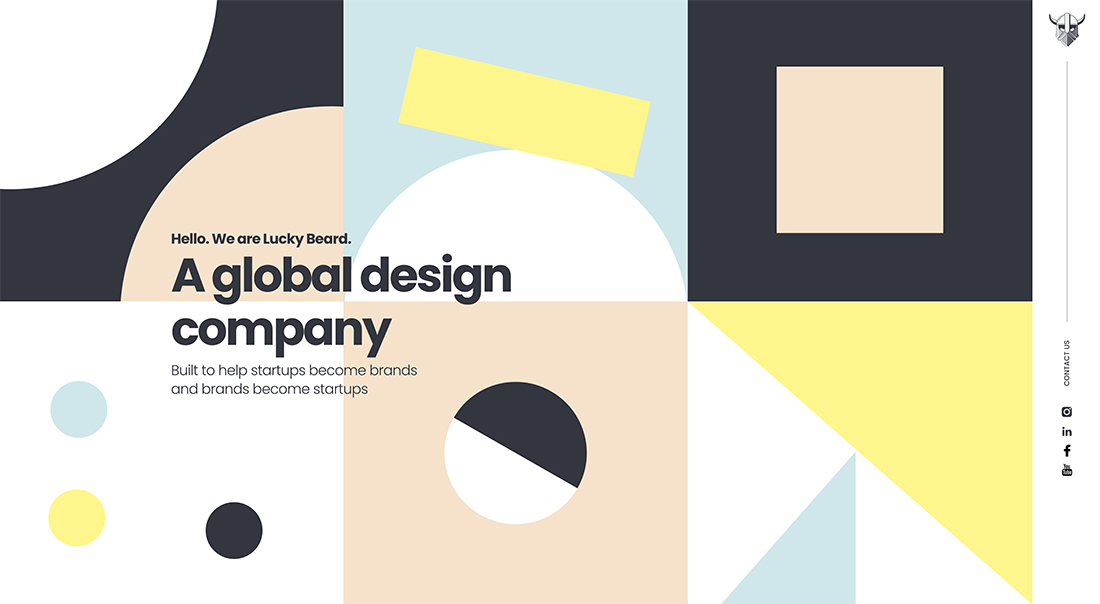
Geometric shapes that you can almost reach out, touch, and move are the focus of some applications of this trend. (And they are often quite clever.)
Each of the shapes in the homepage grid for Lucky Beard has subtle and obvious movement. Geometric shapes tilt and move on an axis, twist and move forward and back, and even pulse apart from one another.
Each shape seems to create a little story in and of itself. Each is rooted in tactile animation that feels so real you think you can touch it.
What’s super fun and interesting about this use of geometric shapes, is that this association isn’t something you’d generally think about with geometric shapes. Seldom are they this obviously connected with a realistic-style motion. But it works beautifully.
Loading Logo Animation
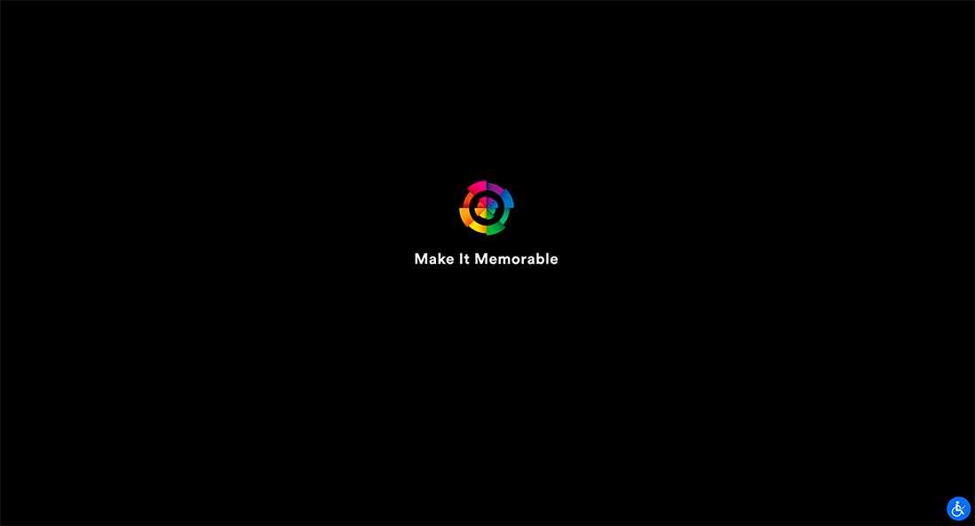
Now, this is a neat use of geometric shapes – use an animated version of your logo as a loading animation. Boom! Brand awareness as a quick precursor to the website design.
The geometric logo animates in other parts of the design as well, such as during scrolling.
The only downside to this application of the trend is using a geometric logo is probably a more permanent or longstanding use. Only go this route if you really like geometric shapes and plan to use them for quite some time. (The good news is this is a trend that’s got some staying power.)
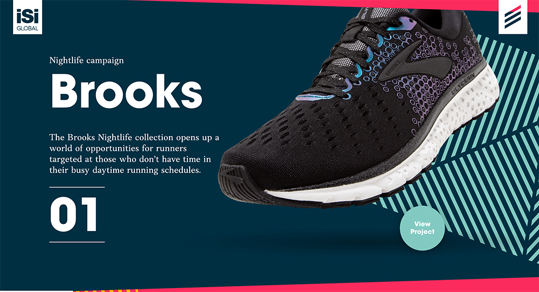
Another way to incorporate animated geometric shapes and patterns into your website design is with parallax scrolling. This type of scrolling animation can create a nice motion element for geometric background and foreground layers.
The trick to making it work is subtlety. Layers that move too fast or include too much motion can leave website visitors with a sick feeling (like motion sickness). A nice easy motion feels more natural and won’t leave users feeling jarred.
The example above uses parallax scrolling with line-filled shapes that fill and move as you navigate down the page. The motion is so subtle that if you scroll too slow, you might even miss it.
Geometric Hover Animations
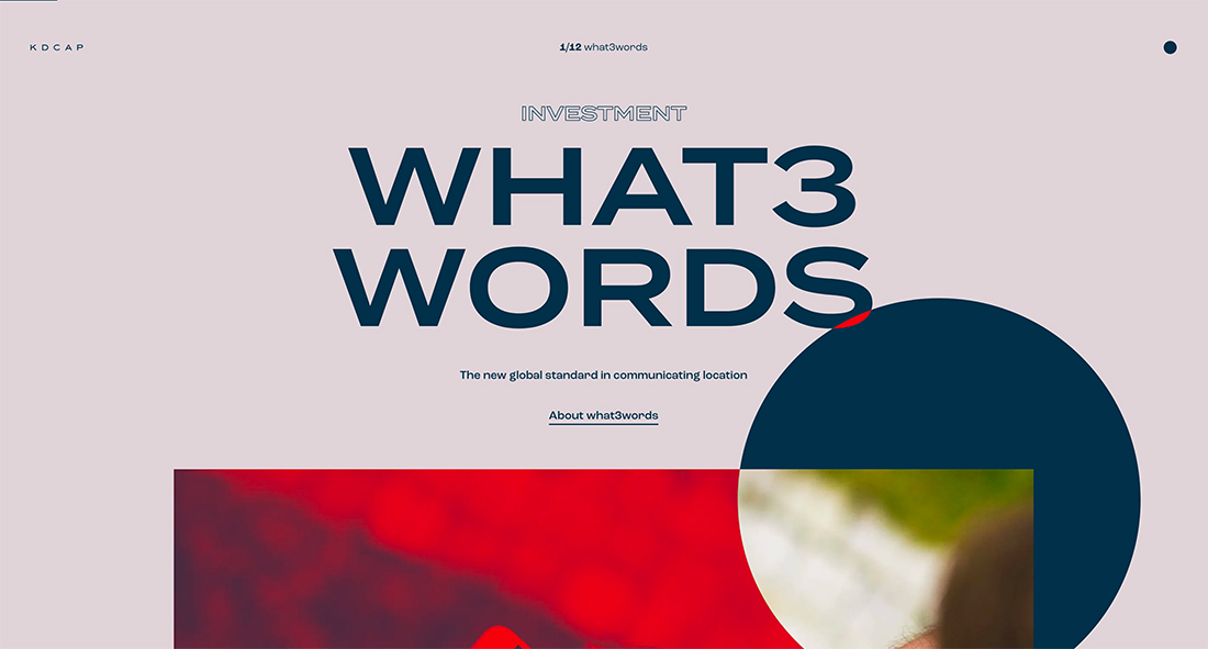
Determining the right speed for motion and animation is an art of its own. What’s too fast for some users might be too slow for others. There’s a lot of personal preference involved with it comes to animation speeds.
Keep this from becoming an issue with geometric shapes and animation that are connected to hover states and cursor placements. This gives each use complete control over movement in the design.
KDCAP does a nice job of this with multiple levels of hover animations that are easy to see with a cursor that “blows up” when it gets in proximity to a clickable element.
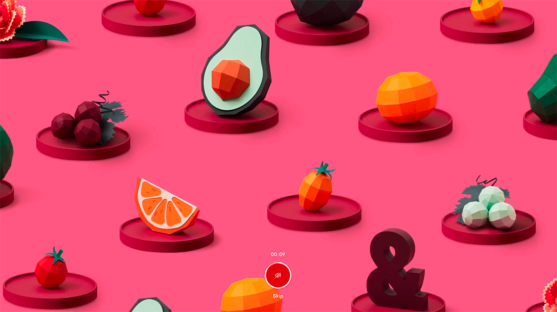
Almost anything can be converted into a geometric form, as proven by the visual display for the Delassus Group. Each element in the hero slider has common objects that have been made into geometric representations.
There’s two-part motion here:
- bouncing hover states for the objects on screen
- Slides that auto-play from one to another
What makes this design stand out is familiarity with the objects and the newness of the new style that has been applied to them. Monotone slides also help bring focus to moving objects.
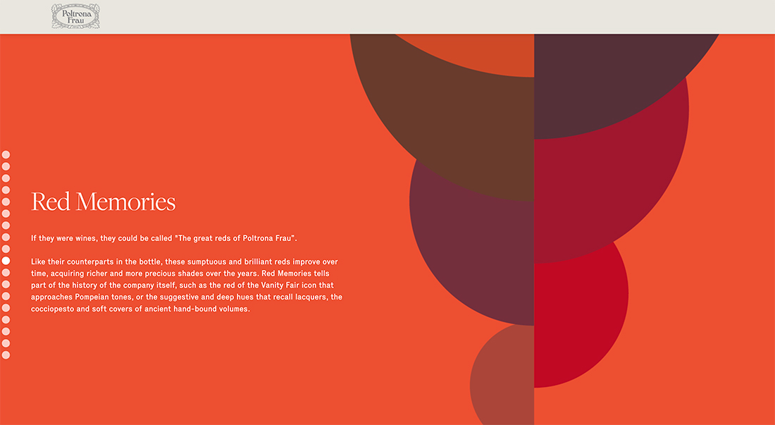
Here’s a way to use geometric shapes that you might not have considered: Create a timeline animation with shapes as the focal point.
Combining shapes and color elements can create visual imagery for projects that might lack other options, such as photos or video. Mixing shapes and colors can be engaging and interesting. Animation brings it all to life.
Conclusion
Some website design trends are meant to be tried in at least one of your projects. Using geometric shapes and animation together is one of them.
This is a highly versatile option that can work with a variety of content types and merges with other aesthetic principles well. Plus, geometric shape usage is a trend that seems to be sticking around. Using this concept won’t make your website look dated.


