(This is a sponsored post.)
When you need to add icons to your interface, the whole process can really suck. “Should I use all these default bootstrap icons? Maybe I’ll just use the same Google Material icons for the hundredth time?”
Some important yet often overlooked things to consider when choosing an icon set includes, the size of the icons, style, consistency, and quantity. It’s frustrating to find icons that only cover half of the use cases you need.
We constantly felt this frustration too and decided to do something about it. This ultimately led to creating Streamline icon set.
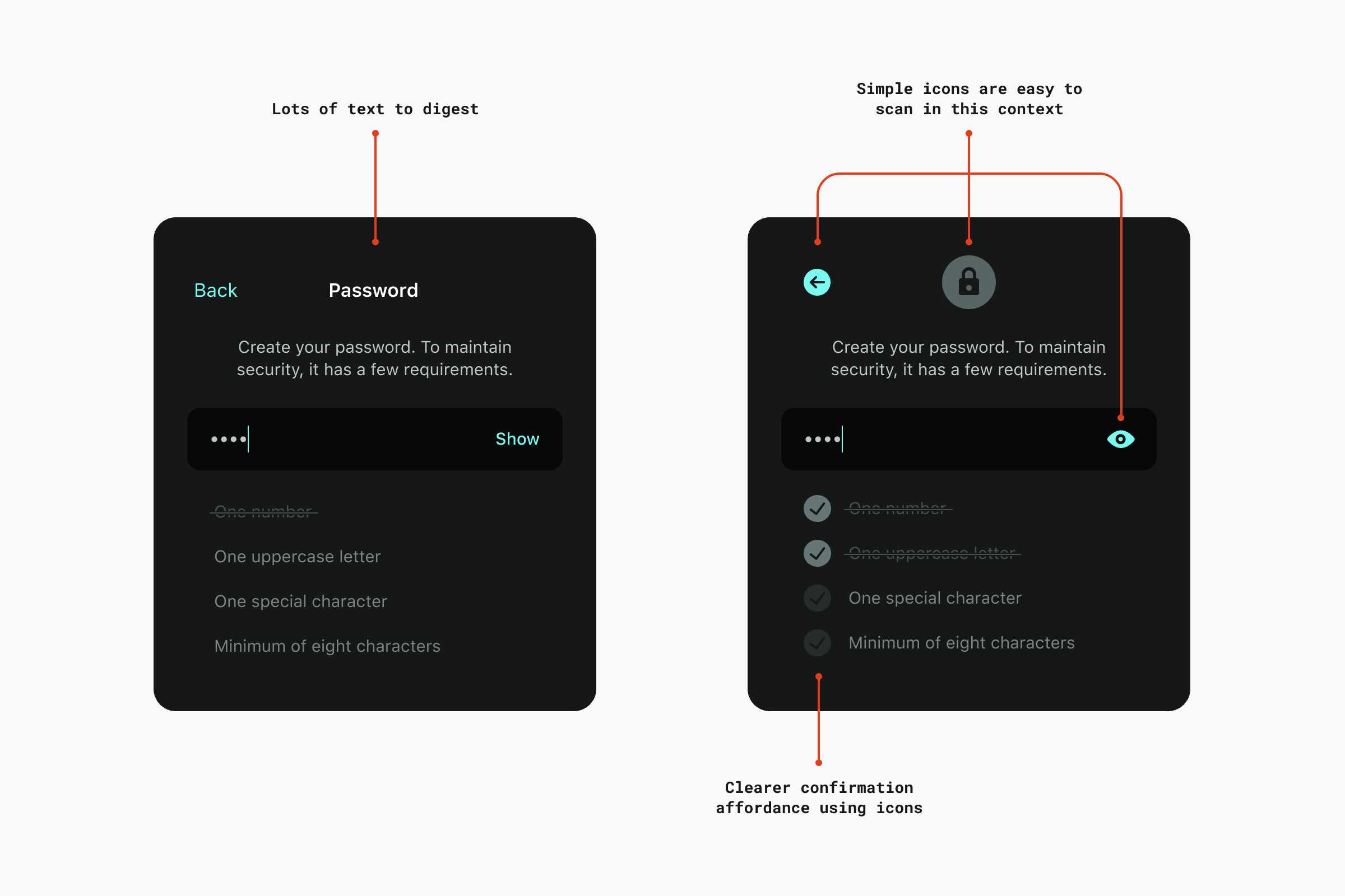
Now in version 3.0, Streamline contains a whopping 30,000 icons in three distinct weights, similar to a font family. There are tons of options to pick the perfect icon for any interface you’re working with, whether it’s a big web application, documentation, or a marketing site.
“I own several icon sets but the one that I return to over and over is the copious Streamline pack, which almost always seems to have just the pictogram I need when I dig into its catalog.”
—Khoi Vinh, Adobe
Easy to Use
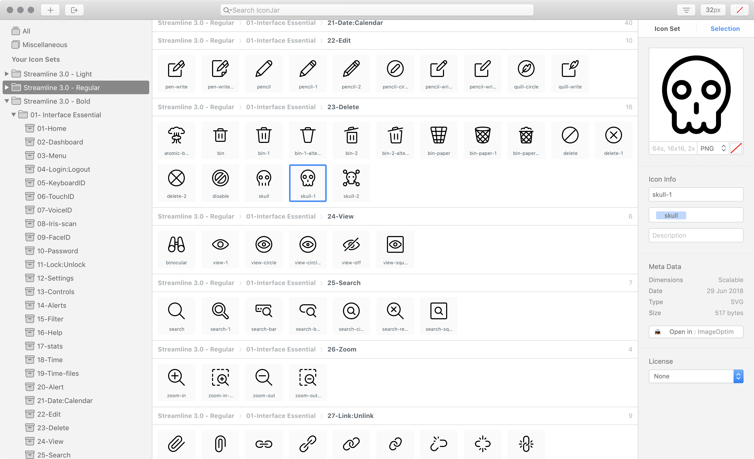
Streamline has also been meticulously organized into easy-to-navigate categories. You can see all of the categories in our handy dandy web-based icon viewer.
If you’re an IconJar user, you can also search for icons by name and drag and drop them into your project folder. We’re currently under development on this functionality for our web viewer too.

Every Streamline Icon pack comes with the following file types: .svg, .iconjar, .sketch, .fig, .ai, .pdf, .png, .xd.
So now matter how you like to work with icons, you have the file types you need.
“Streamline 3.0 is one of the most versatile and detailed icon packs I’ve ever used. The structure and hierarchy make it super easy to work with. This is an amazing product. Bravo, Vincent.”
—Stephanie Walter, UX & UI Designer
Optimized SVG
The SVG versions of Streamline is already dev-ready with proper viewbox tags in place and currentColor set as the color properties for all strokes and fills. You can pop in Streamline using your favorite SVG technique and start changing the color of the icons with CSS right out of the gate.
See the Pen QJQjMm by Matt D. Smith (@mds) on CodePen.
Weights
Every weight—light, regular, and bold—was designed with a very consistent style to give you tons of consistency within your interface.
Light
The classic Streamline style with bits of detail here and there. Designed with 1px stroke on a 24px grid. The Light icons are great for interfaces that need lots of fun personality. They also work well scaled up to 48px as small illustrations.

Regular
A new minimal and geometric style. Designed with a 1.5px stroke on a 24px grid. These are perfect to use on clean and modern web interfaces.

Bold
A new solid style akin to the latest iOS guidelines. Designed with fills and a 2px stroke on a 24px grid. The bold style gives a little more punch for an iOS style interface.

Put Streamline to work for you
There are two different package types available—Essential and Ultimate.
Essential contains 14 categories all related to interfaces and web design, whereas the Ultimate pack contains all 53 categories, including things like Pets, Weather, Finance, Outdoors, Transportation, and so much more.
👉 Check out the Streamline site to soak in all of the icon glory.
“Vincent’s icons are unique, versatile, and easy to work with. I’ve found them to be super useful across a range of projects.”
—Daniel Burka, Resolve to Save Lives

🤓 Some nerdy facts about the Streamline site:
- Initials designs created in Figma
- Coded from scratch with
.pug,.sass, and.js - CodeKit for compiling all of the code
- Grunt to create a sprite with all of the SVG assets
- Animations created in After Effects, exported from AE with Lottie into an icon-animation.json format, and added to the site using bodymovin.js
- Scrollmagic.js was used to manipulate the DOM based on scroll positions for the large icon parallax sections
- jQuery.js was used to make our lives easier since we’re building a marketing site and not a full-scale application
Direct Link to Article — Permalink
The post Add Instant awesomeness to your interfaces with this insanely large icon set appeared first on CSS-Tricks.


