Justin Tadlock · September 11, 2020 · 7 Comments
I could hardly sleep last night. Once in a blue moon, I have an idea I want to try out. While my day job as a writer means I spend far less time breaking sites through the rigorous trials and errors of building plugins and themes, some problems bug me with WordPress, the sort that keeps me from dozing into restful and peaceful dreams.
Last week, Gutenberg 8.9 dropped the experimental flag from its block-based widgets system. Overall, it was a solid first outing for a feature that should land in WordPress 5.6 this December. However, the largest problem centered on how theme authors would be able to style widgets in traditional fashion. Because actual widgets are being phased out and replaced with blocks, theme authors will no longer have access to the standard widget and widget title classes. This is problematic because there is no predictable way to style all widgets of a particular sidebar to look the same.
The classic example is of the boxed widget design. Many themes, such as the popular Colibri, employ such a design for their sidebars as shown in the following screenshot.
 Boxed widget design in right sidebar of Colibri theme.
In its current state, there is no reliable way for theme authors to create such a sidebar design via the block-based widgets system. Because there is no way to exert any sort of control over the structure of whatever content users will drop into a sidebar, it would be easy to look at this situation and think that theme designers are losing control.
Based on a recent GitHub ticket and a related Slack discussion from earlier this week, it does not appear that the Gutenberg development team intends to create parity between the old and new widgets systems, at least as far as theme design is concerned.
It bears repeating. I am a fervent supporter of handing over this type of ultimate control to the user. However, we need to balance that with helping them to make smart choices.
Theme authors must begin thinking about how this impacts the work they do and come up with creative solutions for sidebars, widgets, and other areas that will be affected by full-site editing in the future.
That thing that kept me up last night was an idea of combining block patterns, one of my favorite features, with widgets. The trouble was that the block-based widgets system does not currently support block patterns. And, until a quick discussion with Mark Uraine, one of Gutenberg’s designers, on a GitHub ticket, the idea did not seem to even be on the table.
For theme authors, the traditional sidebar and widget system of the past was nothing more than a pattern. WordPress provided theme devs with the ability to set a wrapping HTML element for the entire widget and the widget title. It was a rigid and inflexible system, but it was a reliable standard.
Block-based widgets are the complete opposite. They are essentially a free-for-all where users can drop arbitrary content into a “block area.”
What happens when we combine the structure of patterns with the flexibility of blocks inside of sidebars?
That was the idea that got me out of bed and behind the computer screen early this morning after my restless night. It was such a simple concept. Theme authors could provide a “widget” pattern to their end-users. This would provide users with a choice between what the theme author thinks best and forging their own path — the best of both worlds.
 Simple example of recreating a boxed “widget” pattern.
And, here is where the beauty of the block system really comes in. Theme authors can create any number of patterns. This provides even more options for users.
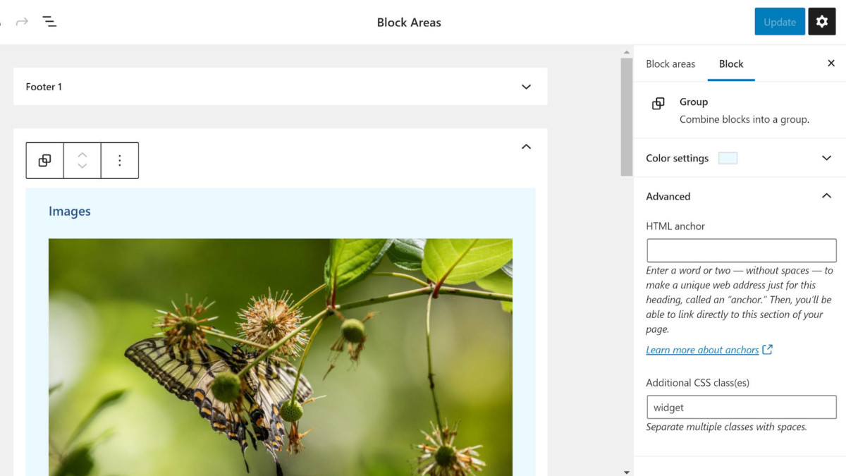
Regardless of whether the Gutenberg plugin currently supports patterns for the block-based widget system, the idea was simple to test. In a sidebar on the new widgets screen, I merely needed to add a new Group block with the widget class. Then, I added an H3 Heading block with the widget__title class. Those classes may even be unnecessary in the context of patterns unless theme authors want to directly target them. Outside of the custom classes, I added a simple background to the Group block and changed the text color of the Heading. I also inserted an empty paragraph where the user’s custom content would go.
Afterward, it was a simple matter of testing it with various blocks.
 Faux block pattern in the widgets block editor.
I would love to know what theme authors and the Gutenberg team think of the idea. I think it has some merit while soothing some of the transitional pains between traditional widgets and block-based widgets.
The biggest issue I see is the discoverability aspect. Will end-users know these “widget/block patterns” exist if theme authors went this route?
Posted in Development
Tagged block patterns, gutenberg, widgets


