One of the most important early design decisions you will make is what kind of background will carry a project. Should it be a single color, colorless, use trendy elements such as geometric shapes, gradients or wood grain patterns? Or would a solid background design can help make a project shine?
Staying on trend with background design styles is important as well. A trendy background choice shows that a website design is modern and the content is new. A modern visual framework can even signal a user that you are thinking about their needs and making the most of the tools that will make their experience better.
So how do you do it? Here’s a look at ten background design trends and styles for 2019, with a great option to try from each style.
Color Block Layers
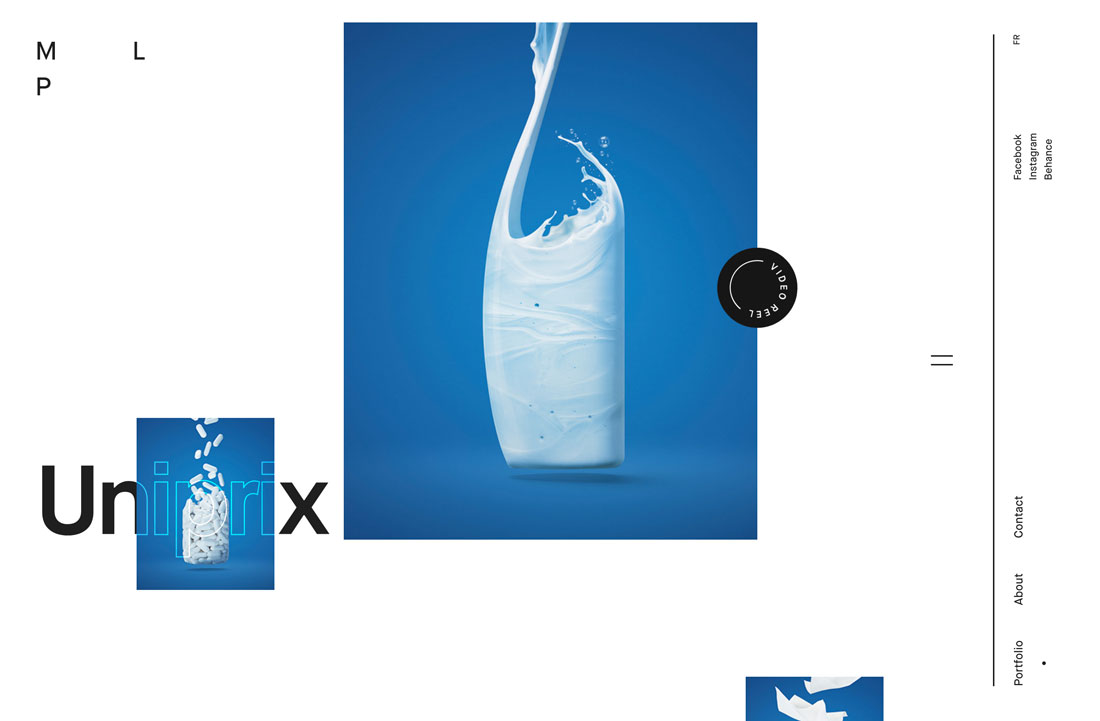
Color blocking has been a design trend that transcends disciplines. You’ll find it in fashion, home décor and website design.
What’s great about this style for design backgrounds is that it can be bright, and with layering, visually interesting. It works with a variety of color palettes – which can be great for brands – and doesn’t create a background that’s overly complex or difficult to achieve.
Use a color-blocked layer with a bright or light background and then add second “background” in another color. You can see this in the portfolio website example above with a white background and then individual elements in blue boxes.
One To Try
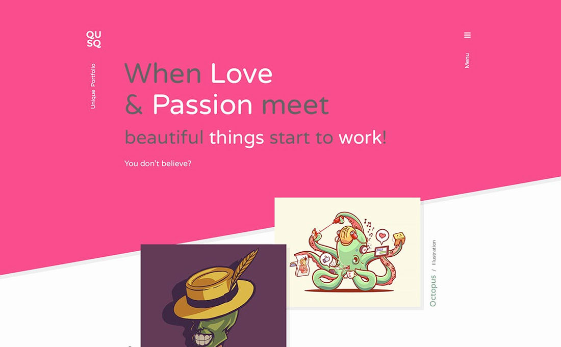
Qusq Pro is a WordPress theme that features a color block theme with layering.
Flat Color
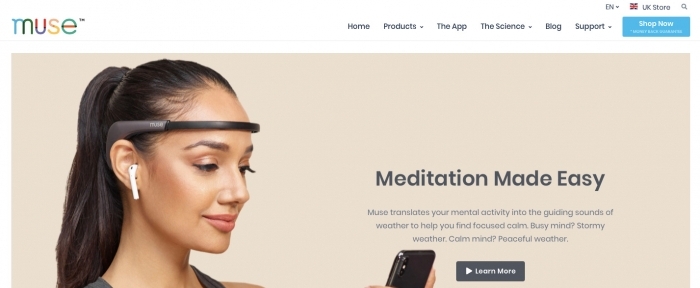
One of the parts of flat design tat’s never really gone away are the colors of the style. These colors are coming back around as background colors.
Not only is the style to use bolder hues for the background, but to use them in a way that’s flat. No gradients, no variation, just a solid color background in a single hue.
These backgrounds often have realistic layers on top and sometimes a border or another background behind them to create depth. (You can see this full effect from the example above with white edging around a beige background with an image on top.)
One To Try
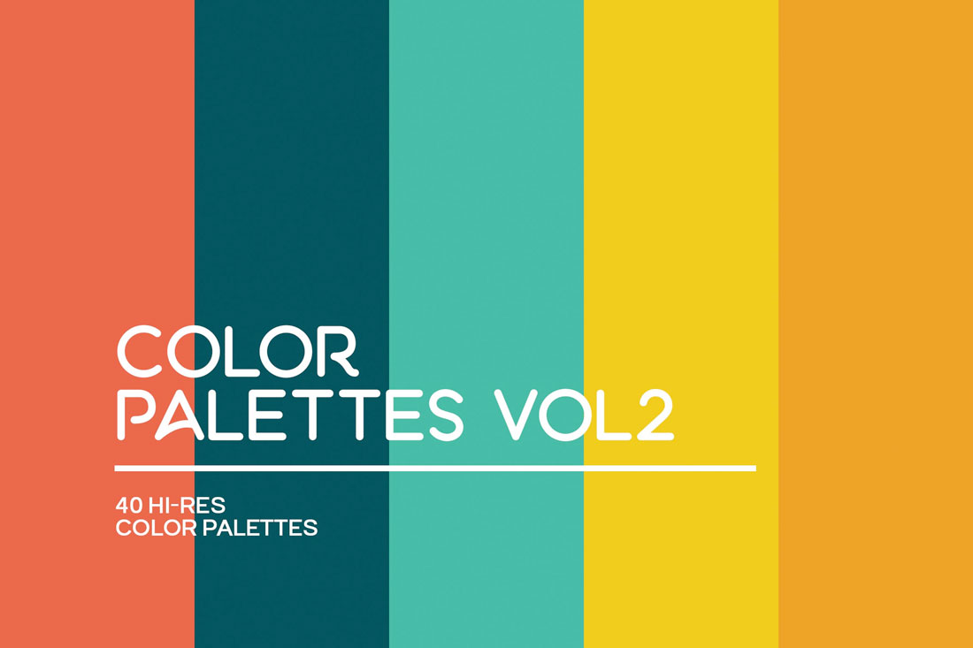
Color Palettes Vol 2 includes plenty of hues that are perfect for bright backgrounds. And each one exemplifies the flat color background trend.
Illustrations
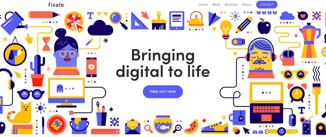
Full illustrated backgrounds are a trending style. Whether you create or commission a custom illustration, use a premade design or piece something together from a scene creator kit, these styles can be intricate, detailed and very interesting.
The things that’s particularly nice about an illustration is that it can be attention grabbing and memorable. The thing that’s difficult about an illustration is that these background designs can be rather busy, and you’ll have to carefully plan placement and style of other elements.
The solution used by Fixate, above, is a good one with a full-screen background illustration with an area cut out of text elements. It’s busy, but visually interesting and easy to read.
One To Try
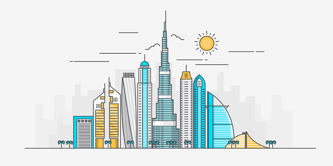
World Cities Flat Line Color Headers is a set of city-scape illustrations that can make a great background starter. When picking an illustrated background, look for something that creates a connection to the content on your website.
Geometric Shapes
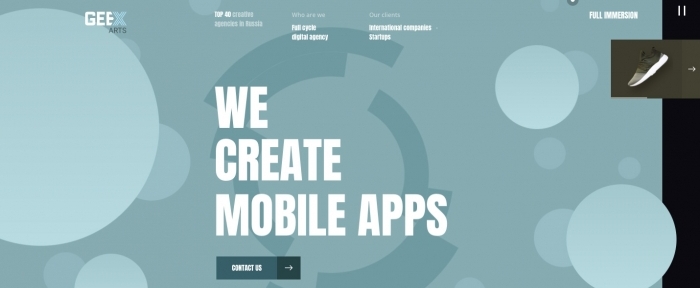
Circles, polygons and other geometric elements are a big part of background design in 2019.
The shapes can be reminiscent of childhood or just a fun alternative to all the flat, single color backgrounds that had been previously trending. For a modern flair on geometry, stick to a monotone color palette and use elements with a lot of contrast to make the most of the background.
These background styles can be somewhat flashy, such as the example above, or include a muted color palette with subtle geometric undertones.
One To Try
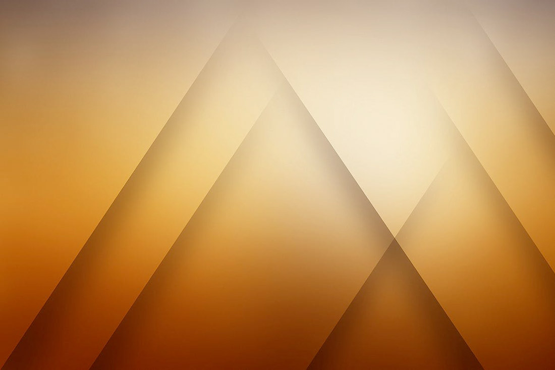
Linear Shadow Backgrounds includes 10 large and small geo (or poly) shapes with fun colors and gradients.
Line Patterns
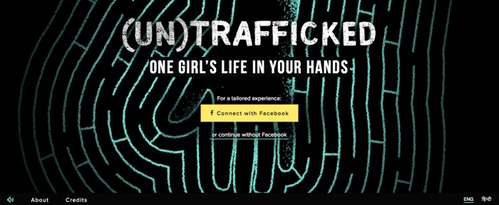
From subtle curves to bold strokes, line patterns are growing in popularity as a background design element.
What makes lines work is that they mean something. The best line patterns help draw the user into the design and lead the eye to other visual elements, such as the custom line pattern in the example above.
Line patterns can be large or tiny, and both can be effective depending on the goals of your project.
One To Try
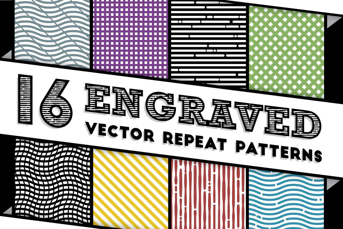
Engraved Vector Patterns includes 16 repeat patterns for backgrounds. The kit includes almost any line style you might like with straight lines, blocks and curved lines. (Repeating patterns are nice because you don’t have to worry about “seams” where patterns meet.)
Watercolor
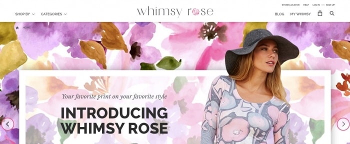
Surprisingly, watercolor backgrounds tend to evoke a lot of response from designers – they either love or hate them.
Many associate watercolor elements with a more feminine tone, such as the example above, but they don’t have to be. Use a neutral watercolor to add depth or balance to a background.
Watercolor backgrounds can mimic elements that are painted or just include lines and swirls of “paint.”
One To Try
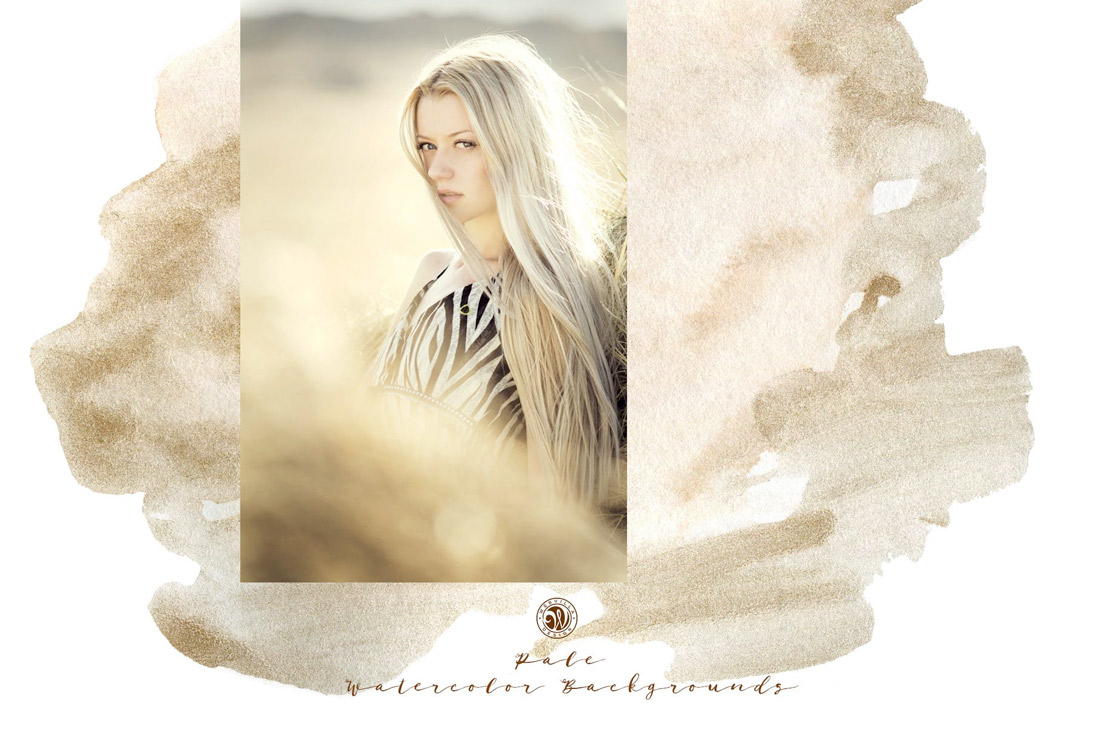
Pale Watercolor Backgrounds is a great kit of PNG files because the colors work with almost any other design scheme. Using pale pastels, these elements include depth for the background and almost fade away at the same time.
Gradients
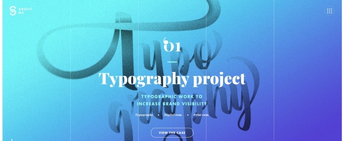
If you are at all like me, then you are one of those designers that truly has a love affair with gradients. (I can’t get enough of them.)
This trend is so flexible with background gradients that are only color, background gradients that overlay an image or video or even animated background gradients that change color or seem to float across the design.
With so many options, it’s almost certain that you can find a workable solution that works with your color palette and design scheme.
One To Try

If you build in Sketch, 75 Gradient Backgrounds includes everything you need with plenty of subtle fades and great color combinations.
Bubbles and Blobs
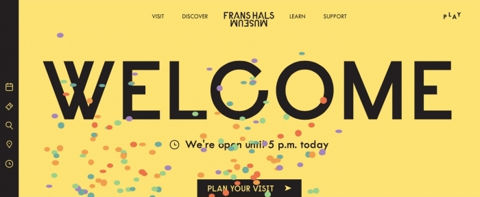
While bubbles and blobs might resemble geometric shapes, they are often different in that many of these elements include some motion and the shapes are rather imperfect.
This trend trends to work in two ways as a background element:
- As an actual background with bubble or blob shaped elements that are there only for visual interest or to add a little color to the overall design.
- As a “foreground” background element, such as the example above. Bubbles and blobs are often moving shapes that float up through the design to create a more layered effect but are “background elements” because they serve no functional role other than to help grab user attention.
One To Try

Vintage Bubble Backgrounds has a true-to-life bubble style appeal, with 10 faded bubble images.
Abstract Shapes
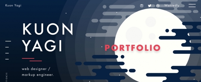
There are plenty of shapes and designs that make beautiful backgrounds, but don’t fall into any one category. All of these elements can be classified under the catch-all “abstract” category.
Abstract background elements are there purely for visual interest. They can create a focal point near an element that users need to see, develop a sense of space and depth or just provide a layer for other elements to sit on.
While abstract background are a “rule less” design, it is good to have some organization and sense of pattern when working with them so that the design does not leave users with a chaotic vibe.
One To Try
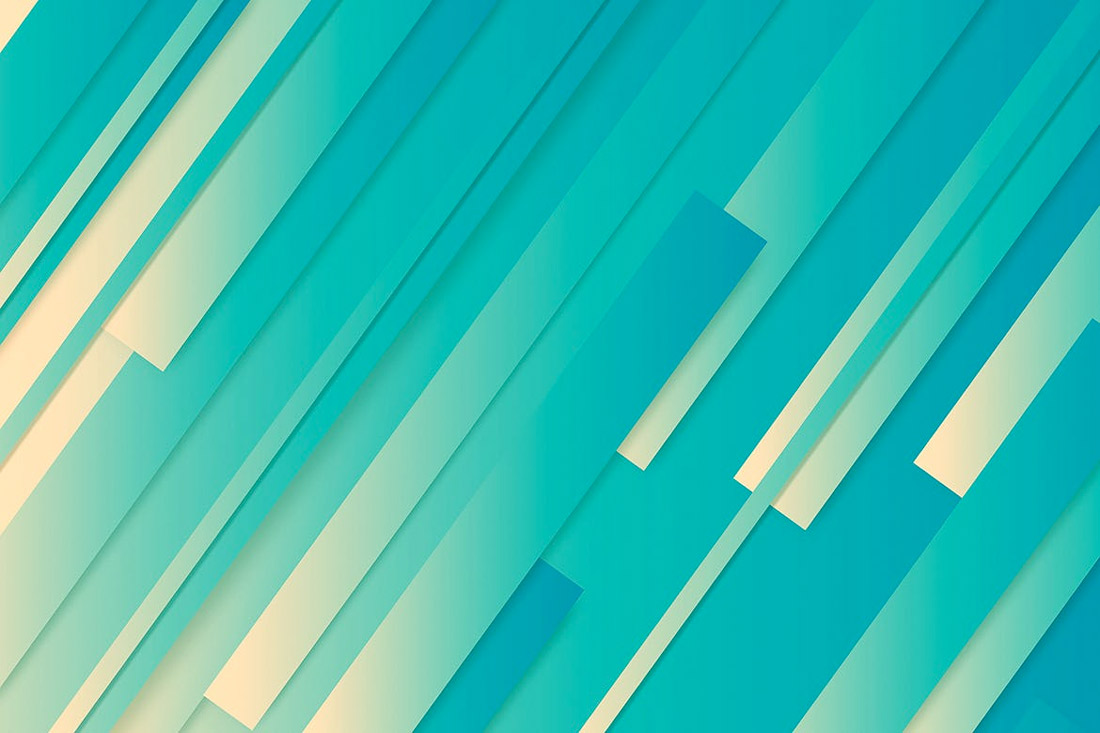
Abstract Striped Backgrounds includes a set of 10 images in different colors with depth of field.
Wood Grain
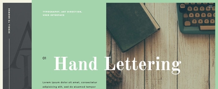
Wood grain backgrounds are popular when it comes to product photography and scene style designs.
Both work well with this element because the wood grain background provides a natural setting that isn’t flat. It’s interesting, but not overwhelming. It provides an interesting location to help bring focus to the thing sitting on the background.
To make the most of wood grain styles, try to match the coloring of wood to foreground elements and look for planks that are wide or thin based on foreground elements as well. Try to avoid elements that fall into the “cracks” between planks.
One To Try
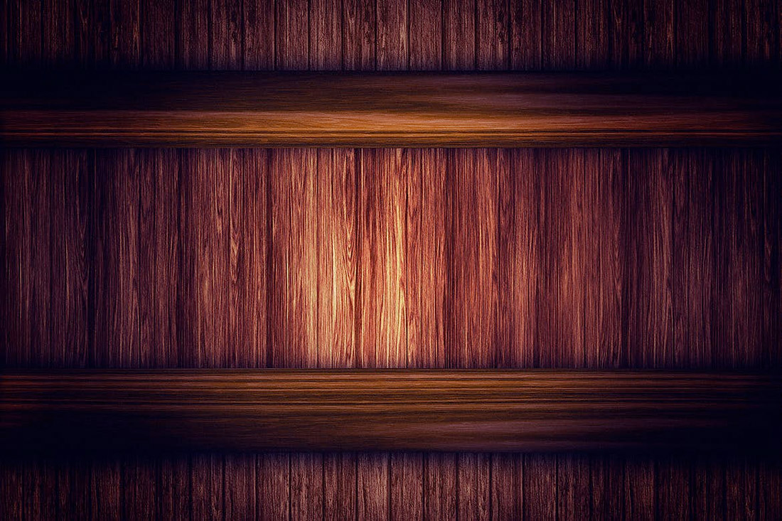
Wooden Backgrounds includes 10 different options with color and lighting changes with images that are more than 3,000 pixels wide.
White and Gray
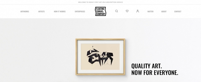
Light colored – white and gray – backgrounds are a trend that continues to hang on. Mostly derived from the minimalism trend, these backgrounds are simple and easy on the user. They provide ample space and contrast for other elements on the screen.
Most white and gray backgrounds have some element of texture, such as a pale gradient, use of shadows to create separation with foreground elements or some sort of overall pattern or texture.
One To Try

Showcase Backgrounds includes 12 background images with a light color scheme with only white a pale gray, making these a perfect fade-into-the-distance design option.
Conclusion
Change up an old design with a new background. Something as simple as changing the look of the design canvas can totally refresh a project.
Look for something with a touch of trendiness to add a more modern touch to your design. Plus, all of the “one to try” options above are ready to download and use.


