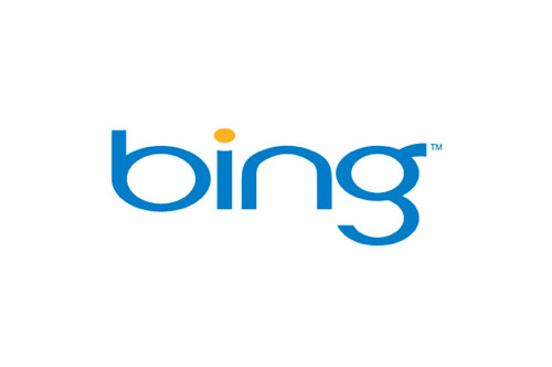
I was never keen on the original Bing wordmark (below).

It looked stretched and awkwardly spaced — not great when you’re gunning for Google.
So the redesign (mentioned by Bing a couple of days ago) is certainly an upgrade.


It’s more in tune with logos for Microsoft’s other services.
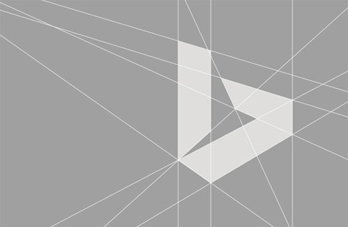
“From the color of our logo to the angle of the cut on the top of the b, the Bing identity has been designed to fit seamlessly into the Microsoft family of products.”


“We’ve taken inspiration from the new Bing symbol by taking all angles to infinity and adding in levels of color and transparency to add depth and energy. We call this the Searchlight graphic as it uses the Bing symbol as a prism of light and inspiration.”
— SCOTT ERICKSON, BRAND AND CREATIVE
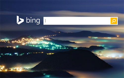
I like to see more visual context when new designs are shared, such as where those “Searchlights” will appear, but it’s early days (the logo isn’t shown on bing.com), and it’s still a good update.
More details on the Bing blog.


