Last week, as I was making the final edits on a review of his Gutenberg Forms project, Munir Kamal was prepping for the launch of another kind of WordPress plugin for the block editor. This one was called EditorPlus, and it would create a design system for blocks. Kamal and his team quietly put the finishing touches on version 1.0 and released the plugin in the WordPress plugin repository a few days later.
Unlike many other plugins that create custom blocks to achieve specific design results, EditorPlus provides users with the flexibility to customize their pages with what they have on hand. It adds a slew of design options to each of WordPress’s existing blocks. On the front end, it leaves a light footprint by outputting only the CSS necessary for that page on the fly.
Perhaps the best thing about this plugin right now is that it lays the groundwork for many design-related features that will likely find a permanent home in Gutenberg and eventually core WordPress. The Gutenberg team can borrow ideas, iterate, and improve upon them. We have already seen the experimental padding control land in Gutenberg 8.3. It would make sense that the development team follows through with additional design controls down the road. The good thing about these controls rolling out in third-party plugins first is that the team can see how users react to them and get a sense of whether they would work directly in Gutenberg before committing to anything.
EditorPlus has no shortage of goodies for those who like to have a lot of design freedom without touching code. Essentially, the plugin is a CSS editor without the need to know CSS. It provides end-users with options for the most-needed CSS features via block options. It is a playground for those who like to tinker with design and powerful enough to create unique layouts without bloating the site on the front end.
How EditorPlus Works
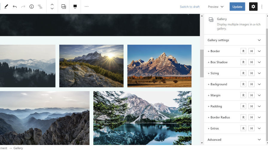
 Editing a Gallery block’s background and padding.
After activating the EditorPlus plugin, end-users can start using its options right away by heading over to the post or page editor. After inserting a block, the plugin makes the following eight tabs available under the block options panel (each is preceded by a + symbol):
- Border
- Box Shadow
- Sizing
- Background
- Margin
- Padding
- Border Radius
- Extras
These tabs will appear only for the core WordPress blocks and not third-party plugin blocks at this time. Aside from the Extras tab, each tab corresponds to its CSS counterparts. The Extras tab provides a more advanced “Display” option, which allows users to change the block wrapping element’s display value in CSS. This option is best left to more advanced users. It also provides a transition option that would work well with hover styles.
Each of the block options tabs also has mysterious “R” and “H” buttons. The “R” button allows users to enable responsive options, which means they can change block styles based on desktop, tablet, and mobile screens. The “H” button lets users change the design based on mouse hover state.
 Adding a shadow to a Pullquote block on hover.
The plugin packs a lot of options in a little bit of space. All of the new design tabs can feel a little overwhelming at first. However, with a little use, it is easy to gain some muscle memory and quickly blast out custom layouts.
Each of the plugin’s options is fairly straightforward. And, when they are not, you get the benefit of instant feedback via the block editor.
There are a few areas that could prove problematic for some users, depending on how their theme styles certain blocks. For example, width settings under the Sizing tab may not always work. Some themes will add a maximum width to blocks, which will constrain the overall width no matter the size. It is possible to overrule this via the plugin, but Kamal has chosen not to do this in version 1.0.
Be careful with margins. Depending on the theme design, it may use left and right margins to place content. Even when setting just a top or bottom margin, the plugin will automatically output 0 for the left and right margins. This could break the content layout for some themes.
One problem I encountered with the plugin was my active theme’s styles overruling the plugin’s styles in general. For example, the default Twenty Twenty theme targets p.has-background in its CSS to add custom padding. Therefore, it overrules the EditorPlus plugin’s CSS with higher specificity. This problem was expected, and the plugin developer added a solution for it in the form of an “important” checkbox for each design option. If a user ticks this box, it adds !important to the style rule on output, which will allow it to overrule the theme styles. It is not a 100% fool-proof solution. Your mileage may vary, depending on the theme, but it should work for the majority of use cases.
I don’t like the idea of an important checkbox in the UI. It is not something a user should have to worry about. However, it is the reality of a world where themes and plugins have no real way to communicate which design rules are more important than others. Despite not wanting this in the UI, it was a smart decision to include it. Otherwise, far too many themes’ style rules would have overwritten the plugin’s CSS.
Final Thoughts
For a version 1.0 release, EditorPlus is off to a solid start. In my tests, I found few flaws. Any problems for the average user will likely come in the form of theme conflicts, and those conflicts will most likely be around themes using high specificity or !important in their CSS.
Kamal makes it clear on the plugin’s webpage that there is more to come from this plugin. I am unsure what features he has in mind, but I look forward to seeing them. I would like to see a text-shadow option for text-related blocks such as Heading and Paragraph. It would also be nice to see some design options for the images within the Gallery block rather than just the wrapping element.
Whether you should use EditorPlus will depend on whether you need additional design controls. EditorPlus is geared toward people who need something more akin to a lightweight page builder but want to stick to native WordPress. This plugin is a nice showcase of what’s possible and is a good indicator of potential design options that may one day land in WordPress.


