Have you noticed all the fluid, boundless shapes in design projects recently? The use of bubbles and blobs is trending. From simple circles to interconnecting loops, to full-screen blobs that move and shift, to simple “blobby” animations, this trend is popping up everywhere.
The nice thing is that while using bubbles and blobs is a trendy design element, there are so many different ways to do it, and you won’t end up with a design that looks like you are just trying to add a fashionable element. Here, we have a collection of mini case studies of website designs featuring the bubble and blob design trend.
Wed’ze
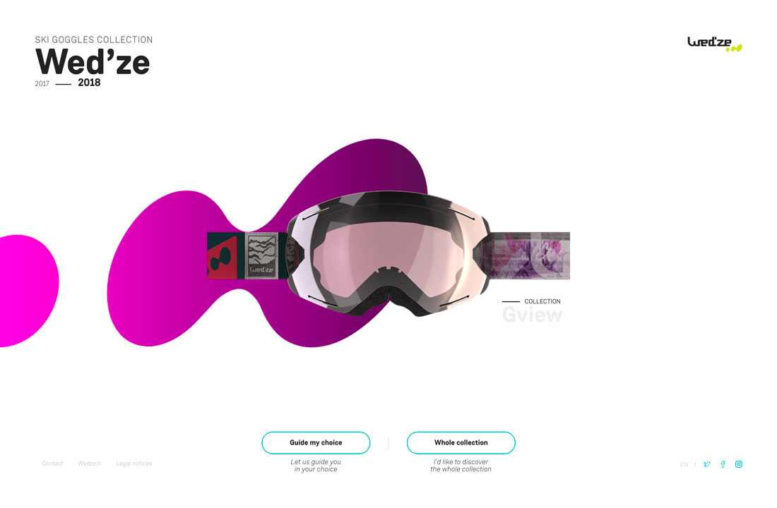
Wed’ze uses cool colored blobs – defined by somewhat rounded elements with no defined shape – to highlight products. The blob brings focus to each different set of ski goggles with a distinct color change, although the shape stays the same.
Use of the interesting shape and color on a stark white background creates a focal point and makes a product that’s not all that visually interesting something to actually engage with.
Thanks to size, each blob creates some directional flow as well from the left to right on the screen, drawing the user to look at the shape, the goggles and then description of the item.
Liber Finance Group
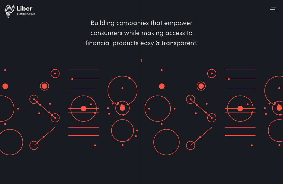
Liber Finance Group uses a series of animated bubbles to create an art element. Bubbles (defined more as a round and bouncy design element) include solid and filled circles with still and moving parts.
Bubbles in this design serve as a visual thread and connect parts of the website throughout the design. The shape is used below the scroll to help draw the eye to text and clickable elements as well as create a theme for a design that doesn’t have a lot of other highly visual information.
Use of animation is an effective way to create interest with simple shapes.
Drip Pop
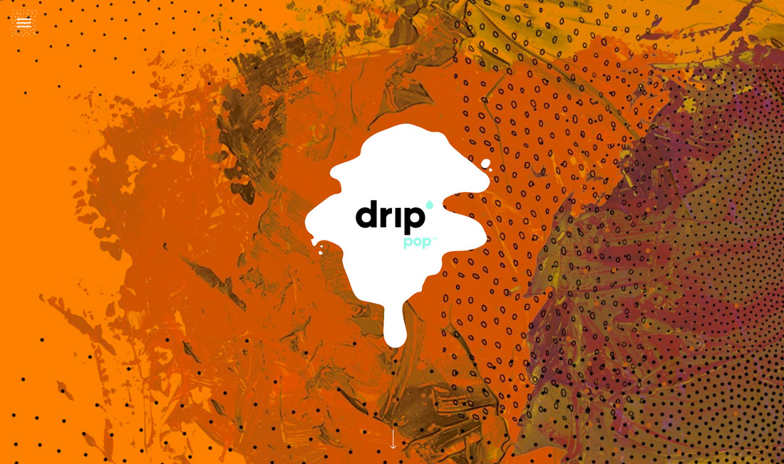
Drop Pop uses a blob as the logo mark on a way too busy background. (Beware of the speed of motion if you click the link.)
The mark is a container element for the wordmark and works with the design option presented because it allows the branding to be seen on a busy and colorful design.
While this logo treatment is interesting here, it might be more difficult to use a technique like this long term.
Josh Dring
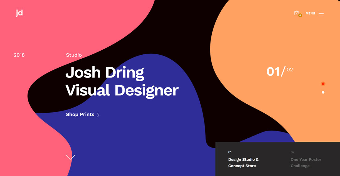
A series of overlapping blobs create a visual collage for John Dring’s portfolio website.
Thanks to the use of color and interesting shapes, the site feels warm and inviting. While you might not be 100 percent sure what type of work he does, the abstract design does invite clicks.
When using a background with blobs, think about layering elements to create a depth effect. This can help draw the eye and make the design more engaging.
Andy Patrick
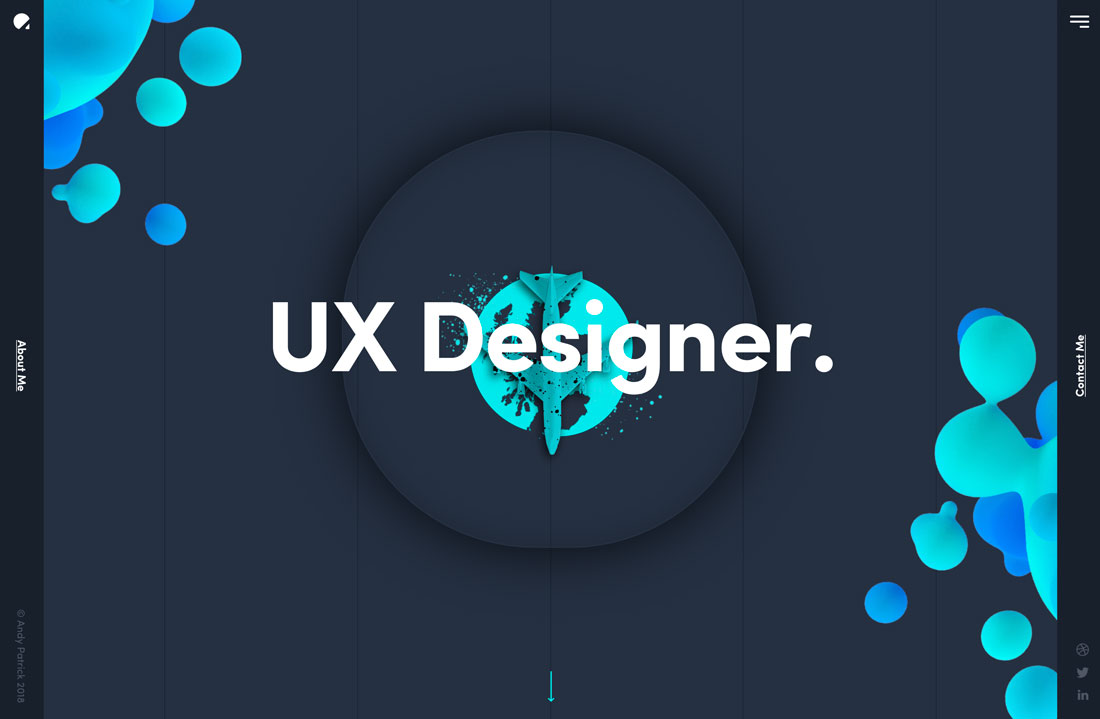
Andy Patrick also uses blobs for his portfolio website, but with a totally different approach. Where the previous example features static blobs, the shapes in this design shift and move with slight animations.
Each blob has an almost three-dimensional feel to it as well thanks to gradient color choices that emphasize the rounded nature of each blob. It almost feels like you can reach out and touch these elements. (I imagine that they have the soft, squishy texture of a good stress ball.)
Iqor
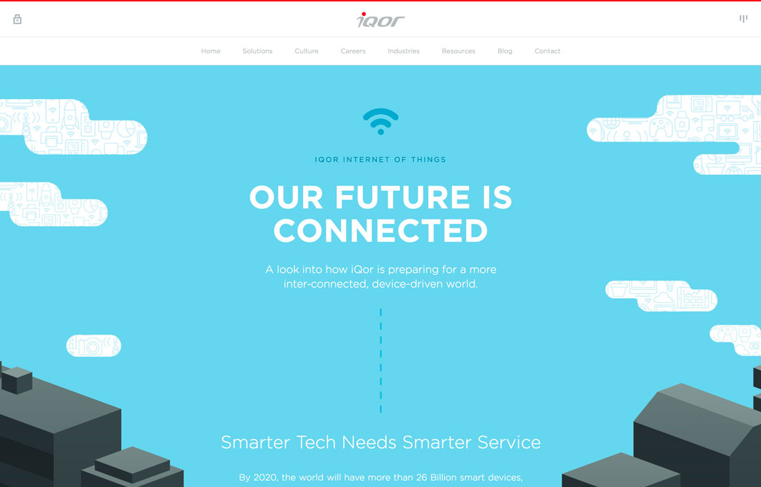
Iqor uses elongated bubbles as part of the sky scene and to allow users to look beyond the clouds and see what the company does.
While these bubbles are static in nature, they provide directional movement thanks to an association with something that moves (clouds in the sky). They work exceptionally well thanks to the information contained therein, serving as an art and informative element.
Studio Volbloed
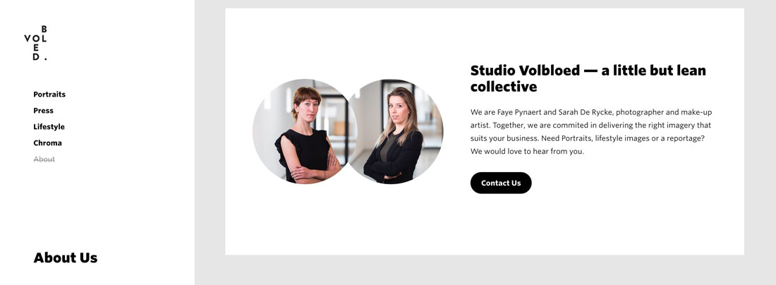
Studio Volbloed uses another static bubble for the images in the footer of the About page to show the women behind the company.
While most people initially think of bubbles as decorative shapes, they can also serve as container elements for images. What makes these bubbles work is the beautiful way the shapes connect to form a single image.
The circular shape is also mirrored in other locations throughout the design for a light bubble presence that’s visually harmonious.
Unter Freiem Himmel
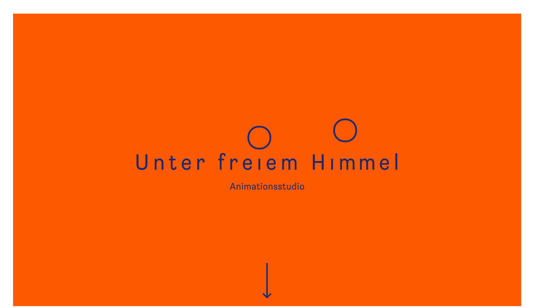
Unter Freiem Himmel uses two animated bubbles that look like bubbles as the screen loads. The animation stops quickly to leave to almost perfectly round shapes above the site name.
The cursor is also a simple bubble.
The simple beauty of the animated bubbles in this design is impressive and beautiful. This example proves that you don’t have to add a lot of elements and techniques to have an impactful design. There’s innate beauty in simplicity as this website shows.
Hashworks
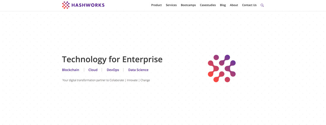
The final example in this collection is from Hashworks. At first glance you might not even really see the blobs; they are a connected unit that serves as the logo for the company. But the large version of the logo to the right includes a cool – and very blobby – animation. (Click through to see it in action.)
The animated blob includes a bunch of pieces that function like drops of oil in water with a fluid design with clear separation. They move and fold and bounce until each of the individual blobs in motion forms the connected single blob logo.
It’s one of those simple and brilliant animations that you can watch over and over because it is so well done. This example – although not a full design project – is a prime example of this trend in action.
Every Bubble is Different
It’s great when a design trend features a technique that you can make your own. Unlike a color trend where “everyone” uses a single hue or spacing or grouping trends, which have a similar feel, using bubbles and blobs can be pretty different for every project.
Few of the examples in the mini case studies above look similar, they represent varying types of industry and are from different locations around the world. And they all have use of bubbles and blobs in common.


