Is the next big thing in website and app design neumorphism? It’s a design trend (named as a mashup of the words new and skeuomorphism) that’s growing in popularity. People seem to either love it or hate it, but it’s interesting enough that Cult of Mac recently pushed an article posing the question: “Is neumorphism the big new look for iOS 14?”
We won’t know the answer for a little while yet, but the trend is gaining traction, particularly on Dribbble, where we see many design trends launch.
Here’s a look a neumorphism to help you get an idea of what it is (and isn’t) so the trend doesn’t pass you by.
What is Neumorphism?
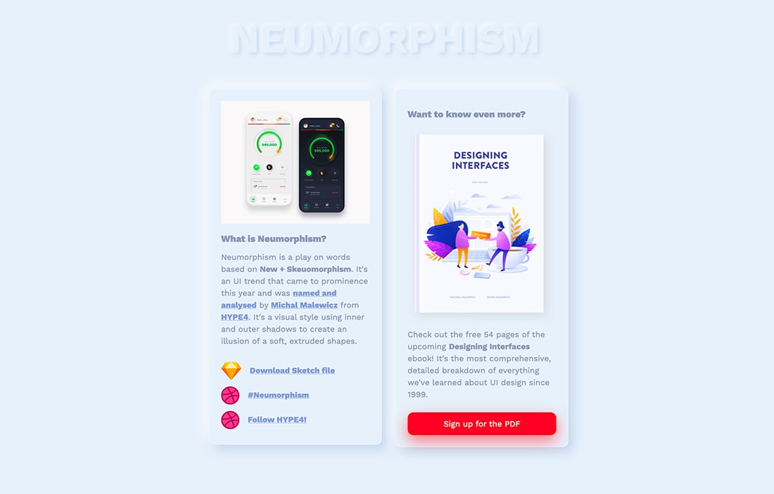
Neumorphism is a term that started gaining traction in late 2019 and has been gaining even more momentum this year. The combination of new (neo/neu) skeuomorphism falls somewhere between the silliness of true skeuomorphism and simplicity of almost flat.
It’s characterized by simple color with shadows to add depth and have an almost real feel without being over the top. The design might include both inner and outer shadows to create this effect.
The first references of the trend can be traced to a post from Michal Malewicz describes it: “A Modern / Material (upgraded) card usually is a surface floating on top of our perceived background and casting a shadow onto it. The shadow both gives it depth and also in many cases defines the shape itself — as it’s quite often borderless.”
Malewicz’s website (above) dedicated to the trend appropriately uses the style.
Neumorphism is showing up as a trending style on Dribble, where tons of shots have popped up using these concepts. (We have some of those showcased here.)
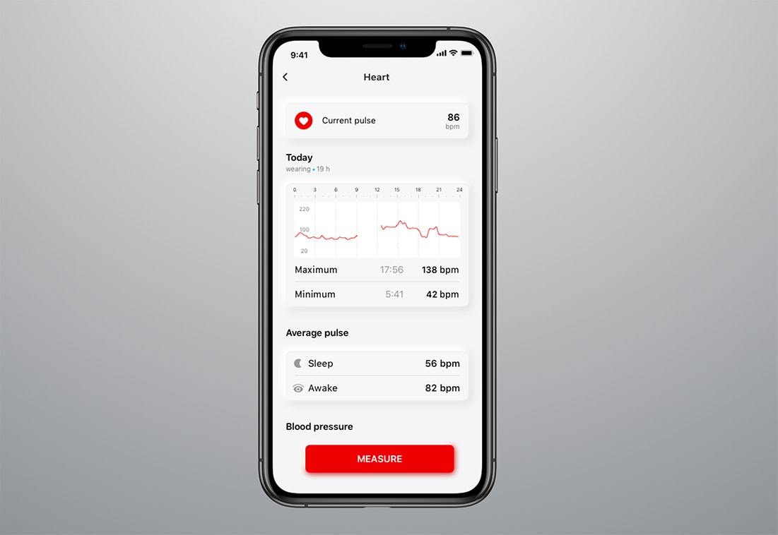
Most of the examples feature card-style app projects where this design technique seems to soften the harshness of the overall interface.
Characteristics of This Design Trend
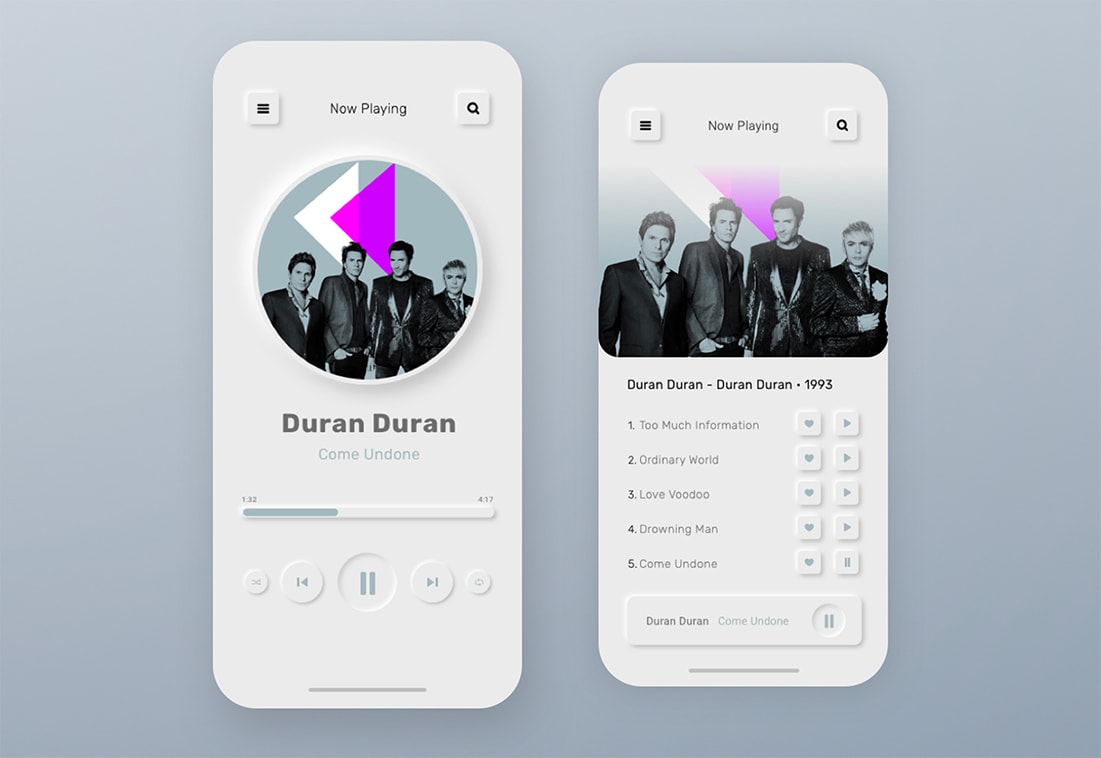
The root of the concept of neumorphism is that the digital design mimics or acts like the object it represents.
Note how the buttons in the music app example (above) look like they have been pushed in. Neumorphic elements, when done well, seem to show you how to use and interact with them, such as pressing buttons, moving sliders, or turning dials.
Neumorphism also seems to be an extension of the minimal design trend. Many designs feature white interfaces, but dark mode options are growing in popularity as well. But there’s nothing to say you couldn’t create a neumorphism style interface in another color.
Visual elements commonly associated with neomorphism include:
- Light or soft color palette (but not always thanks to the popularity of dark mode)
- Basic shapes, such as circles or rectangles, throughout the design
- Subtle shadows and effects for the most part (and it’s all done HTML and CSS)
- More dramatic shadows for buttons and clickable elements
But Be Careful (Neomorphism Challenges)
The neumorphism trend is not without challenges of its own.
The biggest problem areas are accessibility and contrast, which are related issues.
With designs that use fairly monotone color schemes and a lot of white, not all accessibility standards for color are met in the interface. That’s a correctable problem though and could help shape and shift how this trend evolves.
If you are designing with neumorphism techniques, remember to keep a few things top of mind to ensure that your design works for the most people possible.
- Design buttons with extra contrast and make sure they look like buttons
- Don’t force yourself to overdo shadows to make them more visible; focus on text and click/tap elements instread
- Use layers of design effects for buttons that look similar in different states, such as pressing a button
- Don’t feel like you have to overdo it; keep it simple
Neumorphism Examples
There are plenty of great examples of this trend from a variety of designers. Here are a few to jumpstart your creative process and inspire designs.
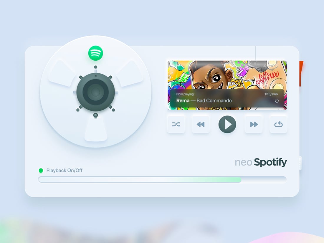
Neo Spotify
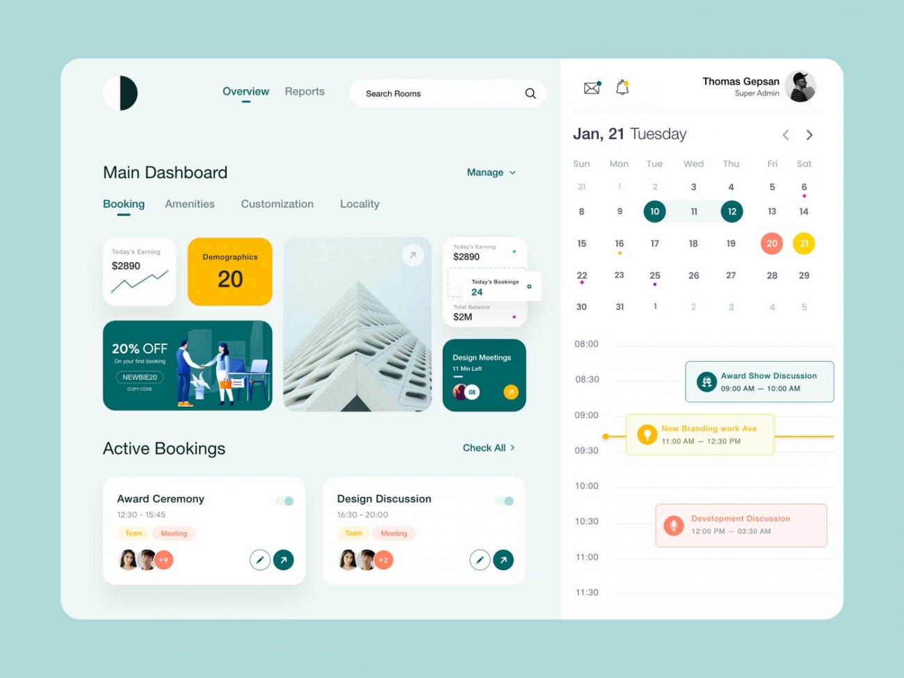
Dashboard Meeting
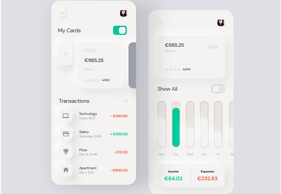
Neumorphism Mobile Banking
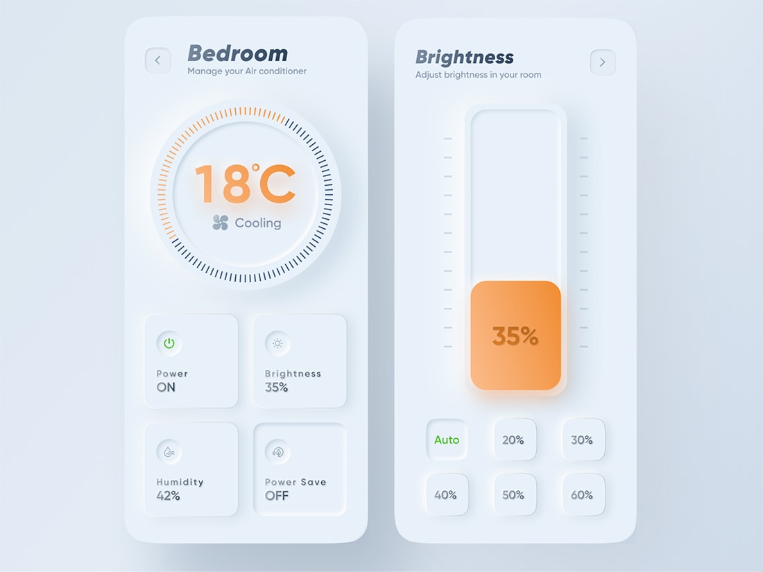
Smart Home App
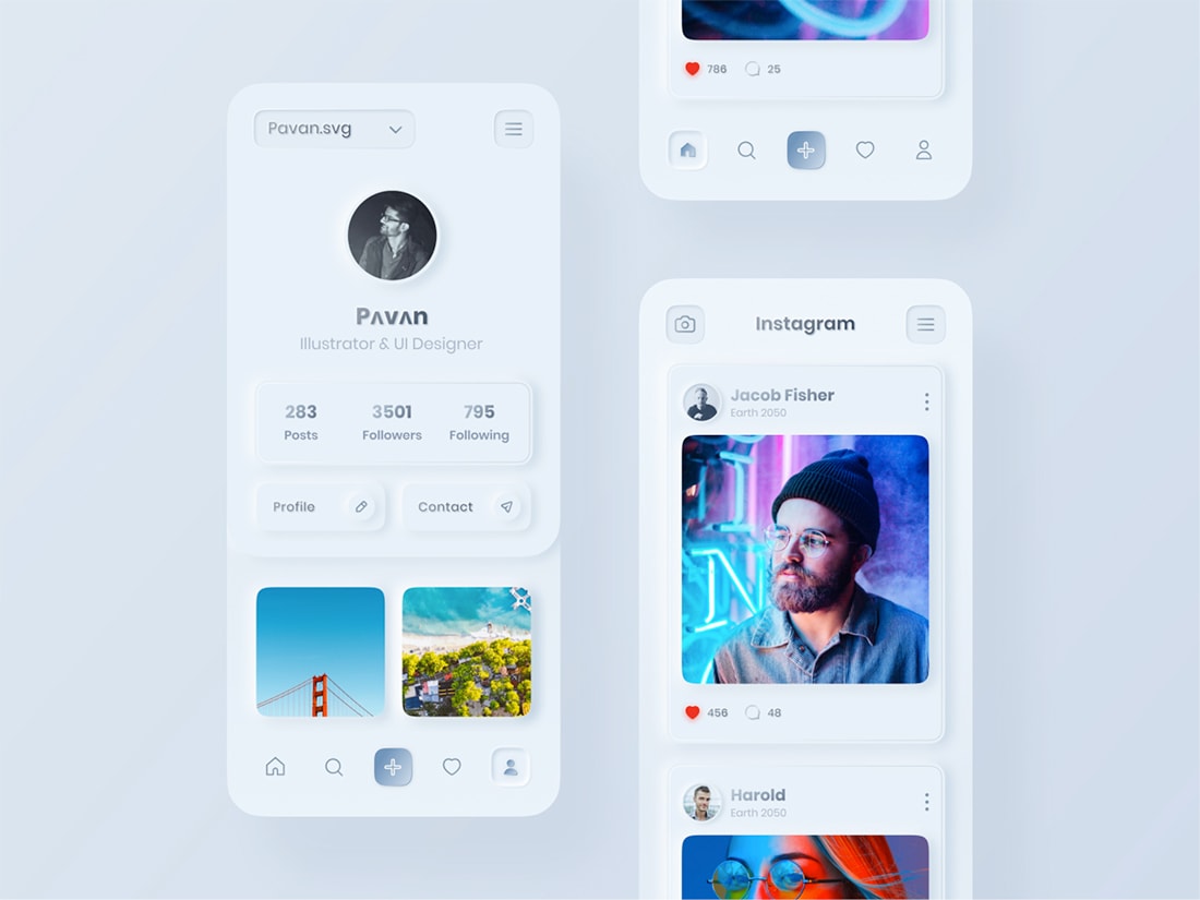
Neo Instagram UI Concept
Neumorphism Concept Design
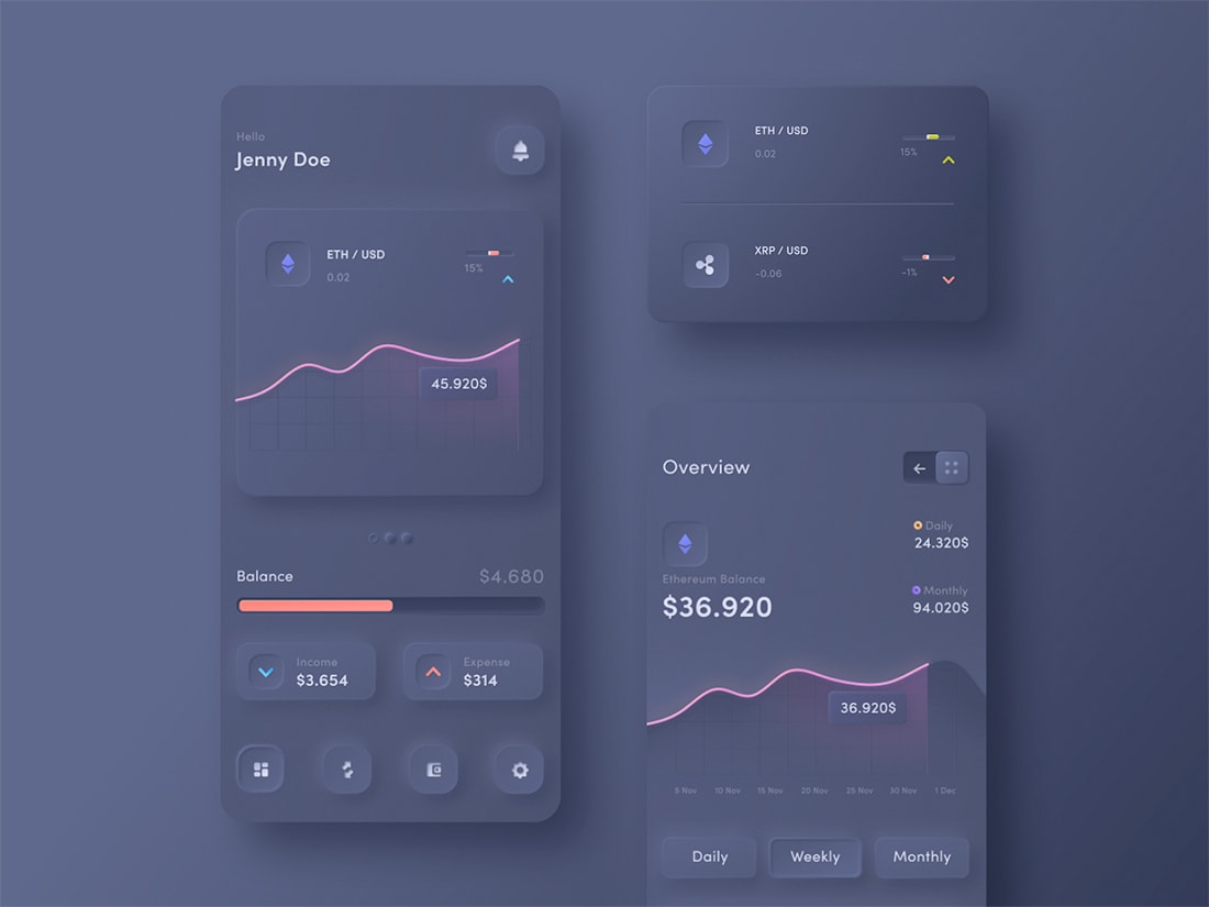
Crytopcurrency Dashboard
Neumorphism Tools and Resources
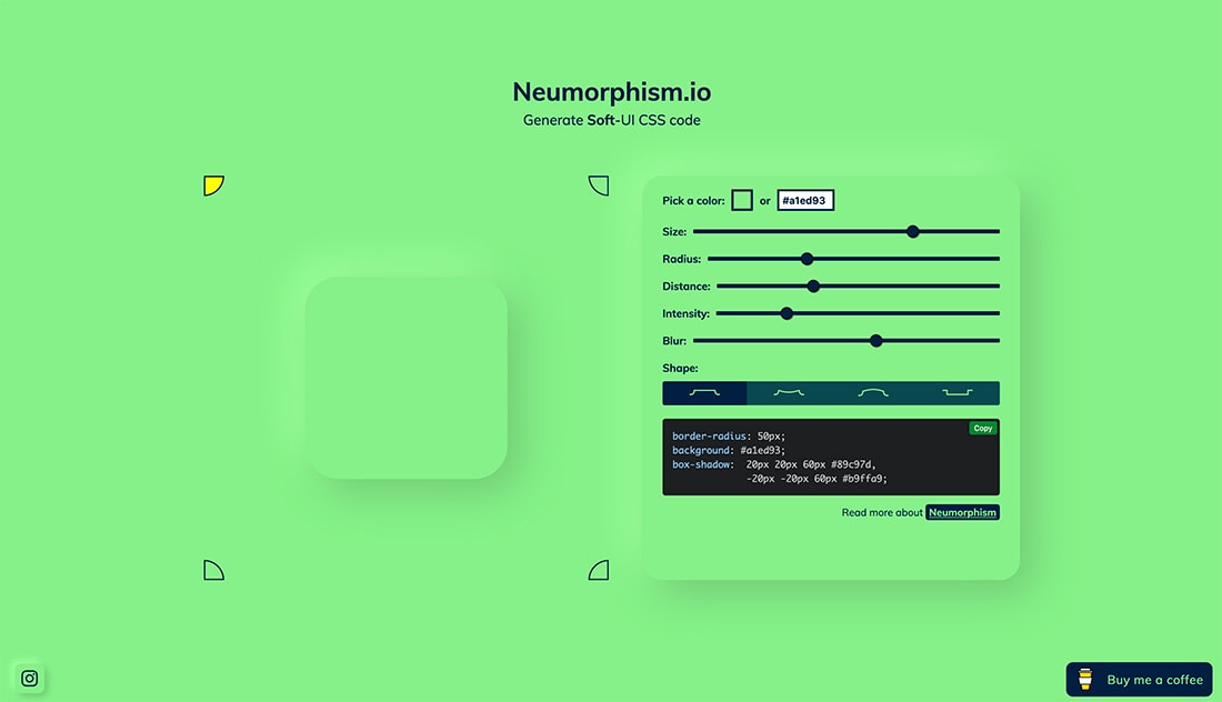
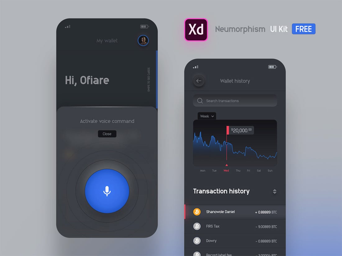
If you want to experiment with shadows and neumorphic designs, there are a few tools to help you get the idea.
- Neumorphism CSS Generator (above)
- Neumorphism Shadow and Color Styles
- Neumorphism Sktech file
- Neumorphism Finance UI Kit (above)
- Dynamic Light/Dark Switch Using Neumorphism Design
- Neomorphism Shots on Dirbbble
Conclusion
Neumorphism is a fun design trend that appeals to me because I like white (or dark mode) minimal interfaces so much. There’s not a lot getting in the way of the design and the concepts feel a little more usable and intuitive than flat and less cartoonish than true skeuomorphism.
When it comes down to it, this trend is like most anything else – it’s a matter of personal preference. Would you consider using it in any of your projects or will it just be a passing fad?


