One of the repositories I have been keeping an eye on over the past few months is Block Experiments. It is a monorepo of blocks in various stages of development from Automattic. In total, five of the team’s block experiments are now available for download from the plugin directory. Three others seem to still be under development.
My interest was first piqued when I saw the company’s Starscape Block plugin. The plugin essentially did something that I had needed on a separate project more than a year ago. If it had existed at the time, it would have saved me from a headache or two, attempting to mix custom HTML into a page that was mostly made from blocks. Since then, I have taken a few moments to check in on what the team has been building.
Except for Bauhaus Centenary Block, which is likely only of interest to designers as something fun, most of the block plugins should be useful for many users.
Surprisingly, the team has failed to add the “block” tag to all of its block plugins, so not all of these are listed in the official block directory. It is likely an oversight that will be corrected at some point. For now, it just makes it a little harder for those of us looking for standalone block plugins to find them.
Starscape Block
 Configuring the Starscape block.
The Starscape Block plugin creates a container with a background of moving stars. End-users can control the density and speed of the stars. The block provides two gradient background options (linear or radial) along with 12 predefined gradient colors to select from. Users can also control the color of the single text input it provides.
The biggest downside of this block at the moment is that it does not behave the same way as the core Cover or Group block. There is no way for users to add anything but a single line of text through a rich text field. If the team would open it up to allow for nested blocks, it would be far more useful.
There is a lot that is possible with this block if the team pushes the envelope a little more. For example, it would also be interesting to have the ability to layer the stars over an image background, such as a cityscape or forest.
Waves Block
 Adding custom content within the Waves block.
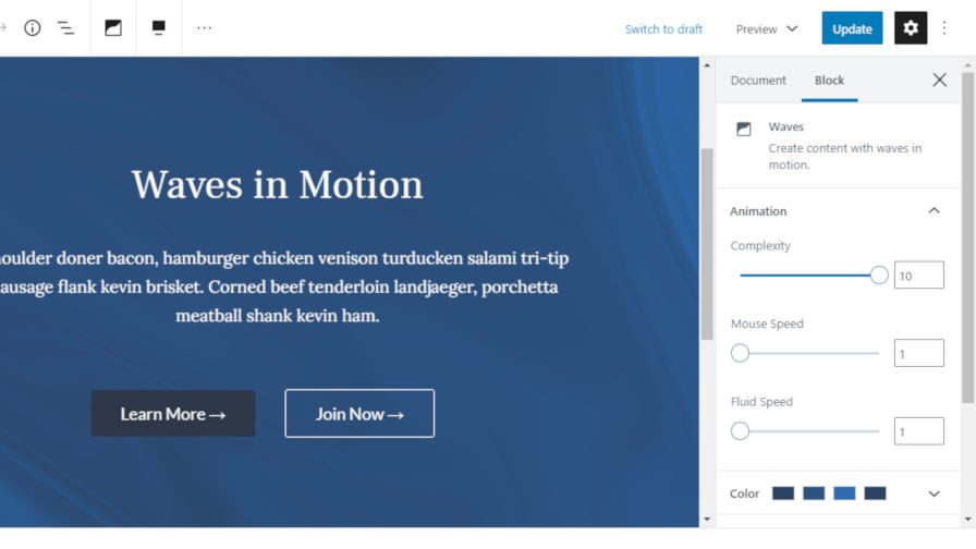
Similar to Starscape Block, the Waves Block plugin creates a container block with a moving background. Instead of stars, the background is made up of — you guessed it — waves. It is not a simple copy of a plugin that does the same thing. The Waves block is a more robust solution. It works almost the same as the core Cover block and allows other blocks nested inside.
End-users can control the complexity, mouse speed, and fluid speed of the waves. They can also set the minimum height of the container and choose the four colors that create the effect of flowing waves.
This block was fun to play around with. Users could create some interesting hero-style page headers with this plugin, especially when WordPress treats the post title/header area as a block container in the future.
Event Block
 Setting up a custom event with the Event block.
More often than not, on most projects that I have worked on that posted events, it was typically a single event once in a while. Many of the event management plugins were overkill. Several times in the past, I have built a widget or a simple shortcode to output a basic event notice. For end-users who need a basic method of outputting an event notification on their sites, the Event Block plugin may be the best option.
It is a standalone block that allows users to enter an event title, date, location, description, and image. It is a simple, no-fuss solution.
One missing component I would like to see with this block is the ability to add both a start and end date. For multi-day events, users must provide that information in the description box, which would be acceptable for most use cases. However, the full event date would be better served via the “when” field.
Layout Grid Block
 Creating a book section with the Layout Grid block.
We have previously covered the Layout Grid Block plugin in a post on whether core WordPress should include a grid system. However, it is worth noting this block is a part of Automattic’s experimental block repository. The plugin has also been updated and improved since the Tavern’s last look. It worked well before, but some minor bug fixes have drastically improved its usability.
Layout Grid Block is quickly becoming one of my favorite plugins for creating columns. It is easy to set up between two and four columns of content and change how the content is displayed based on the screen size. Some of the other plugins I have tested are more powerful. However, some of those tend to be more complicated than what the average user may need. This plugin will likely fit the bill for many use cases.


