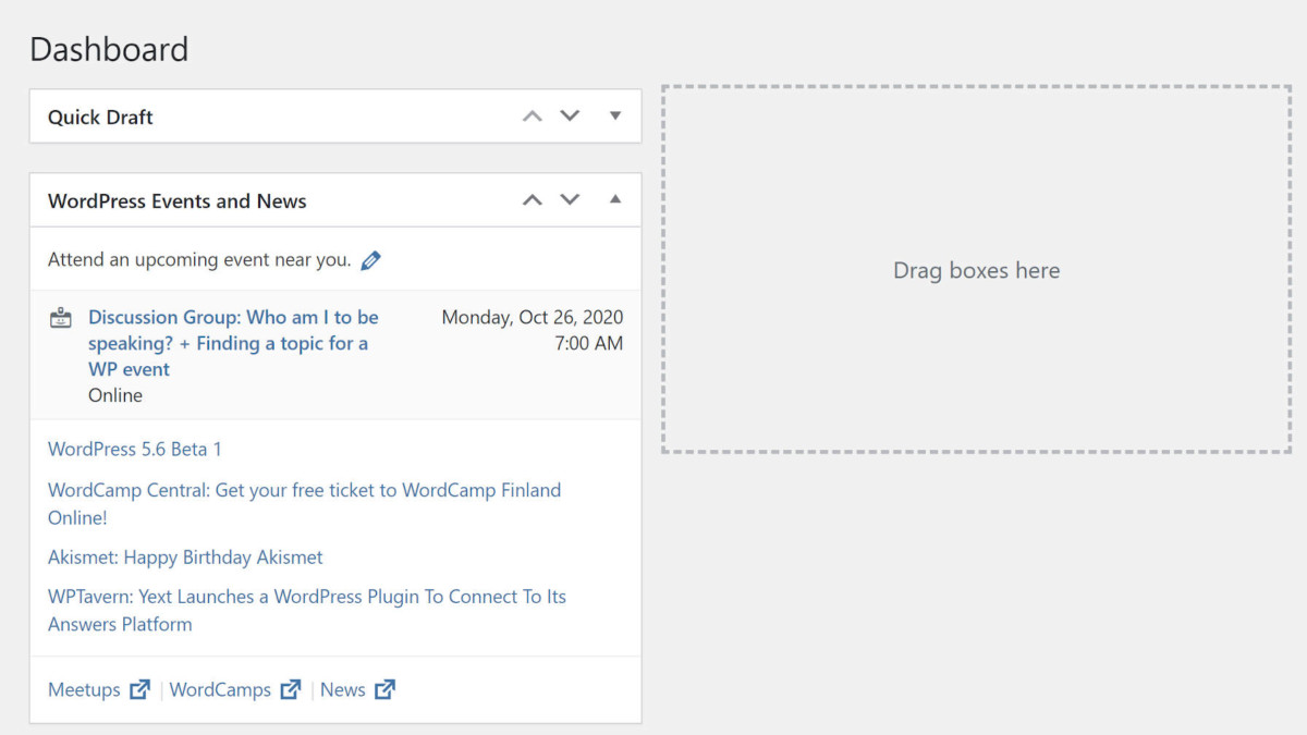
If you have been testing the latest development version of WordPress in the past week or so, you may have noticed that the ability to drag and drop meta boxes seemingly disappeared. This is not a bug. Nine days ago, lead developer Andrew Ozz committed a change that requires end-users to click the “screen options” tab to expose the ability to rearrange meta boxes.
Ozz opened the original ticket and has spearheaded the effort to change how users interact with meta boxes. The issue he would like to solve stems from a change in WordPress 5.5. WordPress’s last major release introduced visible “drop zones” in cases where a meta box container did not contain any meta boxes. These zones let users know that they can move meta boxes into those areas. This change was to fix a regression from a previous release. Needless to say, it was a rabbit hole of changes to chase down. Nevertheless, the problems with meta boxes were presumably fixed in WordPress 5.5.
 Empty meta box holder on Dashboard screen.
Ozz opened the ticket to remove the always-visible drop zones when no meta boxes were present. The argument is that the ability to move meta boxes around the screen is technically a “screen option.” Thus, it should only be triggered when the end-user has opened the screen options tab.
Another side issue is that he wanted to address accidental dragging, which he described as more common on laptops with trackpads than other devices.
Some readers may be thinking that meta boxes are going the way of the dinosaur. For those users who have migrated to 100% usage of the block editor, there is a good chance that their only interaction with meta boxes is on the Dashboard admin screen. For users on the classic editor, meta boxes are tightly interwoven into their day-to-day workflow. Many plugins also use the meta box system on custom admin screens.
The biggest counter-argument is that, because meta boxes look and feel like draggable elements, the ability to do so should be active at all times.
The point of contention is primarily about whether dragging and dropping meta boxes is technically a screen option. One side sees the WordPress 5.5 implementation as a broken user experience. The other side sees the new method as broken.
Without user data to back it up, no one can say which method is truly the best option. However, changes to a standard user experience that is more than a decade old are likely to be problematic for a large number of users.
This seems like one of those if-it-ain’t-broke-don’t-fix-it situations. With years of muscle memory for existing users and an expectation for how meta boxes should work, relegating the ability to drag them around the interface to the little-used screen options tab is a regression. At the very least, it is a major change that needs heavy discussion and testing before going forward.
“Nothing breaks, per se,” said John James Jacoby, the lead developer for BuddyPress and bbPress. “Nothing fatal errors. Nothing visually looks different. Yet, a critical user interface function has now gone missing. In my WP User Profiles plugin, for example, there are 15 registered meta boxes. Previous to this change, users with the device and dexterity to use a mouse/pointer/cursor could rearrange those meta boxes with simple dragging and dropping. After this change, no user can rearrange them without first discovering how to unlock the interface to enable rearranging.”
The problem is illustrated by the following screenshot from the WP User Profiles plugin. Each of the highlighted boxes represents areas where end-users would typically be able to click to drag a meta box around the screen. If the current change is not reverted, many users may believe the plugin is broken when they upgrade to WordPress 5.6.
 Meta boxes from the WP User Profiles plugin.
“Is there a plan for letting existing users know that moving metaboxes is now only when Screen Options is open?” asked Helen Hou-Sandì, the core tech lead for 5.6, in the ticket. “I’m not sure I would ever discover that as an existing user and would be convinced everything was broken if I updated with no context.”
The current solution is to drop a note in the “What’s New” section of the WordPress 5.6 release notes to let users know of the change, which may not be visible enough for most users to see. If it does go through, ideally, users would be welcomed with an admin pointer that describe the change directly in their WordPress admin interface.
There are also accessibility impacts to consider. Joe Dolson, a core WordPress committer and member of the accessibility team, said the user experience for keyboard users would become difficult and that the feature would be harder to discover.
“I can’t see a way in which this change, as currently implemented, improves the experience for anybody,” he said. “The proposal from the accessibility team is how we could compromise to reduce the visual impact of the movers without compromising the usability of the system at this extreme level; but just not doing this would be something I’d find entirely acceptable, as well.”
So far, most people who have chimed in on the ticket have given numerous reasons for why this is not a good idea. There is almost no public support for it at this time. However, it currently remains in the latest development/trunk version of WordPress. If not reverted in the coming weeks, it will land in WordPress 5.6.
Update: This change was reverted in WordPress core on October 27, 2020.


