The Gravity Forms team formally announced version 2.5 of its form plugin yesterday. The product, owned by Rocketgenius, promises an overhauled experience that is more in line with the core block editor. The team also wanted to put accessibility at the forefront of this release.
The design is fresh, ditching pieces of the older WordPress UI in favor of cleaner lines and branding. The update should make current users feel like they are getting an overhauled product that still offers all the tools they are accustomed to. It should also feel more attractive to new customers.
“Our big push with 2.5 is to update our editor so it looks more like Gutenberg, added more enhancements to using it in the block editor as well as doing our level best to make Gravity Forms the easiest form plugin in the ecosystem to make accessible,” said James Giroux, Community Experience Manager at Rocketgenius.
 Version 2.5 Form Editor
 Version 2.4 Form Editor
Comparison between new and old Gravity Forms editor screens.
While much of the new UI looks and feels like the block editor, there are differences in the user experience. Instead of a block inserter, form fields can be clicked or dragged and dropped from the right sidebar. Users more accustomed to slash commands will not be able to work directly from the content canvas. Even with the differences, building forms felt natural.
“The native WP editor experience is changing a lot, and things are continuing to evolve there,” said Giroux. “One of the things we’ve worked really hard on with this latest release is to be as consistent as we can with our UI without being completely identical to the editor. This gives us the freedom to adapt to our users’ needs without being constrained by the timelines and development priorities of the WP editor. Our previous form editor was designed to fit in with the look and feel of the editor of the day, and I expect we’ll continue to be influenced and shaped by what the community designs and creates for Core.”
Gravity Forms always carved its own path, leaping when others were still learning to crawl. Building entirely with native WordPress methods could hinder their goals, and the block system is still rapidly changing.
“We’re very excited about the new UI patterns that the block editor has introduced,” said Giroux. “It gives us a blueprint to create with consistency that we believe will lead to better user outcomes. The legacy WordPress Dashboard was not opinionated by design. The Block Editor and now Full Site Editing workflows, however, are giving us a lot more that we can apply. This will make Gravity Forms more familiar to WordPress users, and that’s probably the biggest way the new editing experience has shaped our approach.”
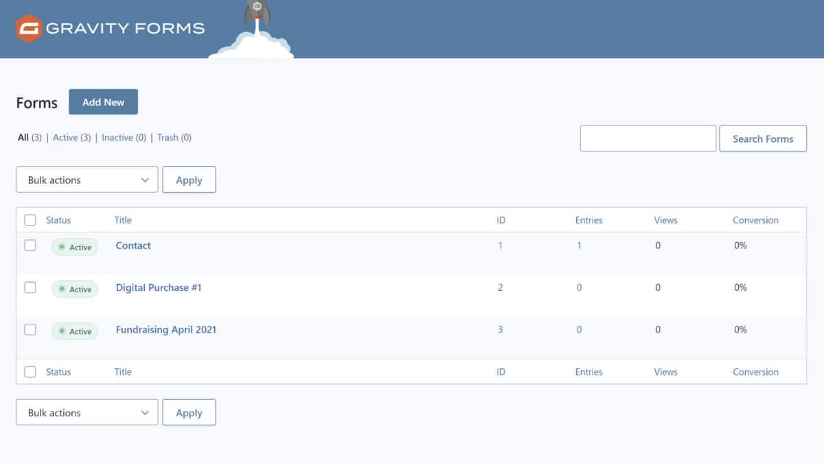
 Forms management screen.
“The Block Editor is a great tool for users,” said Giroux. “If we can find ways to give more functionality on a per post or per-page basis that will maintain the stability and performance that our users have come to expect, I don’t see why we wouldn’t move in that direction. For now, there is a lot of opportunity for us to explore the existing options available within the editor that keep development complexity to a minimum, and we’re keen to do that and provide more value to Gravity Forms users via the block editor.”
On accessibility, the primary lesson the team learned is that there is no magic switch to make a site WCAG compliant. It takes a holistic approach. WordPress, themes, and plugins must each do their parts to make this path easier for users.
“What we have done is invest in learning as much as we can about accessibility, the challenges of accessible forms, and worked with Rian Rietveld and the team at Level Level to make creating accessible forms easier and faster,” he said.
Gravity Forms 2.5 introduces new tools to enable accessible forms and outputs warnings when a user is configuring a form in a way that would pose an issue. The team also has extensive documentation on accessibility and a blog post covering it in the context of version 2.5.
“We’ve committed ourselves to making accessibility and accessibility testing a part of our development process,” said Giroux.
Outside of mentioning that the current release is the foundation going forward and excitement over new ideas, he remained tight-lipped about specific features in the pipeline for version 2.6 and beyond.
Competition and the Forms Market
 Extensions from the Certified Add-On program.
For years, few developers or companies could afford the time and monetary investment of creating visual builders, for forms or otherwise. It is no small feat to accomplish what Gravity Forms and others have done in the past. However, the block system is a set of APIs that could take some legwork out of the equation. Eager developers might see this as an opportunity to carve out their own slice of the market.
Even while Gravity Forms is taking cues from core WordPress, the block editor could level the playing field, introducing new competition.
“I’m very excited by what we’re seeing plugin developers do with the functionality in the WordPress editor,” said Giroux. “Giving users common patterns that work the same regardless of the developer, I believe, will only help further adoption of WordPress and the plugins that capitalize on the power of the editor. Gravity Forms is more than just a form builder, it’s a platform for building some pretty exciting workflows which can be challenging to adapt to the pace of change in the editor. As the development cycle matures and becomes more predictable, I’m eager to see how more complex plugin ecosystems like ours adapt to it.”
The Gravity Forms team looks at forms as “just the tip of the iceberg,” seeing value in helping web professionals solve problems with different types of business data.
Even in an increasingly crowded space, they have tripled their team size in the past two years, launched a Certified Developer program, and upgraded their support and user feedback system.
“We are committed to being the most reliable, secure, and accessible form solution, and I think that’s what keeps us relevant,” said Giroux. “The WordPress ecosystem is maturing, and while it is harder to stand out today than perhaps a few years ago, there is still a lot of opportunity for great ideas and great innovation, just like we’re seeing with the WordPress editor.”
Like this:
Like Loading…


