Yesterday, Gutenberg 10.9 landed in the WordPress plugin directory. The update overhauls the Query and Query Loop blocks, allows users to expand or collapse items in the editor list view, and introduces rich URL preview cards for links. The new version also packs in an updated template-mode creation modal and moves the blocks manager.
This update ships several enhancements, particularly to the user experience. One of my favorite low-key upgrades is a new set of add-card, bug, key, post author, and security icons by Filipe Varela, a product designer at Automattic.
Another small-but-packs-a-punch UI change is the inclusion of the post type in the editor breadcrumb trail. The type’s singular name label now replaces the root “Document” item.
For the past several cycles, the new template editor slated to launch with WordPress 5.8 has been enabled by default. The goal was always to allow everyone the chance to experience it, regardless of whether they were on a classic or block theme. The development team has now scaled this back to only be auto-enabled for block themes. Classic themes must opt-in to support it. Theme authors should read the recent template editor overview by Riad Benguella for the complete details.
Query and Query Loop Blocks Renamed
 Query Loop block in the editor.
Query? Query Loop? What the heck is all this? If you are unfamiliar with those terms, you are not alone. Even on the developer end, the early implementation of the Query and its inner Query Loop block could be a little confusing. For the average user, it probably makes even less sense.
Gutenberg 10.9 takes one step toward clearing up this confusion for end-users. The former Query Loop block is now named Post Template. This is a far more accurate description of what it does. It is the “template” that outputs individual posts. It contains all the things you see, such as the post content or excerpt, the featured image, tags, categories, and more. This template is, of course, customizable via the block editor.
While this is a step toward a less complex user experience, it is not quite where it needs to be yet. The Query block has been renamed to Query Loop. Therein lies the remaining issue. The terminology might still be confusing.
The goal is to expose a variation of this block named Posts List to users. It already exists, but the query-related terminology still appears when using it. There is an open ticket to address this.
The primary win with this update is the overhauled text in the Query Loop block sidebar. “The query block is a powerful and complex block,” said lead Gutenberg developer Matias Ventura in a GitHub ticket. “It can be intimidated to users without proper guidance. We can use this block as an opportunity to explain some of the underlying concepts of the WordPress software in a more didactic manner.”
The more advanced options, such as whether to inherit from the URL and which post types to include, now have longer descriptions. Each should guide the user through features that have long existed in the developer world.
If you are a theme author and have already been building with these two blocks, do not worry about everything breaking when updating. The Query block has simply been renamed to “Query Loop” in user-facing text. Under the hood, it is still the same. The former Query Loop block has literally been renamed to Post Template (core/post-template block name). It is backward compatible. However, you should update any past calls to the wp:query-loop block to wp:post-template.
Expand and Collapse Nested List View Blocks
 List view with collapsed nested blocks.
The development team introduced an expand/collapse feature for the editor’s list view. Once opening the panel, users should now see arrow icons next to each item with nested blocks. Closing one or more of them makes it easier to see all or many top-level blocks at once.
The downside is that the open/close state is lost once the list view is closed. If I had one request, it would be to store this data while editing the post. That would improve the user experience with longer documents, particularly when switching between navigating and editing.
This update, along with the persistent behavior of the list view in Gutenberg 10.7, has made for a much more well-rounded document navigation experience.
Rich URL Previews

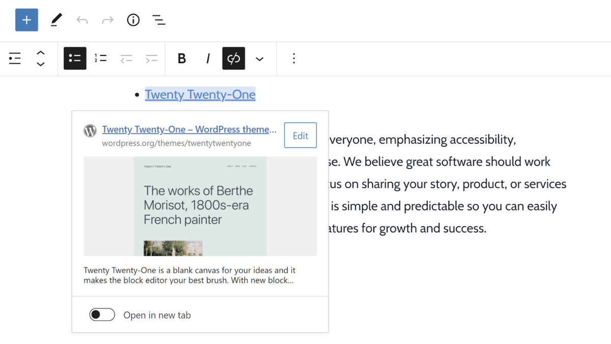
The editor will now show a website preview in the link editor popup. This feature only works for links in a Rich Text context, such as in the Paragraph, Heading, and List blocks. The preview also only appears after the link has been set and clicked on, not when initially typing it.
If available, the popup preview displays the site icon, title, image, and description.
“In the near future however, we expect to extend this to provide previews of internal URLs and to roll out support to more areas of the software,” wrote George Mamadashvili in the Gutenberg 10.9 announcement post.
Admittedly, I was not keen on the idea of adding this feature. It felt like unnecessary bloat when more pressing issues were lying on the table. However, in the past day, I have enjoyed the quick previews when double-checking links in posts.
Like this:
Like Loading…


