Yesterday, the Gutenberg team released version 8.3 of the ongoing plugin behind the block editor. While much of the focus for the team is on the upcoming full-site editing, this update includes several user-facing features, such as a reorganized set of block categories, a parent block selector, a spacing control, and link color options.
One smaller enhancement includes the ability to filter the Latest Posts block by author. The level control for the Heading block has also changed. Instead of selecting the level in the block options sidebar, the level selector is now located in the editor toolbar.
In Gutenberg 8.2, hitting the Enter key within the caption field for an image block created a new paragraph. In 8.3, that feature has been extended to all blocks with captions.
The team corrected over 20 bug fixes in the latest release. On the whole, the new plugin update appears to be solid after a day of use. However, some of the experimental additions, such as the new padding control, may be worth some concern. Theme authors need to start testing this, providing feedback, and making sure development is heading in the right direction.
New Block Categories
 New “Design” category in the block inserter.
The Gutenberg team has renamed and reorganized the block categories. The new list seems to make more sense and is better consolidated into proper groups:
- Text
- Media
- Design
- Widgets
- Embeds
While I am a fan of the new category names, I find the categories useless for any practical purpose at this point. Ever since Gutenberg dropped the tabbed interface in the block inserter, it has felt like a large wall of blocks. My eyes naturally skip by the category names as I scroll and scroll and scroll through the list of available blocks to find that particular block I need. I almost always use keyboard slash commands for inserting blocks. In those cases where I don’t, it is not an ideal user experience, and the new categories do not help much.
Select Parent Block
 Hovering over toolbar to find parent block selector.
One of the more frustrating experiences in Gutenberg is attempting to select a parent block in a nested-block scenario. Far too often, users feel like they are clicking around at random in the hopes they hit that sweet spot where they can actually navigate to the block they need to edit. It is an exercise in frustration in the best moments.
The Gutenberg team took a step — a small step — toward alleviating this pain. When hovering over the “change block type or style” button in the editor toolbar, a new button appears to select the parent block.
I am unsure if this is the right way of handling the problem. I would like to see some experiments with some sort of arrow button that appears without hovering. For now, I am satisfied that the team is attempting to solve the issue and hope that future iterations improve navigation within nested blocks.
This feature does not seem to work when the top toolbar mode is enabled. For those who use this mode, the best way to select a parent block is via the breadcrumb navigation at the bottom of the editor.
Experimental Spacing/Padding Control
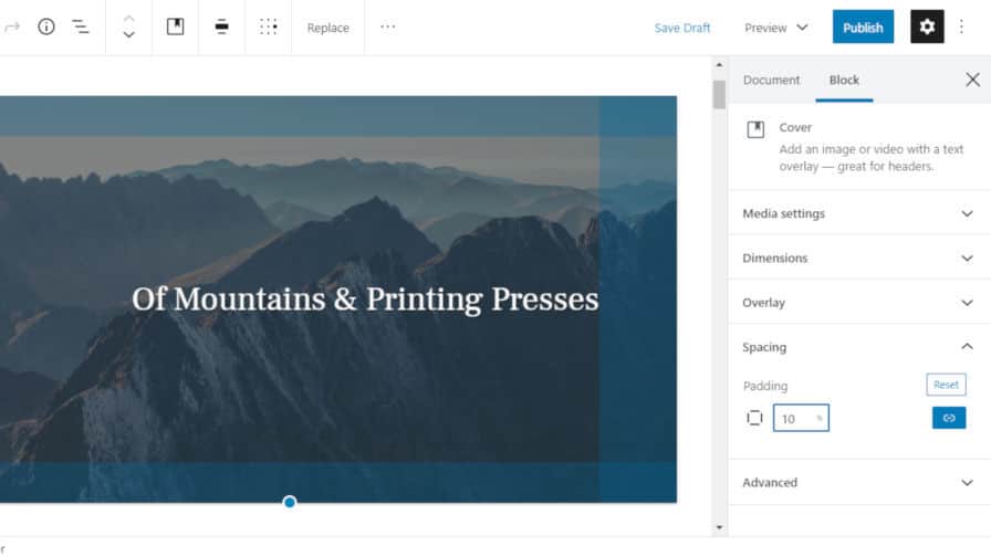
 Adding custom padding to a Cover block.
Theme authors can now add support for an experimental padding control via add_theme_support( ‘experimental-custom-spacing’ ). When supported, the end-user will see a new Spacing tab under the block options sidebar for the Cover block, which should be available for other blocks in the future. By default, users can control the padding for all four sides of a block with a single value. They can also “unlink” the padding and control the top, bottom, left, and right values individually.
Presumably, the Gutenberg team will extend this spacing feature to include a margin control too. It would be the natural move and one in which I hope that leads to the death of the Spacer block that users have had to live with for the past couple of years.
However, I am not sold on allowing end-users to control padding with explicit values. Haphazardly changing padding values will break the vertical rhythm that many theme authors take the time to meticulously calculate. When using pixel values (the default), users will most certainly run into issues with tablet and mobile screen sizes. Essentially, it will create a complete mess of spacing.
I am not against the idea. I want it done right before this lands in WordPress. Theme authors should be able to register named classes that are handled via the stylesheet. This goes back to the idea of WordPress having a design framework. Create a set of utility classes for spacing (oh, hello, Tailwind). Let theme authors define the spacing based on their design. Let users choose from those. Then, provide a custom option for those times where users want to take matters into their own hands. At that point, they have made an explicit decision to break away from the design flow the theme author has chosen.
Link Colors
 Selecting a custom link color.
One of the tougher hurdles theme authors have had to face when styling for the block editor is figuring out what to do with link colors when the user changes the background color of a block. Users have long had control of the text color in that scenario. However, link colors could quickly become inaccessible or just downright ugly. Forward-thinking theme authors would style those link colors so that they inherited the text color, but that is not always the ideal solution.
That’s where user-controlled link colors come in. To add support for custom link colors, theme authors must opt into the feature via add_theme_support( ‘experimental-link-color’ ). This will add a new color selector for the Paragraph, Heading, Group, Columns, and Media & Text blocks.
Unable to get this feature working with the theme-support function call, I had to dig into the code a bit to find the issue. For theme authors to add support for link colors, they should also define their default links as shown in the following CSS code snippet:
a { color: var( –wp–style–color–link, #000 ); }
WordPress will automatically set the –wp–style–color–link variable. For further specificity, theme authors can also target .has-link-color a.


