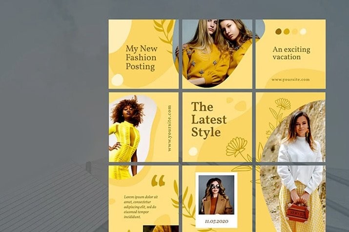
A secret used by some of the boldest visual brands on Instagram is to use a grid or puzzle template. What this style of template does is create 12 cohesive panels that come together as a single image when someone visits your Instagram profile page.
The trick here is that the panels have to work equally well as single image posts and together as a whole. It can be difficult to pull off if you are not careful.
A template can make it a lot easier to figure out and manage. You can create one yourself, or download a ready-made option (best if you are looking for quick and easy). Here, we are looking at 10 great Instagram grid templates with tips for how you can take the inspiration from each and use it with your images on your social media account.
2 Million+ Instagram Post + Story Templates, Videos, Photos & Design Resources With Unlimited Downloads
Download thousands of beautiful Instagram post and story templates, Instagram video templates, and anything you need to supercharge your social media presence with an Envato Elements membership. It starts at $16 per month, and gives you unlimited access to a growing library of over 2,000,000 Instagram templates, design assets, photos, videos and more.
1. Great Holidays
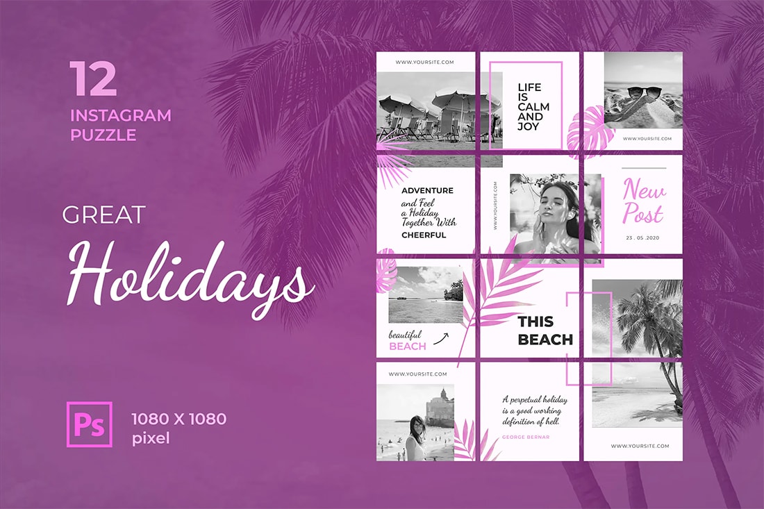
Forget the name of this Instagram puzzle/grid template (the terms puzzle and grid template are interchangeable), it works for almost any photo set that deserves a summer theme.
What’s nice about this grid template is that it provides for plenty of different content types. You don’t need nine photos to make it work. This gives it a little more flexibility for brands or marketing purposes.
The elements that tie panels together are pretty simple and you can quickly change the magenta hue to match your color scheme.
2. Winter Sale

A solid Instagram grid template has to look like a “thing.” If users visit your profile page and don’t see the big picture theme immediately, then it’s not working.
This template does a nice job of pulling it all together with a pretty simple aesthetic that comes together with bold color. While some of the images are broken up, generally that doesn’t happen. This can make working with a template and your images a lot easier to manage than if every panel and image overlaps another.
The biggest thing you have to worry about here is aligning photos so you don’t end up with any unfortunate crops as single posts.
3. Wedding Post
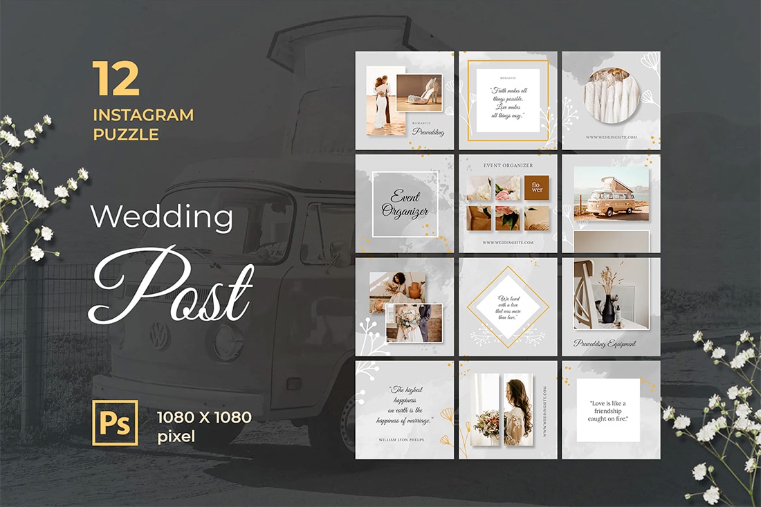
Using a big background and not even really trying to connect images between panels is a good option if you are new to creating Instagram grids. This template uses that idea in a simple, beautiful way.
The watercolor background is interesting but doesn’t detract from the images in each post. You really only pay attention to it when you see it all together.
It provides a nice little surprise for profile page visitors without being too much to manage. The gray color scheme also works with almost any type of content.
4. Instagram Grid Posts
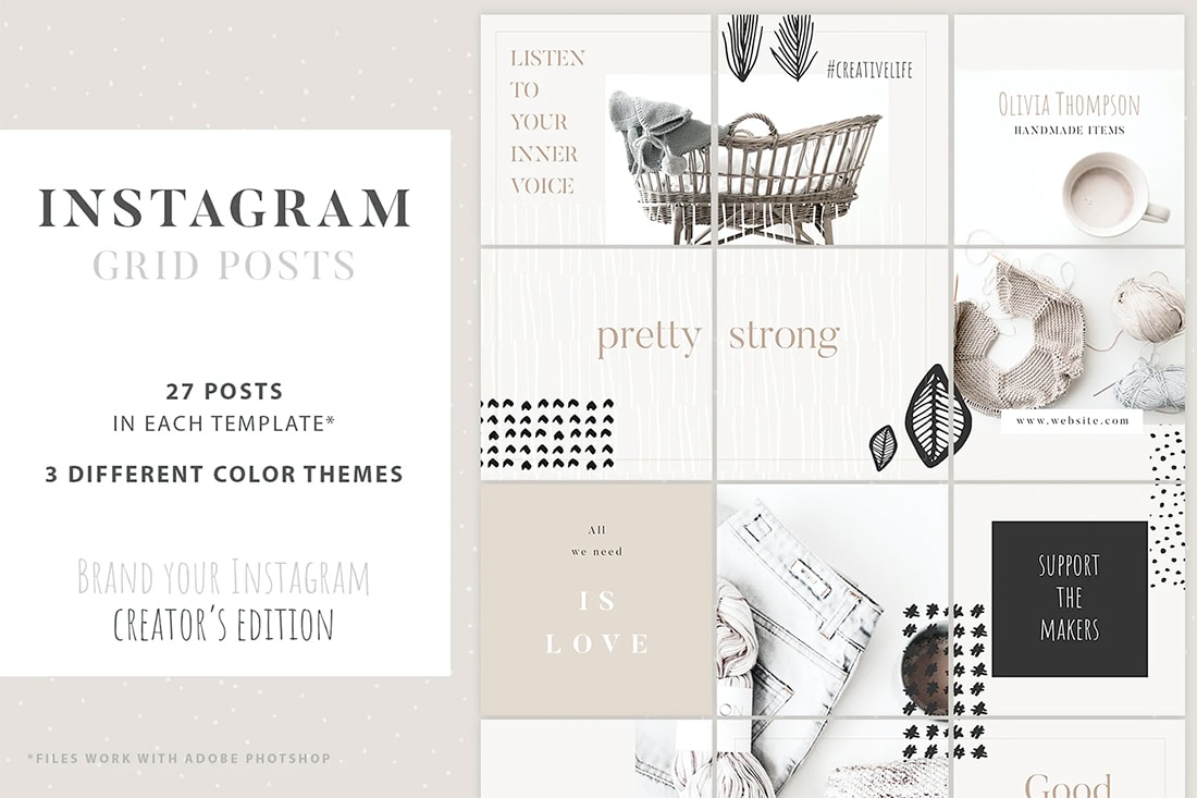
Another template with a neutral color scheme, Instagram Grid Posts is easy to pop content into without a lot of customization (unless you want to).
When using a template to create this style for Instagram, look for a flexible template that you can customize using the software at your disposal. Many of these templates are compatible with Adobe Photoshop and come as layer files. This template is particularly robust because It includes 27 post options in three different visual styles.
You could be a lot of work done with a single template here.
5. Sale Posts
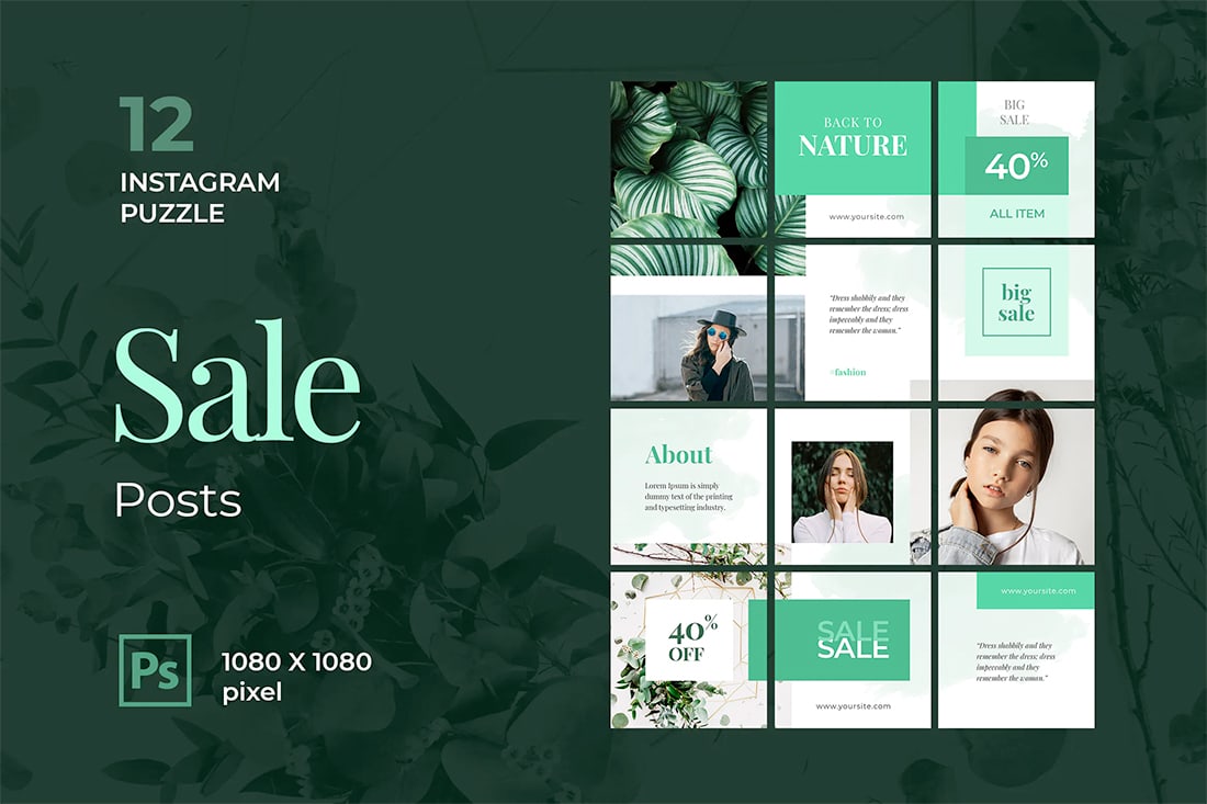
With so many e-commerce businesses flocking to Instagram, it’s no wonder that a sale grid template can be a lifesaver. This one has a nice feel with a strong flow between panels with plenty of room to show product images.
The key selling point for this template is that the background and design elements don’t have a true visual theme – there are just color blocks and blobs that can be coordinated to your content.
All you have to do to make this template your own is to change the color!
6. Instagram Puzzle Medical

While a template with a specific theme like is isn’t for everyone, it is a good example of how to use design elements to bring a theme together in a way that does not result in strange image crops.
The parts of the design that carry between panels are color blocks that contain text or design elements. It’s a solid use of creative space to ensure a nice visual theme and flow that doesn’t get too complicated to pull off.
7. Fashion Style

If you want to jump into using an Instagram template (or even just the visual social platform) and don’t have enough strong images to make it work, a theme that uses a bold background can be useful.
Here, you don’t need many images to pull off a grid style. When going this route, it is best to truly go back and colorful with the background. Just substitute the background color to match your brand and divots (here flowers and stems) with iconic graphic shapes that better match your content.
8. Instagram Puzzle Feed
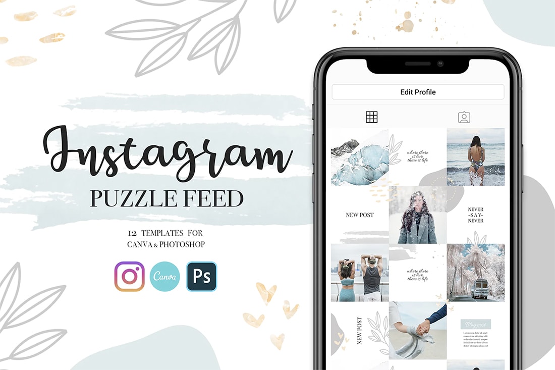
Not all puzzle or grid configurations have to have a lot of carryover between panels. Sometimes a more subtle template can actually work better with your content.
That’s what makes this option so appealing. The template provides plenty of room for full image posts with intricate details that help tie the pieces together.
What’s more, is that everything is simple and subdued. Only the most astute users will even think to look at how it all comes together but will be delighted when they figure out the trick. This can be a fun way to create your social profile or brand on Instagram.
9. Traveland
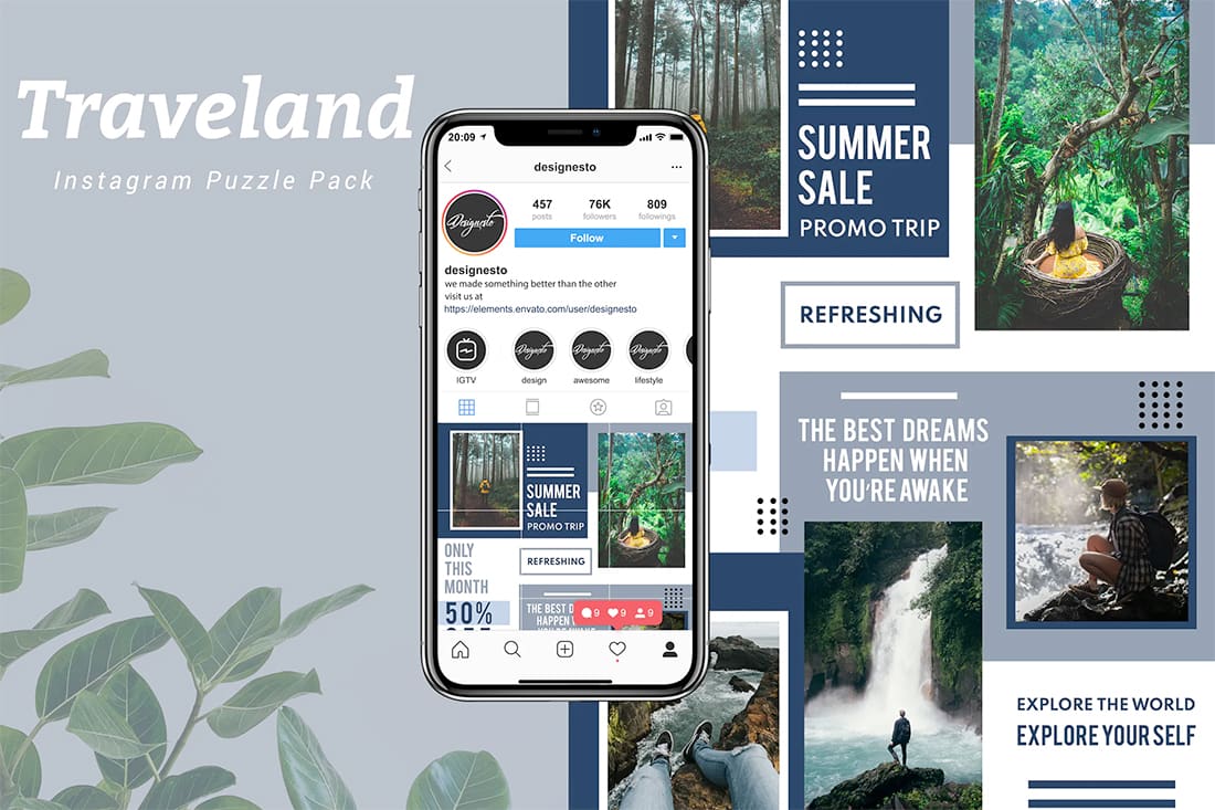
Traveland is the most complex template in this collection in terms of pulling everything together visually.
When it comes to designing and editing using the template, it’s actually rather easy because it uses smart objects, layers, and free fonts. These are all things to look for in a template if you don’t want to do a lot of heavy lifting with the design once you download it.
It’s practically ready for you to make image and text edits and start sharing.
10. Cisty
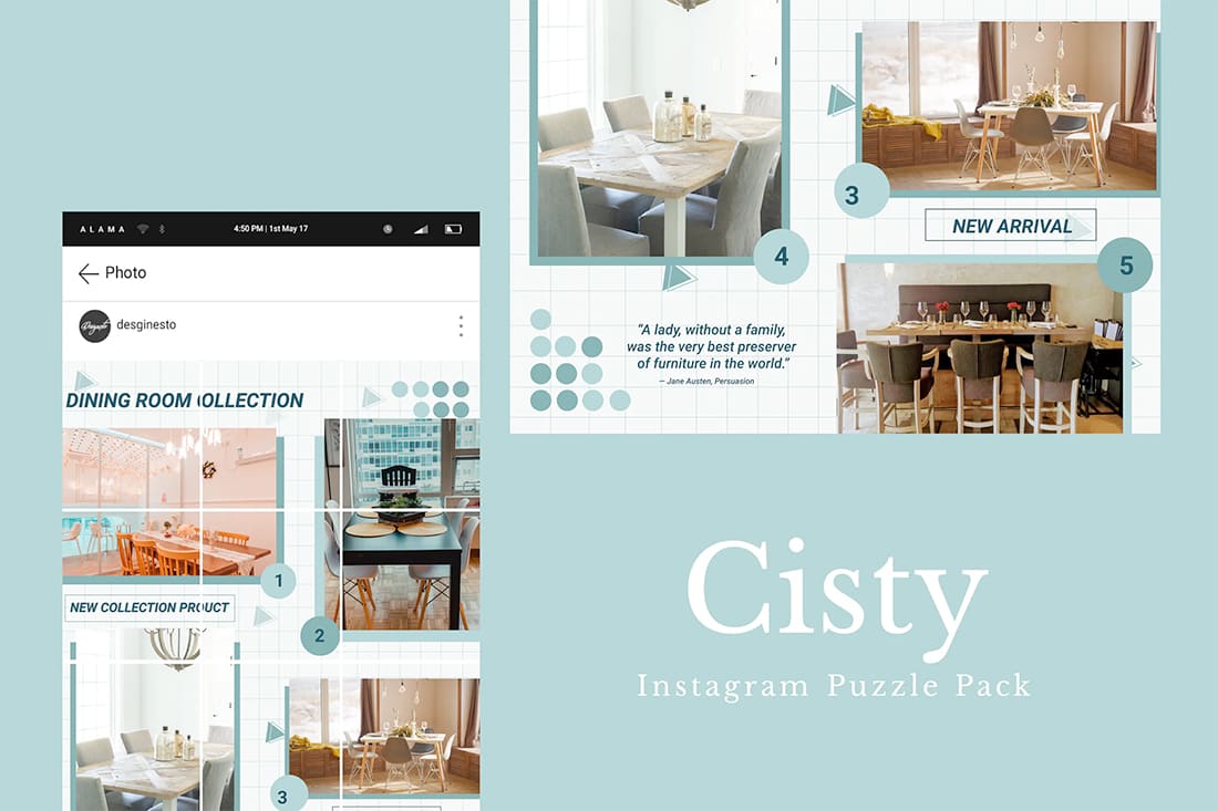
Cisty is another highly-editable Instagram grid template. While the design is made for images, it does contain some background elements to help eliminate unused or dead spaces.
What’s nice about this template is the way it works, using a single Photoshop file with a 12-slice feed ruler. Some templates using individual image boxes. Look for a template that suits your work style best.
Instagram Templates
Learn how to supercharge your Instagram account. Craft beautiful posts and updates, improve your branding, find templates, and use Instagram in a new, creative way!


