If you aren’t designing Instagram Stories, it might be time to start. More than 500 million people use the vertical format on the social media channel every day.
Stories are fun, they allow for creativity, and this is a place where you can really showcase your design skills to a social media audience.
It’s a little different from some of the other ways you’ve probably used social in the past. Here’s a guide to help you post Instagram Stories like a pro, with examples and ideas to help you see our advice in practice.
1. Tell a Story
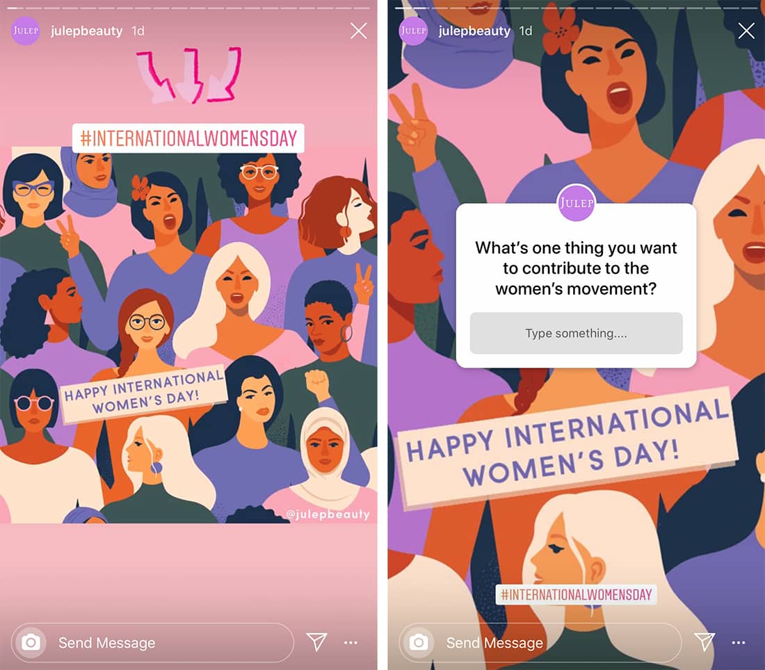
A good story has a beginning, middle, and end. A good Instagram story does this visually so that users will want to keep watching and moving through the story without skipping to the next thing.
When posting, it’s a good idea to storyboard your concept. How many slides will it have (3 to 5 is probably ideal)? What content will the sides include? Who (if anyone) will you tag or what hashtags will you use? Is there a call to action (swipe or bio link)?
Map out how each of these elements plays into the slides that make up your story.
All of the slides in a single story should have a visual theme that ties them together. That way users know when your story begins and ends. This is important since Instagram Stories “auto-play” from one user account to the next.
2. Optimize for the Right Size

Not just anything goes when it comes to Instagram Stories. The best ‘grammers know how to size everything for the medium.
There are three key specs to keep in mind:
- The video/photo aspect ratio is 9:16. That’s your typical horizontal format turned on its side for a vertical orientation.
- The actual size is 1,080 pixels by 1,920 pixels. An image or video that size will fill the space completely. Don’t forget about the Instagram name at the top and engagement tools at the bottom of the screen. Don’t put words or tap actions in those locations. While the slide above looks great, this tiny error is distracting.
- The max video length is 15 seconds. Anything longer will get automatically broken into multiple slides.
3. Use Brand Colors and Styles
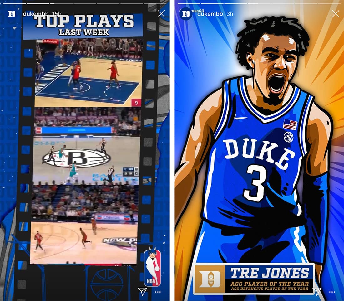
There’s no need to go overboard with branding in Instagram Stories – your username and logo are visible, but using brand guidelines (if you have them) can help keep your feed clean and tidy. It can also help users recognize our Stories as soon as they start to play.
From a design perspective, it’s always a good idea to use brand colors and styles when you can.
Did you know that if you tap and hold on a color and swipe up a little you can get a full rainbow color picker? This is how to add and customize brand colors within Instagram Stories.
If your colors don’t quite work, consider a drop shadow to enhance the readability of text, or consider using a secondary hue, black, or white.
The top way to make sure brand elements are readable is to use large text sizes with just a few words per slide (they move to fast to read any more than that), and images that are part of your collection.
Using custom fonts is a little more difficult. Instagram has a few default options that allow you to add text right in the native editor. While it’s unlikely this is your font, choose one that matches the mood of your brand.
You can also include text on the image before adding it to Instagram to use specific brand fonts.
4. Use Stickers, But Not Too Many
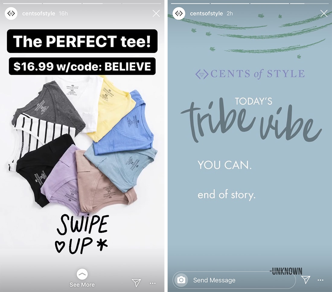
Instagram is packed with extras – stickers, gifts, emojis, countdown timers, polls, and more – that you can add to stories. Use these elements!
But proceed with caution.
If you want to use fun elements, that’s totally acceptable. Just limit them. Add too many things to a story will make a design mess rather quickly.
One or two elements per story – not per slide – should be enough. Remember the limited duration of each individual slide. How many things can a user realistically look at and understand in the time permitting?
The answer to that question can help shape what elements you use.
5. Try a Stylized Template

If you are posting to Instagram Stories regularly, a template might help you decide how slides should look. While you don’t want too rigid of a formula – it can get visually stale over time – a template with plenty of options can help you plan and create beautiful slides.
Use the specs above to create slides for different types of content. And then you can plug and play images and text.
If creating your own Instagram Stories template seems intimidating, you can download one, such as the example above. Envato Elements has tons of Stories templates in dozens of styles to help take your Instagram game to the next level.
6. Mix Media Formats

Use Instagram Stories to mix media formats – photos or illustrations or video – into a single post.
Part of the joy of the format is it comes with visual surprises for the user.
The only thing that really matters is that you use high-quality visuals so that the experience is a good one.
7. Create Highlight Covers
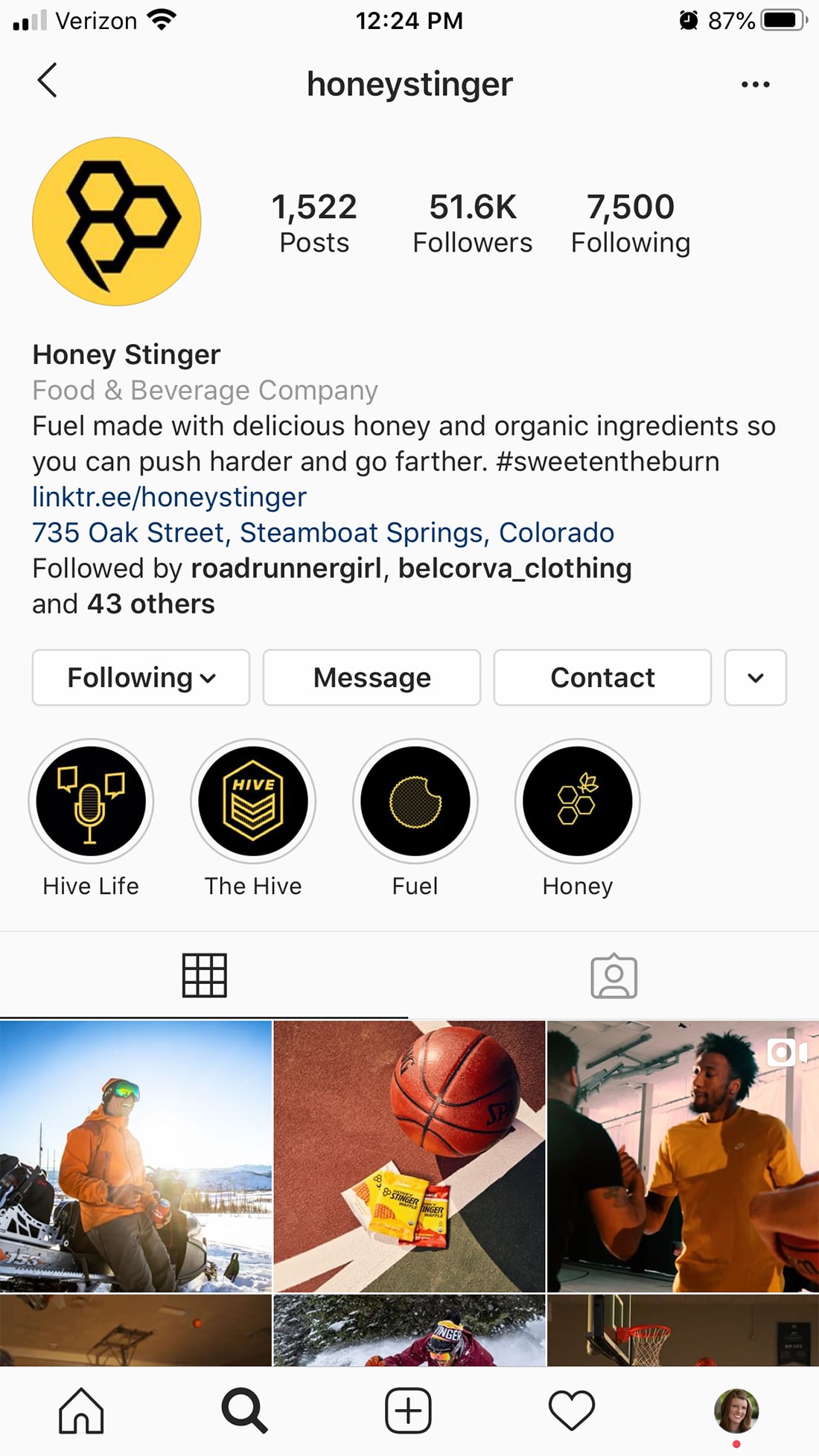
Are you saving Instagram Stories into Highlights? If so, level up your Instagram homepage design with custom highlight covers that you design for each story.
Create a template for different types of story themes for a consistent but varying design. You can add the custom design – or create it on the fly in Instagram – when you save a new highlight. It can be as simple as using a brand color to bring attention to each of the saved stories.
Honey Stinger, above, does this beautifully and everything ties to brand colors and messaging.
Conclusion
Instagram Stories is one of the fastest-growing social media formats. (Facebook has its own version of Stories that looks and acts in a similar way. Probably because the companies are actually one and the same.)
Designing stellar Instagram Stories can bring more attention to your content and increase user engagement, even leading to more clicks to your website or portfolio.


