Need a new logo? Whether you’re starting from scratch or just planning a tweak to a current mark, understanding shifts in logo design trends can help you create a design with a modern touch.
The big 2019 theme in logo design is to create something that’s just a little bit different. With so many new websites and brands and companies coming online almost every day, it’s no wonder that logos are trending toward designs that stand out.
Here’s a look at a few logo design trends for 2019, and how you can make them work for you (and while you’re at it, be sure to look through our full guide on how to design a logo!)
Small Serif Logotypes
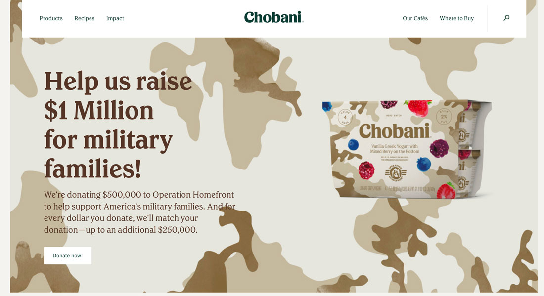
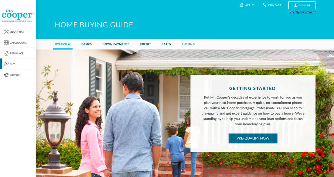
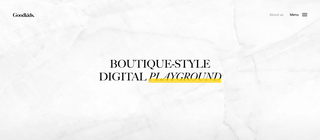
A logo doesn’t have to be complicated to be elegant and effective. More brands are turning to small serif logotypes to portray who they are.
When we refer to small serifs, it’s less about the font size and more about the size of strokes used within the type family. This trend is exemplified by characters that include tiny serifs. They are simple, light and almost fall into the background of the lettering.
These serifs might be sharp or rounder and as with any logotype are a contributing factor in how the brand should feel to users.
Small serifs can be a great option because:
- They are different. With so many sans serif logotypes out there, this style immediately stands out.
- Serifs communicate a little more about a brand without imagery. These divots can establish mood and feel in a logotype where no other “art” is used.
- These typefaces are interesting without being hard to read. While simple minimalism has been a trend for a while, there’s a movement toward somewhat more complex design elements.
Overlapping Elements
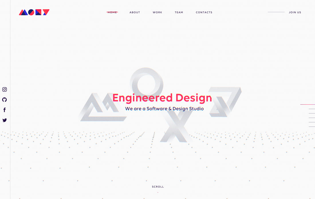
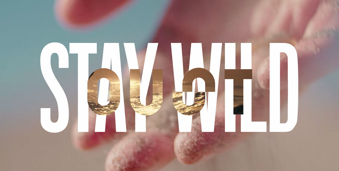
It’s one of those design rules that you don’t expect to be broken with small elements such as logos. But designers are breaking this rule … and it works.
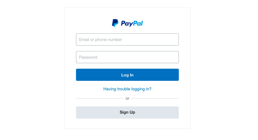
From big brands like PayPal to smaller studios such as Moxy and Oust, logo designs are using elements that stack and overlap to create depth and visual interest. Overlapping styles tend to work best for logos that have a simple mark or lettering and that are contained to s specific part of the logo.
PayPal, for example, uses an overlapped letter for its iconic “P” but the word “PayPal does not use this treatment.
How do you use overlapping logo elements?
- Pick one element to overlap; too much overlapping can get difficult to understand.
- Use an overlapping element to create depth. Think about what the design technique does for an understanding of the mark.
- Use color. This trending technique is made for high-color designs. (You might even consider an overprint style.)
Intricate Details
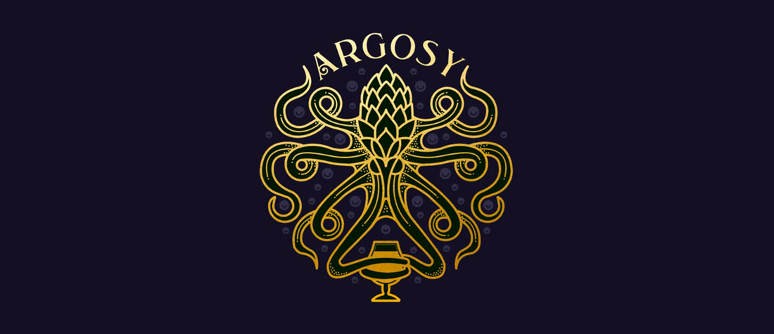
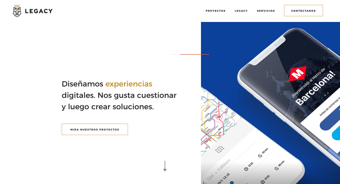
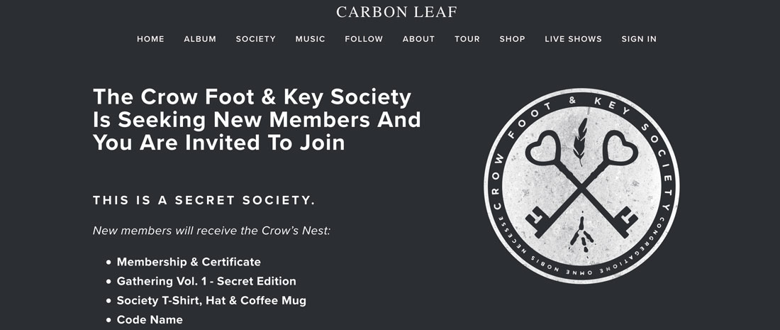
This logo design trend is a fresh take on visual elements after such a long period of minimalism – logos with intricate details.
From line-style logos has come an extension to more detail logos with plenty of varying lines, color variations, type choices and plenty of small elements that bring it all together.
This logo style can be a lot of work to create, but the result can be pretty amazing and creates a piece of art that more than a logo. A great intricate design can be used everywhere at any size and maintains that same level of interest.
These designs beg users to look and then continue to engage with the design, trying to see every hidden stroke and meaning to the brand mark.
Here’s how you use the intricate detail logo design trend:
- Take care with color. Too much color in an intricate style can get overwhelming quickly.
- Make every detail count. The design should not be complicated because it can; it should be complex and intricate because it should be.
- Pair simple typefaces with complicated artwork for readable balance.
Lowercase Lettering
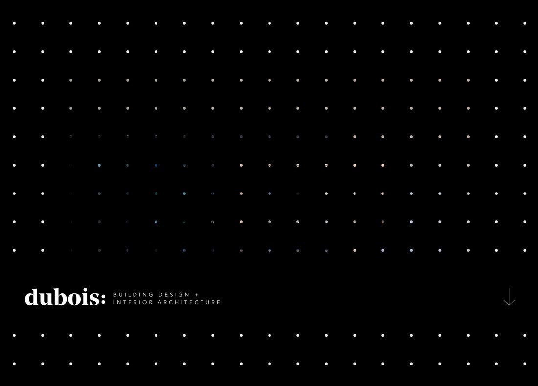
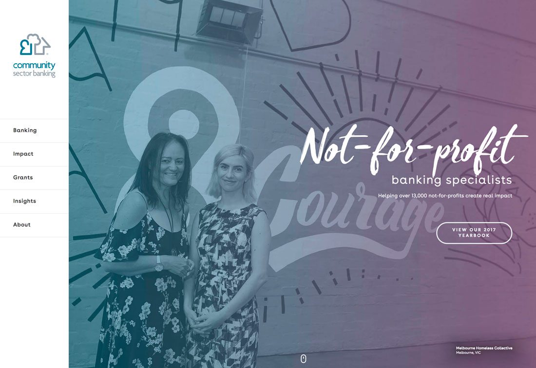
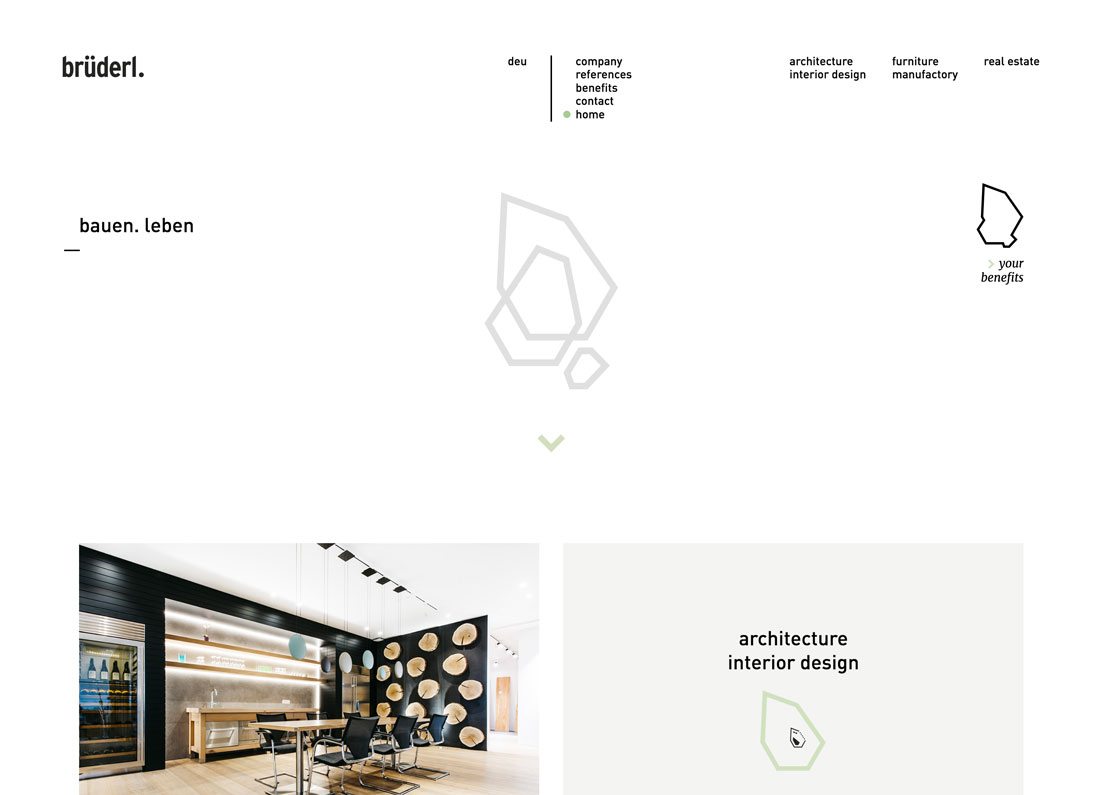
These logos would make e.e. cummings proud. The style features great typography in all lowercase characters.
With so many designers focusing on typography for their projects, the shift to a type-based logo isn’t that far-fetched. Using all lowercase letters is a little more unusual and can be an attention-grabbing solution.
The catch is whether this use of your brand or company name meets visual standards and usage.
Here’s how to make it work for you:
- Use a beautiful typeface. Any old sans-serif won’t do here.
- Amp up the contrast between letters and the background to ensure that the smaller stance is seen.
- Take care with readability. Is the word clear in all lowercase letters?
- Opt for a heavier weight. Lowercase letters have a little less heft and presence than title or uppercase options. Create that balance with a thicker stroke weight.
- Give it plenty of room. Whitespace can add weight and visual interest to a simple lowercase logotype.
- Try it with short and simple words. Too many letters or words without capitals can get a little cumbersome in terms of readability.
- Don’t crowd it with other elements. Lowercase lettering is the design trick with this logo style. Avoid other effects to maximize its impact.
Simple Shapes and Lines
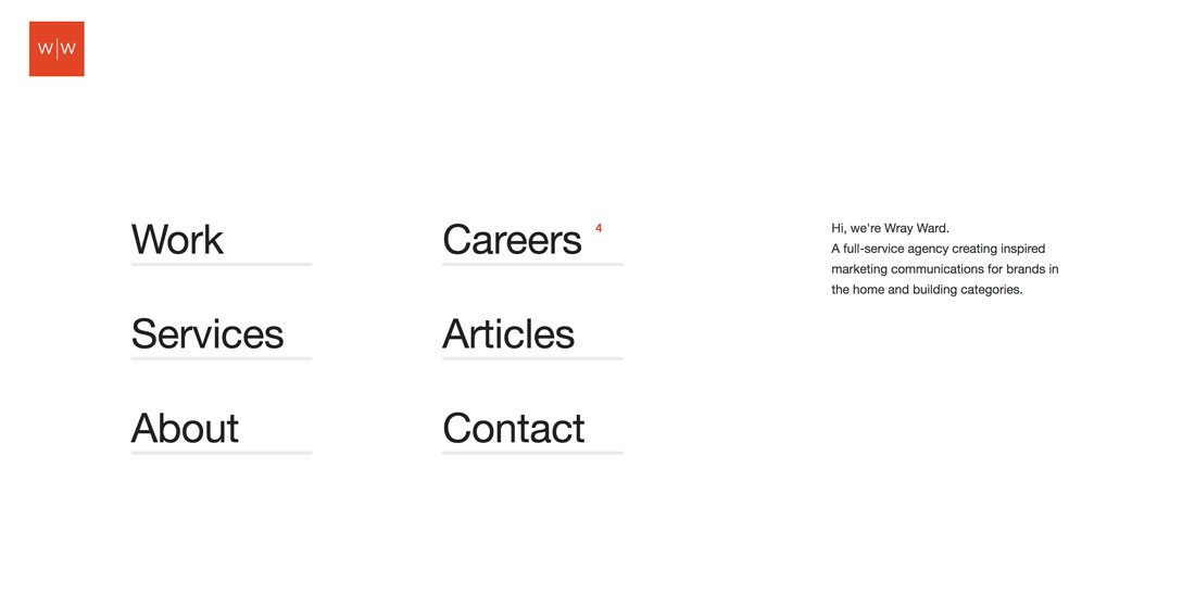
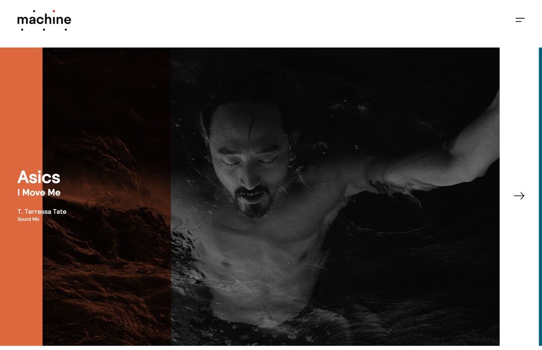
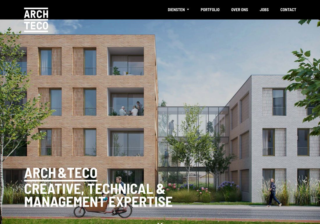
Use of geometric shapes and lines is another popular trend for design projects overall that’s rapidly becoming a logo staple. With clean lines, simple shapes and splashes of color, geometry is a logo must.
It’s important to note that many of these shapes are simple and fit into a square or circle format with uniform (or close to it) heights and widths. This initiative could be in part due to the need to have such a shape for common online mediums and logo usage, such as social media profiles.
Tips to make the most of the logo trend:
- Don’t overthink it. A bold line or stroke can make simple lettering pop.
- If you love the idea of a simple shape or geometry, but can’t quite make it work for the main logo, consider this treatment as a secondary option.
- Give purpose to divots and shapes so that they frame or accent lettering, just dropping elements around a word isn’t quite enough to be effective.
Flat Design

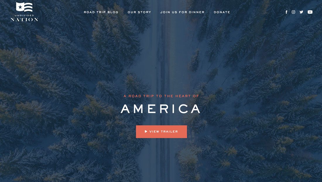
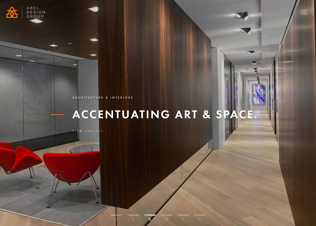
Flat design remains a popular logo option because it is so easy to work with. While flat design as a whole is beginning to recede from the trends radar, logos are still using the flat treatment.
Flat logos remain trendy because of how they are used. Many design projects feature full-screen video or images, particularly in website design, in full color. Flat logos often rest on a foreground layer and need to have some separation from the background.
Even brands that have more ornate logos often create a secondary, flat-style logo for this kind of use.
Going flat? Get the best result with these tips:
- Use one or few colors in the design. Black or white options are the most popular.
- Stick to simple typography that matches an icon or visual element in the logo.
- Remember the basics of flat design and don’t feel tempted to add design techniques; simple is better if you want a logo that’s truly flat.
- Consider a combination of a visual divot and text to tie the logo together.
- Don’t overthink it. Often there’s not a lot of substance to a flat logo. The logo is often made to fall into the rest of the design.
Initials
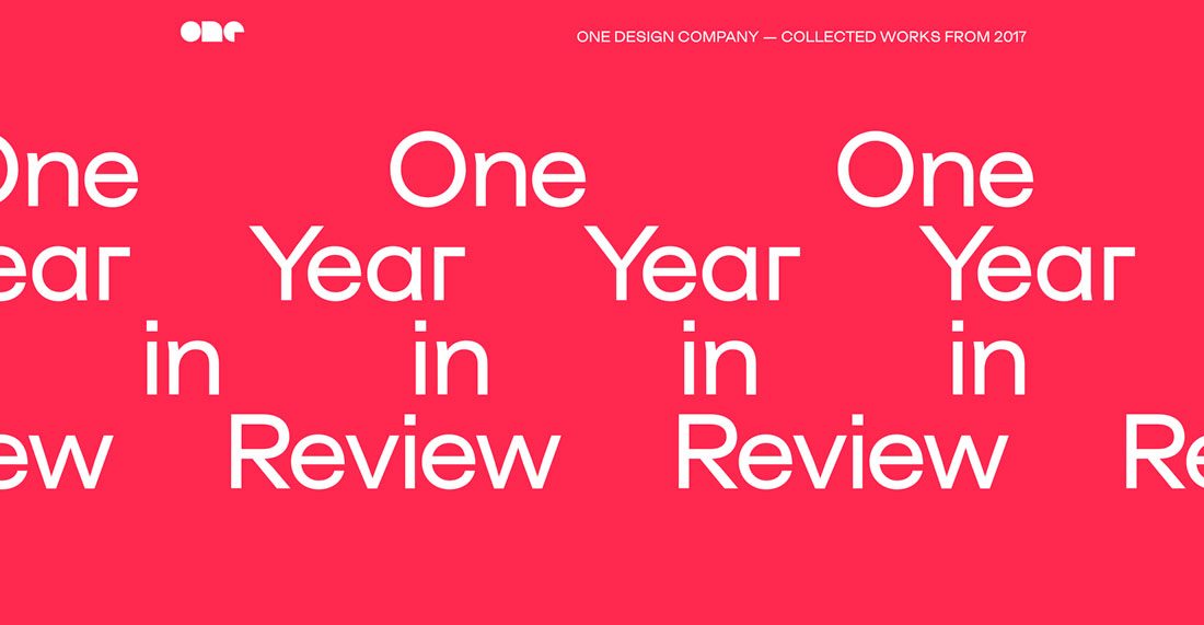
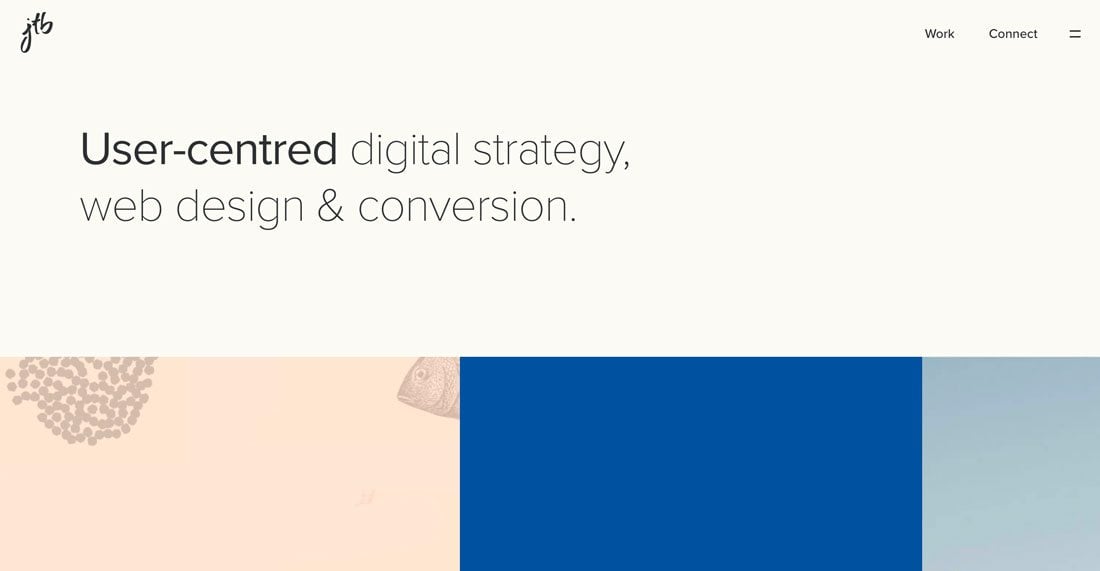
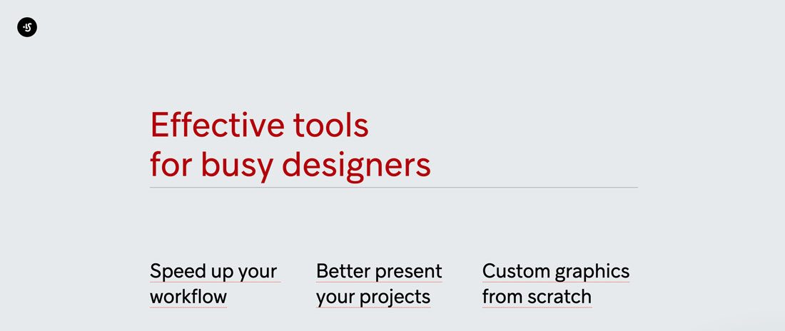
LOL. OMG. SMH. It seems like the whole world talks in acronyms and initials these days. And logo design is no different.
While most commonly used for secondary logos, initials are everywhere. While there are three examples above, this collection could have easily included hundreds of designs with a three-letter (or less) logotype.
Most of these logos feature interesting or custom typography that’s designed to have a personal feel. The logo should speak right to the user and create an instant connection. The idea is further emphasized by the fact that the user needs to know what the letters actually mean (or have a desire to find out).
Here’s how you do it:
- For designers or portfolio sites, use your initials to create a logotype that reflects your personality.
- Add a simple animation to draw more interest to a logo that likely doesn’t carry a lot of visual weight in the design.
- Consider boxing the letters so add more emphasis.
- Acronyms and initials for logos are often secondary messaging and are subtle in placement and scale.
Circles
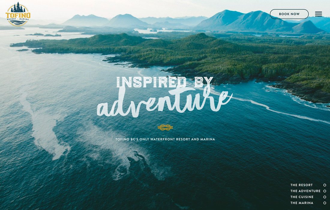
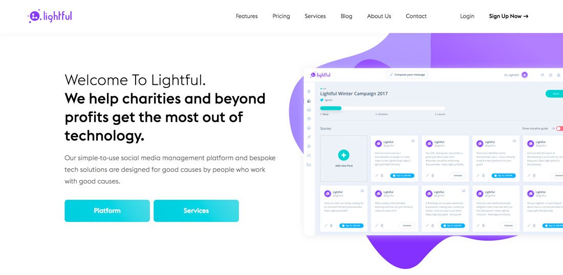

Circles are fluid and associated with energy, power, harmony, and infinity. And that’s why the shape is a trending logo design element.
Circles are also easy to plug into other places where a logo needs to appear, such as social media profiles and in corner locations on printed designs, such as business cards or letterhead. Like many of the other elements that are trending in logo design, circles have become a more popular shape in website design overall in recent months.
Here are a few tips for using round logo shapes:
- Don’t force it. Some words and elements just don’t fit into round shapes.
- Match the meaning of your brand and the shape. Do the associations match?
- Use a circle with a harmonious color palette to create a sense of balance between the logo and branding.
- Don’t get stuck inside the shape; consider elements that break through the perfect roundness of the shape.
- Opt for lettering that goes outside of the circle, particularly if words are long. (Short words are less of an issue.
One Color
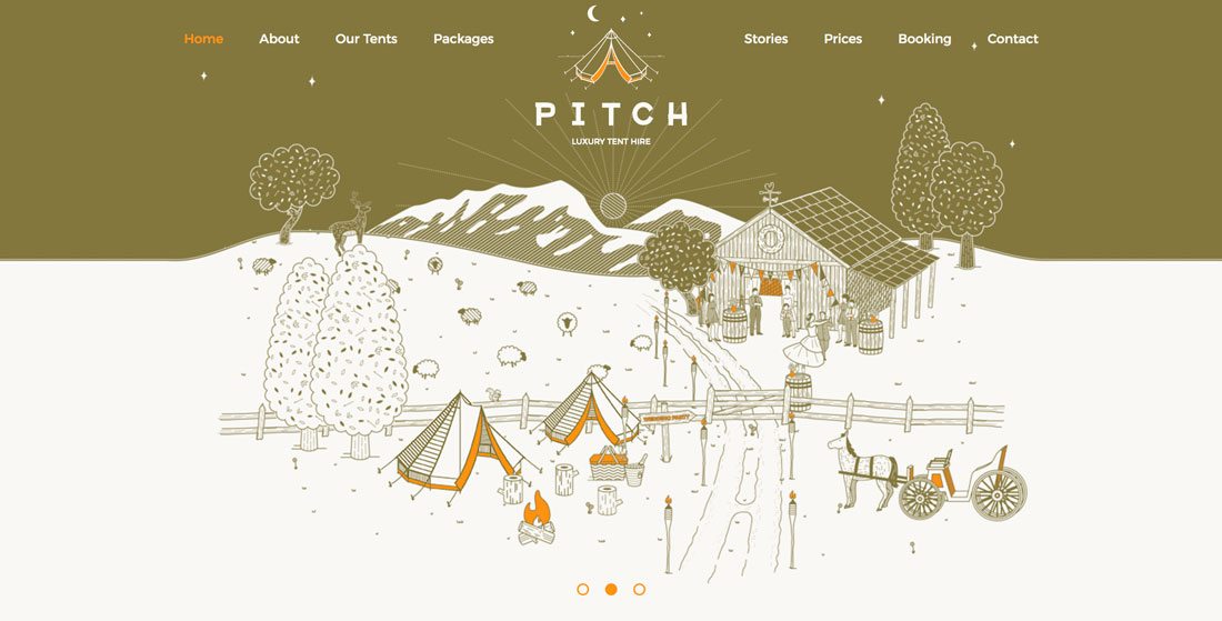
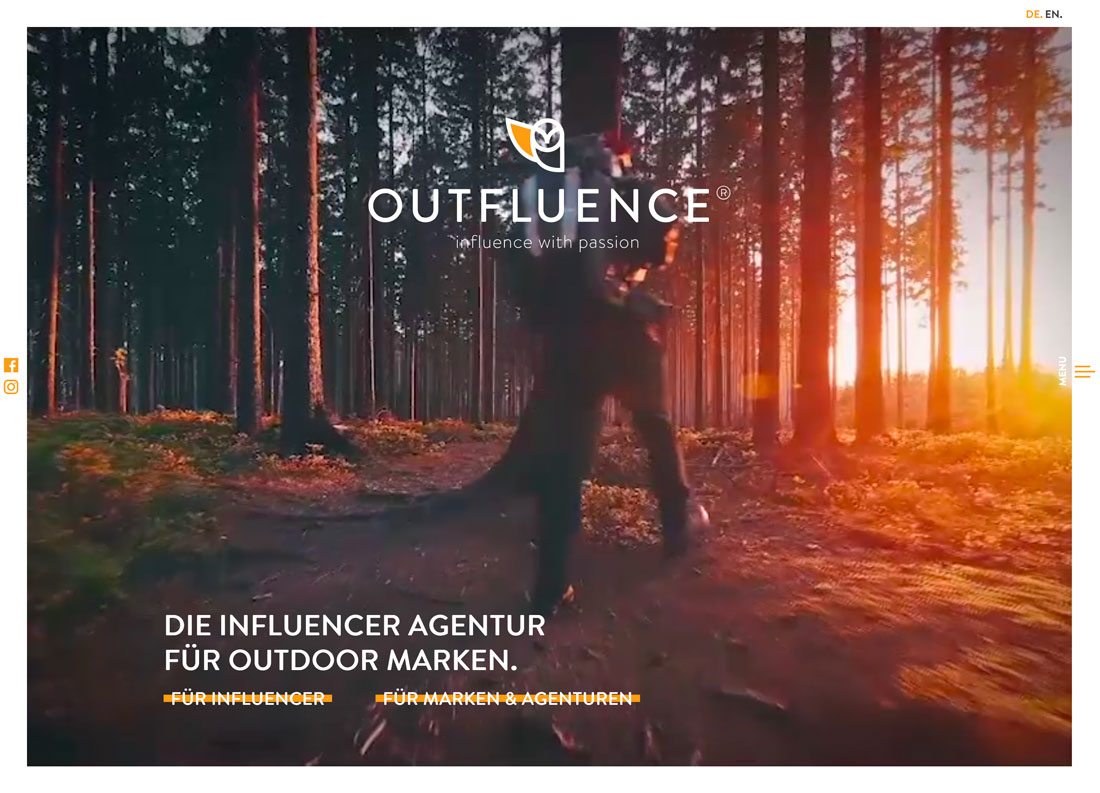
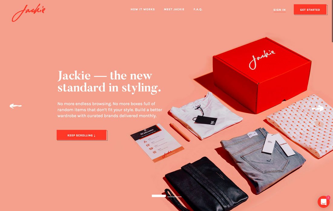
Aside from black or white, logos with a single color a wildly popular.
While it’s not something that you would jump to design, these logos are classically beautiful with a simplicity that showcases the associated brands well. By chance or maybe as a color trend of its own, each of the examples above features a one-color logo style that uses a variant of orange.
Tips for designing a one-color logo:
- Think of the design as colorless. Even with black and/or white and one color, use will be much like a true single-color logo.
- With only one color, the meaning of that hue will speak volumes. Be mindful of color choice.
- Don’t force too much color. A small swatch in a subtle location can have an impact.
- Add color in a way that means something. Does it make your logo, brand or product easier to understand?
Conclusion
Logo trends are interesting elements because, while what’s popular is always changing, logos are made to be constant. This creates an innate struggle for designers that are trying to create a logo that’s both modern and will withstand time. (It’s a pretty tall order.)
For the best chance at longevity, opt for a trend that includes some classic styling and is rooted in design theory. Design a logo that has a great aesthetic quality, is recognizable and readable and you’ll have the best chance at it lasting for years to come.


