I have been obsessed with art direction on the web for as long as I can remember. The term is often used to describe the act of designing individual pages around the content itself. This is the opposite of how most users typically operate when writing posts. The template or design is disconnected from the written word.
Jason Santa Maria’s website is likely the most-cited showcase of such posts. I highly recommend browsing around, especially viewing the Candygram articles.
There are times when stories call for more visual emphasis. The content’s design can paint a picture that is not possible through text alone. Sometimes, these are elaborate, full-page layouts. In others, it is the insertion of images and other elements that draw the reader’s attention.
It is one of the reasons I have enjoyed using the Archeo theme by Automattic lately. Its patterns bring up early, pre-home-internet memories of perusing magazines, each featured story with its own layout.
Over the years, I have tried developing several systems for per-post design, but they always fell short of where I wanted them to be. Part of the problem was that I did not have a solid framework that felt future-proof enough that I would not be still fixing its problems a decade or more down the road.
When WordPress launched its block editor, those old ideas started creeping back to the surface. Could it allow people to tell their stories visually and offer some assurance the layouts would not break a few releases later?
Today, I am confident that WordPress makes it more possible than before. There are some things it could do better, such as extending its shared CSS toolkit and bringing its range of design controls to more blocks. But, at its heart, the block editor is a design language that allows end-users to tell their stories through visual and text elements. This will only get better with version 6.0 and beyond.
I wanted to offer a small glimpse of how users could utilize these tools to create more visually-unique stories. This entry in the Building with Blocks series is meant to provide a jumping-off point.
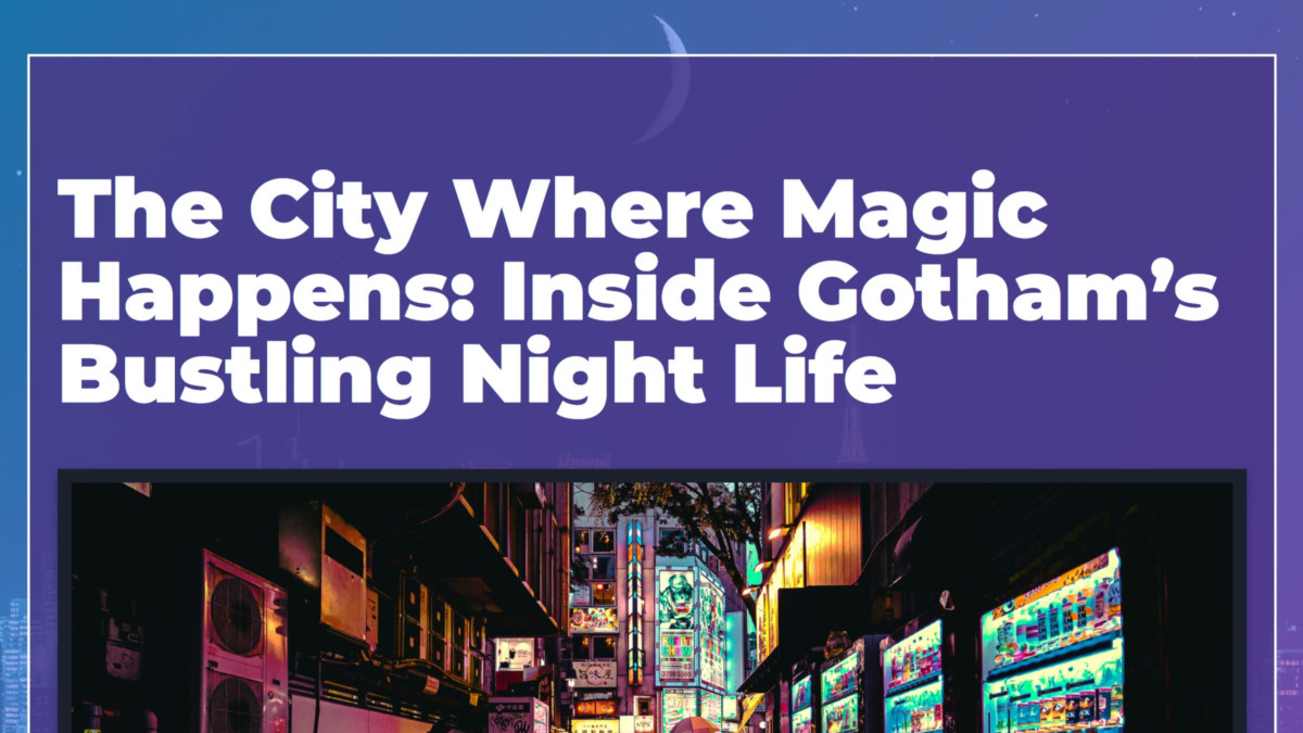
For those following along, we will build a post header/intro section for a fictional story about Gotham City:
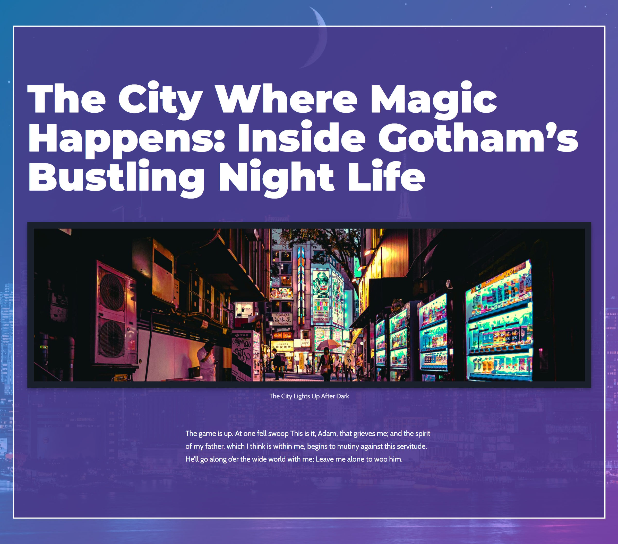
It is not a full-page design, but my hope is that it helps folks start experimenting more with their content. WordPress has a ton of solid design tools to work with now.
I actually pieced together two different patterns for this tutorial. However, I did not feel comfortable with the methods used for the original:

In particular, getting the content aligned left and in a maximum-width container has its problems. There are at least two ways of going about it. The most-used method is to insert a 50/50 Columns block, using the first column for content and leaving the second empty. This has the most cross-theme compatibility, but it can be messy at some screen sizes.
The second is to rely on the Cover block’s positioning control to align an inner Group block to the left. This is the best option for a pure responsive layout. However, its output was inconsistent when testing against several block themes.
Ultimately, I set the first layout aside. However, I wanted to at least share it with those who wanted to take a crack at it.
Building the Post Header Hero
For this pattern, I worked with version 12.9 of the Gutenberg plugin. I attempted to stick with features available to WordPress 5.9 users, but the older interface feels slower and bulkier than more recent updates of the plugin.
I also used a custom block theme. Any should work, but it should have a “blank” template or an equivalent full-width, open-canvas option. If not, you can build one from the built-in template editor. It would only need the Post Content block inside of it.
Step 1: Creating the Background
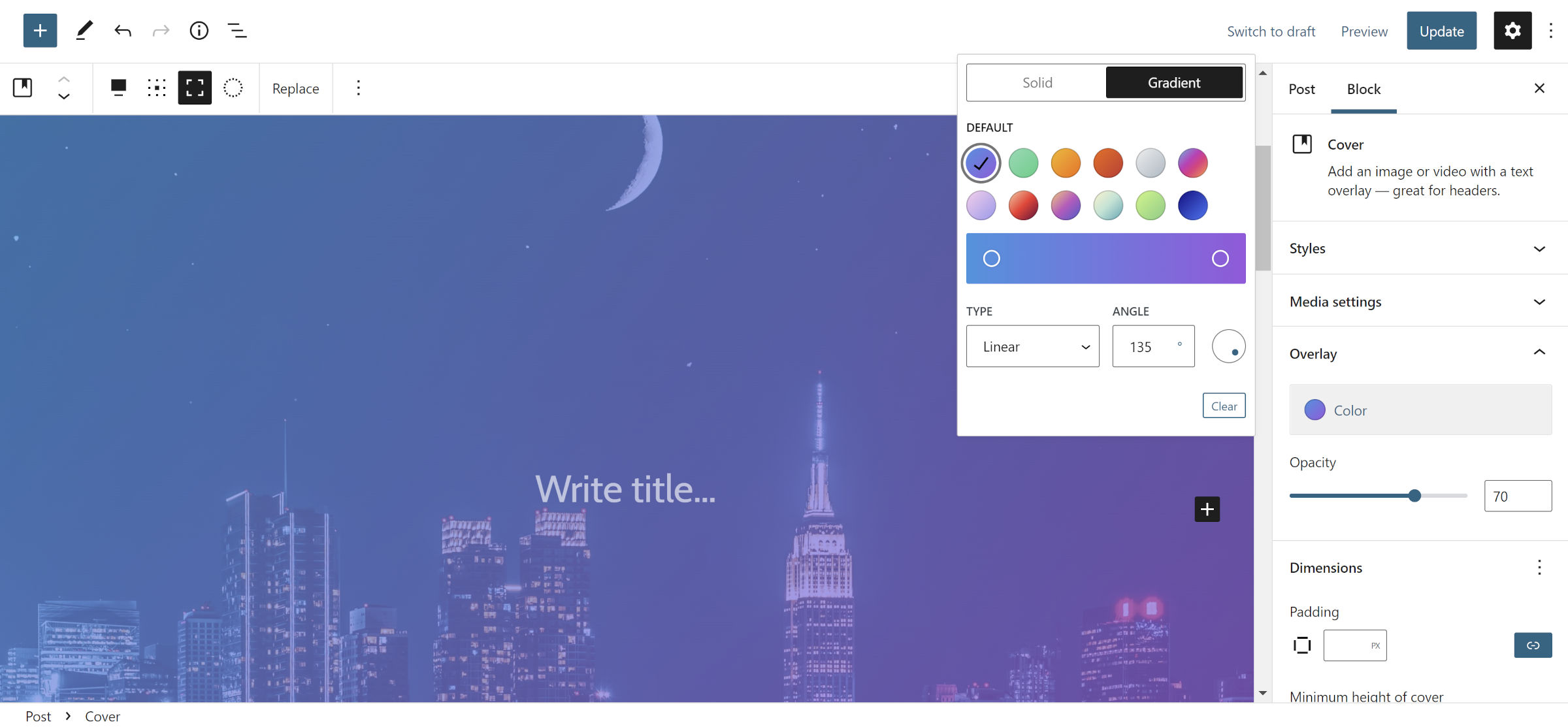 Adding a Cover block with background image and gradient overlay.
The Cover block is my go-to choice when creating many layouts. It is one of the most versatile options in WordPress, paving the way for many types of designs. It is no surprise that I started here.
The first step is to insert a new Cover block and select an image for it. Then, set it to full-width and toggle on the full-height option.
Depending on the image chosen, you can customize the overlay option to match it. I selected the “vivid cyan blue to vivid purple” gradient with a 70% opacity. I wanted enough of the background image peeking through to see it but not so much that it would overwhelm everything else.
Step 2: Spacers and a Group
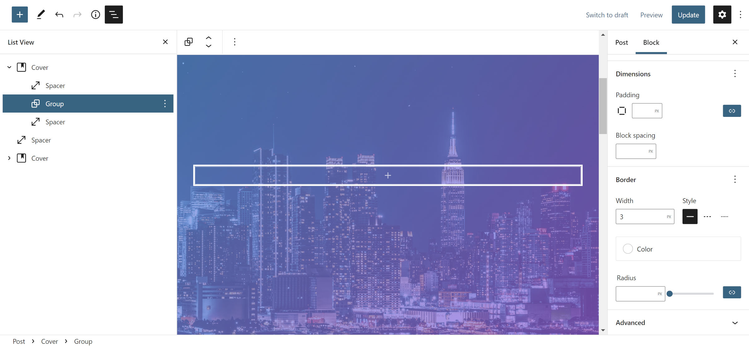 Adding a Group between two Spacer blocks.
At this point, we are still building the overall layout for the content. Inside the Cover from step #1, add a Spacer, Group, and another Spacer.
Set each Spacer to 2rem or your preferred value. This is just to show a bit more of the background image at the top and bottom of the pattern. Alternatively, you could adjust the padding option on the outer Cover block to achieve the same effect.
For the Group block, I only changed the border settings. I selected 3px for the width, set the style to solid, and chose white for the color.
Note: the Group block in this step will be unnecessary in the future. Ideally, we could just stick in the Cover from step #3. However, it does not yet support custom borders. There is an open ticket to add the feature. It is unclear if WordPress will offer this for Covers in the upcoming 6.0 release. For now, we must add an extra wrapper.
Step 3: Inner Cover
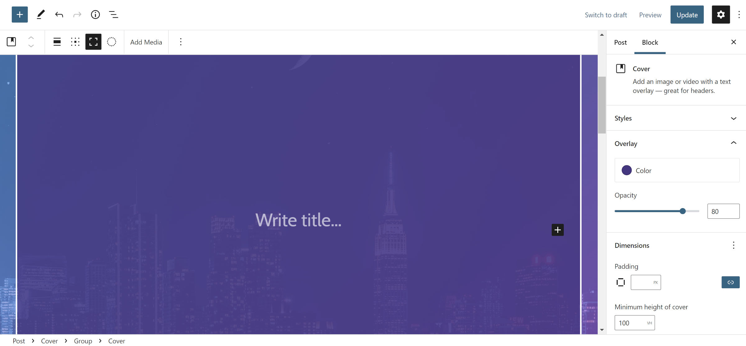 Adding a Cover inside a Group inside a Cover.
Add a new Cover block inside of the Group from step #2. Set it to full-width alignment and enable full height. Then, select a background color of your choice and adjust the opacity to something that fits into your design. This layer must be dark enough that your text will be readable. You may opt to modify this later, depending on how everything looks.
For those testing with the latest version of Gutenberg, see the note at the end of the next step.
Step 4: Content Group
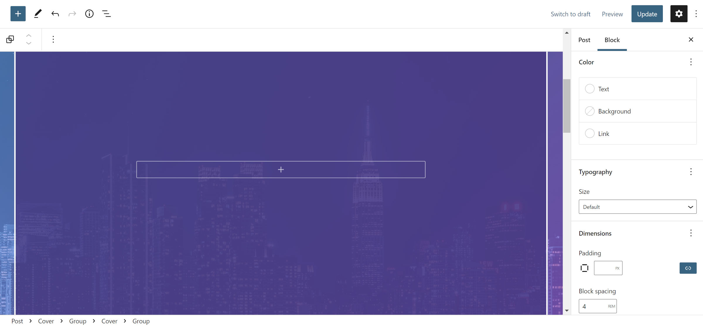 Yet another container layer.
I promise this is the final layer of nested containers to make this pattern work. For this step, insert a new Group block inside the Cover from step #2.
The only necessary setting is to switch on the “Inherit default layout” option in the block sidebar panel. I adjusted the “block spacing” setting to 4rem to give the content plenty of breathing room, but this can change from theme to theme. You should also select white or another light color for the text and link color options.
Note: this is, once again, a scenario where WordPress 5.9 falls just shy of offering the tools we need to cut back on some of the cruft. The Cover block from step #3 was necessary for a transparent background. However, WordPress 6.0 allows users to adjust the opacity of any color. For those testing with the Gutenberg plugin, you could simply use the Group block in this step and put a transparent background on it.
Step 5: Catchy Title
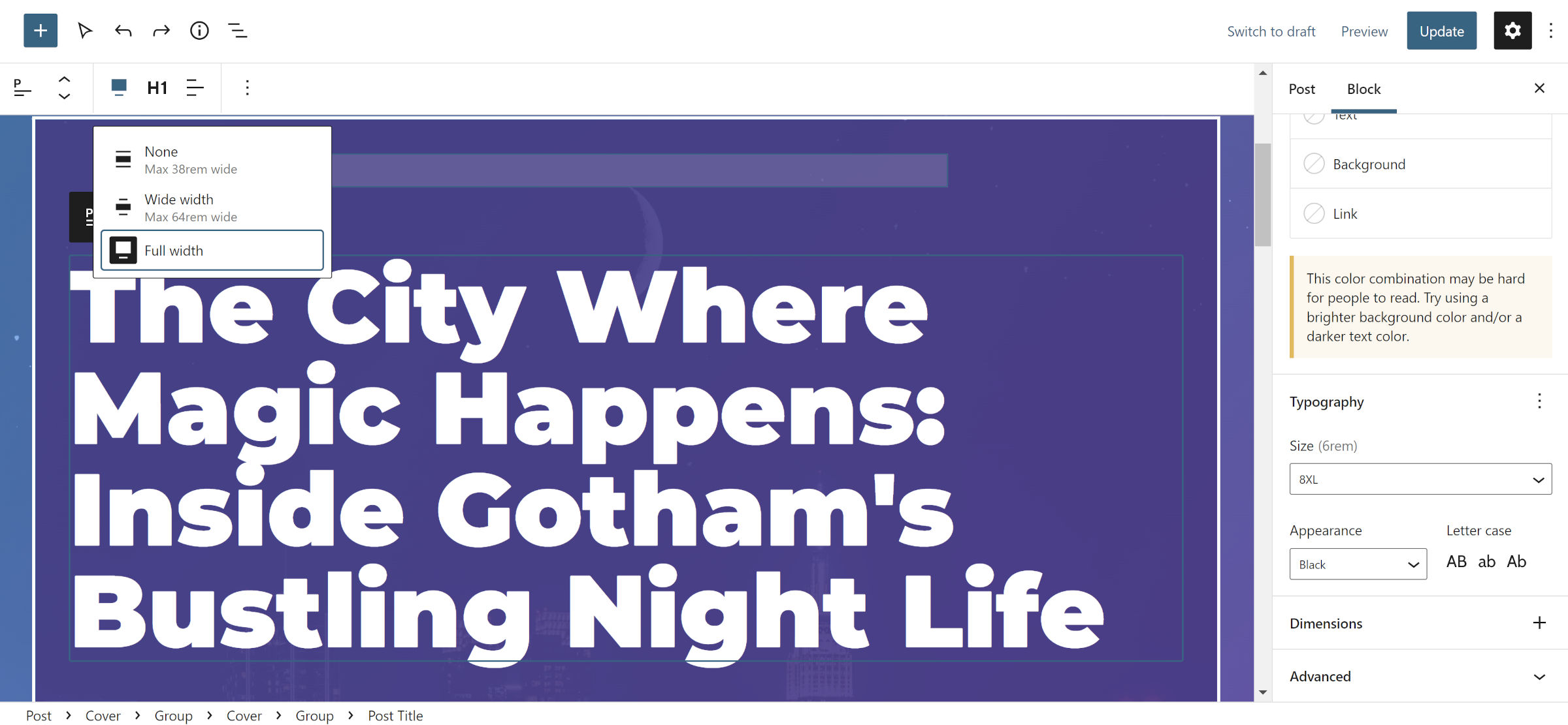 Go big or go home with the post title.
Now, we are getting to the fun part—the actual content. Just remember that with WordPress 6.0 it might be possible to cut the earlier steps in half.
Wanting extra space between the title and its container, I inserted a Spacer block with a 2rem height inside the Group block from step #3. After that, I added the Post Title block and set it to full-width alignment. Remember, we are using a “blank” template for this post, so we need to add the title somewhere.
This is where things get dicey, and I nearly opted out of sharing this specific tutorial altogether because of it. Font sizes in WordPress are only as good as your active theme. The core platform has no responsive handling for them and their associated line heights, and each theme can be wildly inconsistent with the choices it offers.
The best option is to choose a reasonably large font size if offered by the theme for the Post Title block. A well-rounded design will provide a range of choices and handle resizing them for smaller screens. If unavailable, you will need to add a custom font size and line-height. The values used in my setup are 6rem and 1, respectively.
Then, select the “Black” option for either the Appearance or Weight options, depending on which is available.
Step 6: Add an Image
 Adding a full-width image for the post.
You have two options for this step: the Post Featured Image or Image block. The former does not have nearly as many settings in WordPress 5.9. Your active theme may also make some custom styles available to one and not the other.
I opted for the Image block primarily because I wanted to add a caption for the photo. I then set it to full-width alignment and selected a “Border” style available by my theme to separate it a bit from the background.
Step 7: Wrapping It Up
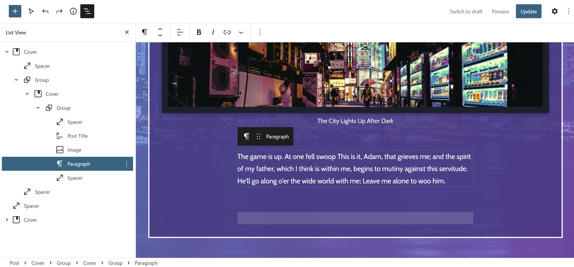 Adding Paragraph and Spacer blocks.
From this point forward, just have fun with things. I added a lede for my fictional story and another Spacer block, but you may tinker with other options like displaying the post author and date.
This felt like a lot of work piecing together. However, WordPress 6.0 should make things much simpler.
Category: Building with Blocks
Source


