Codrops has a very nice article on CSS Shapes from Tania Rascia. You might know shape-outside is for redefining the area by which text is floated around that element, allowing for some interesting design opportunities. But there are a couple of genuine CSS tricks in here:
- Float
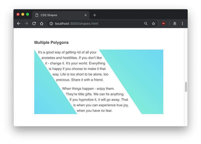
shape-outsideelements both right and left to get text to flow between them. - You can set
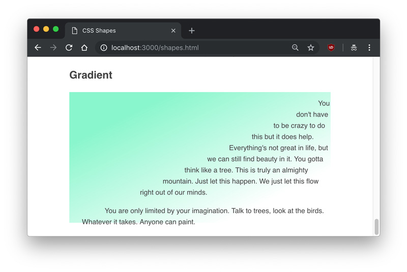
shape-outsideto take an image and useshape-image-thresholdto adjust where the text flows, meaning you could even use a gradient!


Shapes are in the water recently, as Heydon Pickering recently published a short video on using them. He also covers things like clip-path and canvas and such:
[youtube https://www.youtube.com/watch?v=eCHt8zsbCT4&w=560&h=315]
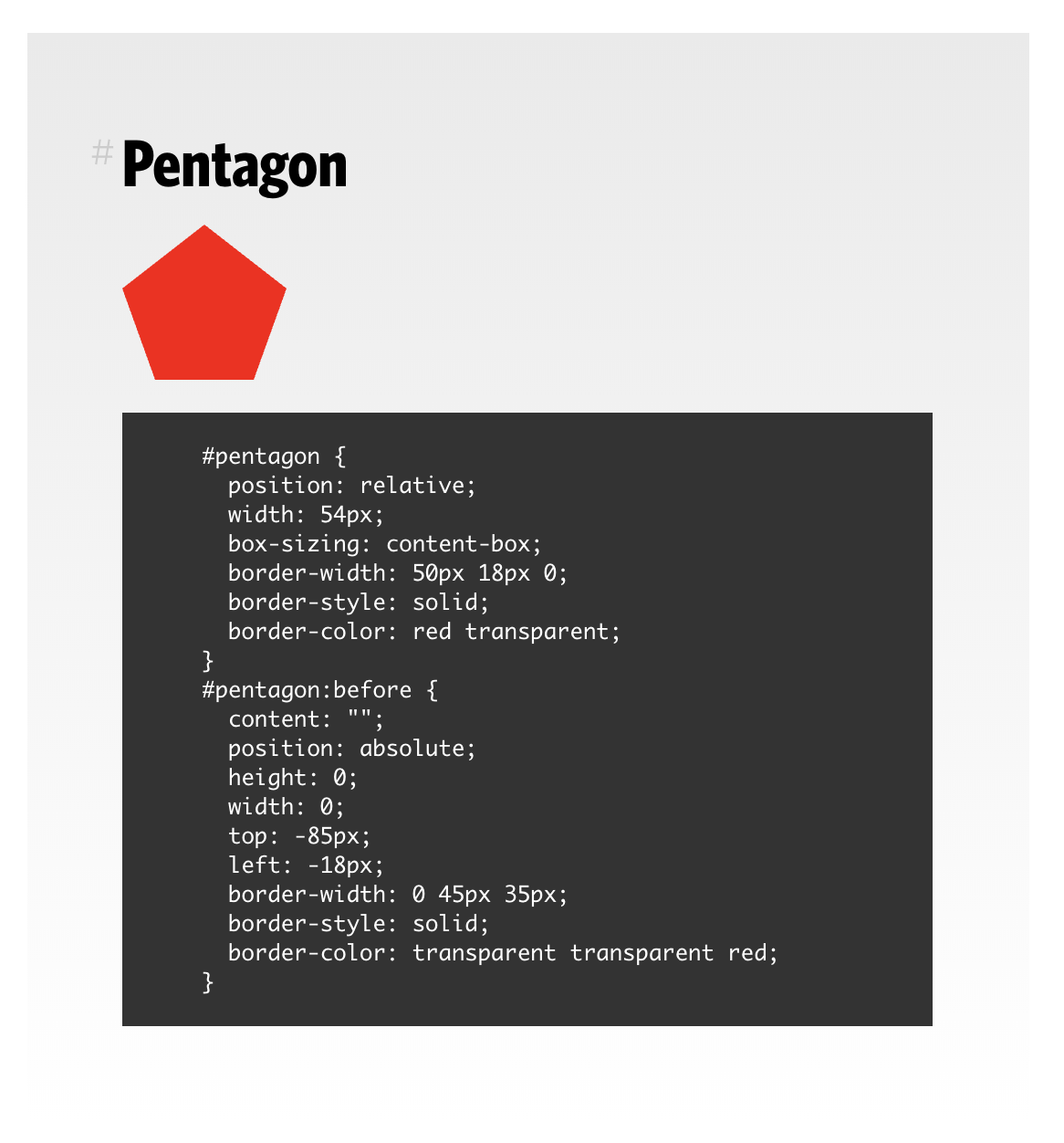
We recently moved our long-time page on (basically faking) CSS shapes over to a blog post so it’s easier to maintain.

Robin also wrote Working with Shapes in Web Design that digs into all this. So many tricks!
See the Pen 10c03204463e92a72a6756678e6348d1 by CSS-Tricks (@css-tricks) on CodePen.
When we talk about CSS shapes, it’s almost like we’re talking about values moreso than properties. What I mean is that the value functions like polygon(), circle(), ellipse(), offset(), path(), etc. are more representative of “CSS shapes” than the properties they are applied to. Multiple properties take them, like shape-outside, clip-path, and offset-path.
I once did a whole talk on this:
[youtube https://www.youtube.com/watch?v=Bj6TFixkT1A&w=560&h=315]
The only thing that’s changed since then is that Firefox started allowing clip-path: path() behind the flag layout.css.clip-path-path.enabled (demo).
And don’t forget Jen Simmons was talking about the possibilities of CSS Shapes (in her lab demos) years earlier!
The post People Talkin’ Shapes appeared first on CSS-Tricks.


