 Single post view.
Empt Lite, the latest theme by Rough Pixels, landed in the WordPress theme directory today. Like most of the company’s prior work, the design is on par with the best free themes currently available.
I have come to disregard that icky feeling whenever I see “Lite” attached to a theme name, at least when it falls under the Rough Pixels brand. The company does not deal in the stripped-down lite themes I wrote about a couple of weeks ago. Empt Lite is one of those rare themes that does not downgrade the experience with the free version. Most additional features in the pro version seem to be value-adds for users who need something extra. There is almost an honesty to it. Users can get a feel for the theme quality before deciding to hand over money for the commercial version.
Some pro features probably do not make sense as an upsell in the long run. WordPress’s upcoming Full Site Editing (FSE) could make them obsolete. For example, an option for customizing archive titles will be easy to accomplish in the site editor. An “about me” widget will not be a great upsell a year from now. However, custom patterns for an “about me” section might make more sense.
This is assuming the theme developer goes down the block-based theme path in the months to come. Looking at theme releases in 2021 needs to be done with an eye toward how they might function in an FSE world. This includes what freemium-based theme companies are upselling. Some will likely need to change tactics in time.
The one missing feature that I would like to see Rough Pixels include in this theme and others is custom block patterns. They are already covering all of their bases with block editor styles. Now that patterns have been in WordPress since version 5.5, it is time to keep building on the work already in place. This is also an opportunity to transition toward selling design-based upgrades. Put together some custom pattern packages and see what type of feedback customers provide.
Theme Features
In essence, Empt Lite is mostly a standard blogging theme. Where it shines is its support of the block editor.
 Wide-aligned Cover block.
One of the surest signs of a theme author doing their due diligence with block styles is to test a full-aligned Cover block with text afterward. If the text butts against the Cover, the theme probably has numerous other issues. If there is spacing between the two, the theme author likely took the time to test almost all WordPress blocks in various scenarios. I promise you this test works 90% of the time. Empt Lite passed this test and my entire block-testing suite with ease.
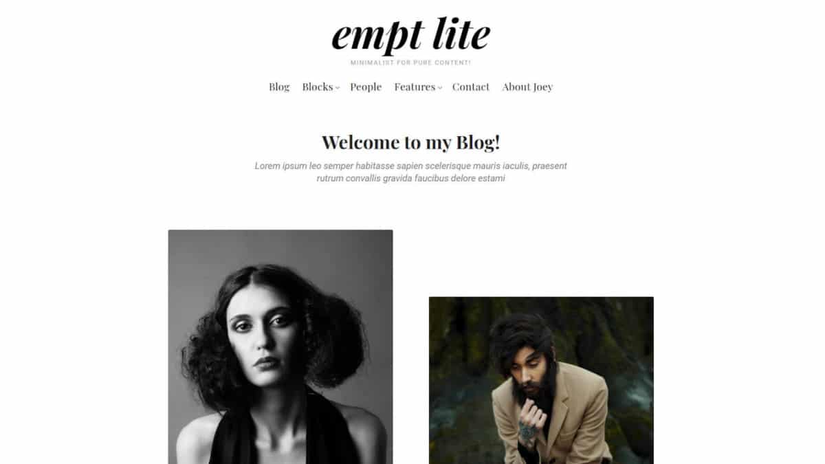
The feature that immediately caught my eye was the gallery-style blog layout. Rather than the typical top-aligned or masonry-type grids, the theme employs an offset style reminiscent of the Twenty Twenty-One theme’s image and gallery patterns. The effect is achieved by using varying featured image orientations, which the theme aligns to the middle. It is a break from the monotony of typical layouts.
 Offset, gallery-style layout.
This gallery style does require that every post have a featured image. Posts without them simply disappear from the blog and archive pages, but not completely. These posts leave empty gaps, throwing off the layout. Their titles appear when hovering over seemingly-random spots on the page. There is also an empty
Users who love to customize their theme and make it their own will find enough theme options to whet their appetites. Whether it is colors and typography or post meta and the nine sidebars, the theme has settings to cover it. Outside of the gallery blog layout, none of the customizer options seemed groundbreaking.
If anything, I look forward to the day when theme authors do not have to build all of these options and relegate them to the site editor. Rough Pixels and others put so much custom code behind the customizer that it feels like a waste of development hours in the long term. FSE cannot get here soon enough.
The theme has a few noticeable issues, but they are relatively trivial.
The mouse cursor is set to “pointer” when hovering a post featured image, even when that image is not linked. Yes, I unsuccessfully attempted to click a featured image multiple times, wondering why it was doing nothing.
The wide-layout for single posts provides plenty of breathing room for custom layouts. However, the default font-size, set to 17px, is too small for comfortable long-form reading. There is an option to customize the size, but it applies to the text across the entire site and not just the post content on single views. Making it larger creates the opposite problem on non-single pages. When a project is billed as a blog theme, words-per-line matter. Nailing the typography is a must, even when it is on an alternative layout option. Outside of this one case, the theme gets the defaults right.
The default quote style can make the text tough to read. The quote icon in the background bleeds too much into the foreground. I love the style; the color just needs to be dialed back while letting the text take center stage. The theme provides an option for changing the blockquote icon’s color. I suggest tinkering with it.
 Blockquote style.
Overall, this is one of the better themes to land in the WordPress theme directory in the past few months. Recreating the theme’s demo requires almost no fuss. The typography is on-point for a blogging theme, and it works well with the block editor.
Like this:
Like Loading…


