The Chain Reaction Project (TCRP) is a non-profit organisation launched in 2009, when four women committed to help change lives in some of the world’s least-developed nations.
“TCRP’s mission is to find a cause, and have an effect and from there, grow their initiative by inspiring others to be catalysts for change as well.”
The brand identity was created in 2012 by Singapore-based Bravo Company, a design studio founded by Edwin Tan and Janice Teo.
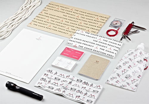
It’s an excellent example of how a simple-looking symbol can form part of a much stronger visual identity, and why there’s a lot more value in logos when viewed as part of the bigger picture.
The symbol is based on the Chinese character Rén, meaning “people.”

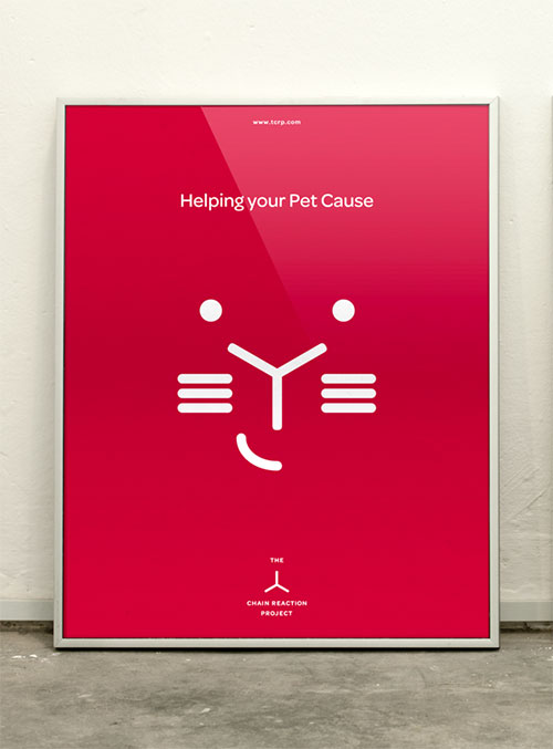
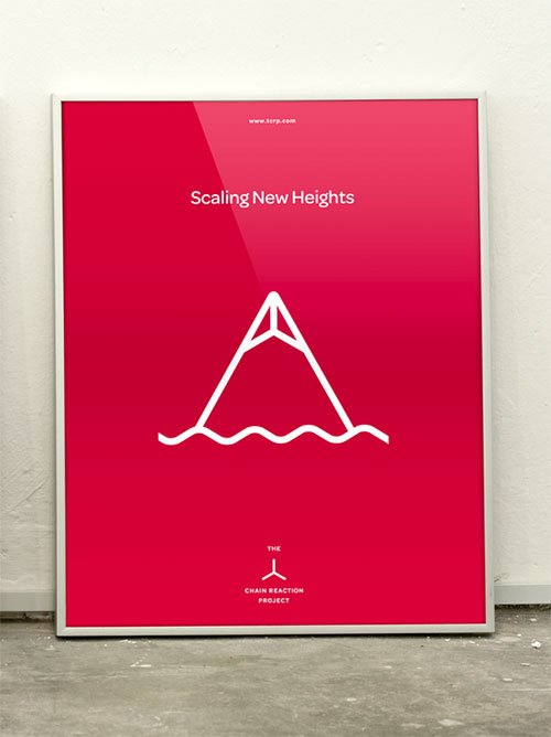
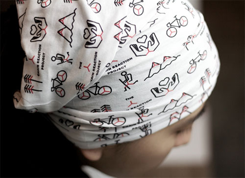
Bravo created a series of icons with the symbol for their client’s various causes.
![]()

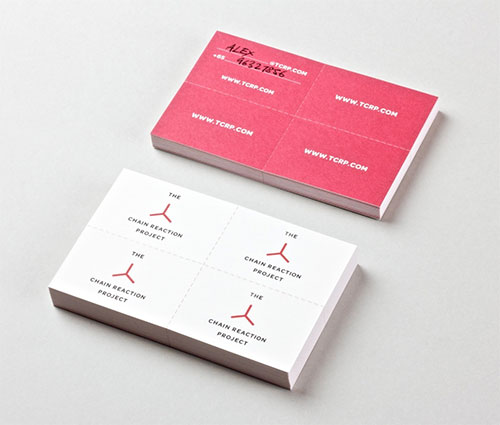
The namecard creates its own chain reaction. You can pass it on to three other people.


Bravo Company are on Twitter.
And here’s The Chain Reaction Project website.


