Dark patterns are website interfaces that cause users to interact with a website in a way that isn’t what they intended. They cause users to click through to a page, or even add an extra item to a shopping cart, without intending to.
From sneaky clicks to straight-up poor website practices, dark patterns are in more places than you might expect. Today, we’ll look at what dark patterns are, how to identify them and why you shouldn’t use this technique in your website or app projects.
If you think a dark pattern is a cute background image, you need to keep reading.
What Are Dark Patterns?

A dark pattern is “a user interface that has been carefully crafted to trick users into doing things, such as buying insurance with their purchase or signing up for recurring bills.” The neologism dark pattern was coined by Harry Brignull in August 2010 with the registration of darkpatterns.org, a “pattern library with the specific goal of naming and shaming deceptive user interfaces.” — Wikipedia
Here’s how Brignull describes dark patterns on his website: “When you use the web, you don’t read every word on every page – you skim read and make assumptions. If a company wants to trick you into doing something, they can take advantage of this by making a page look like it is saying one thing when it is, in fact, saying another.”
The key word there is “trick.” When you use website patterns and techniques to trick users into doing something unintentionally, you have created a dark pattern. This technique is manipulative and can cause users to interact in ways they would not have without the dark pattern.
To be honest, it’s a pretty unethical way to interact with users.
Further, dark patterns “trick” you into thinking certain things about website content and engagement that might not be true. For example, if clicks to a page via a dark pattern are high, that’s probably not a realistic number because users did not want to go there.
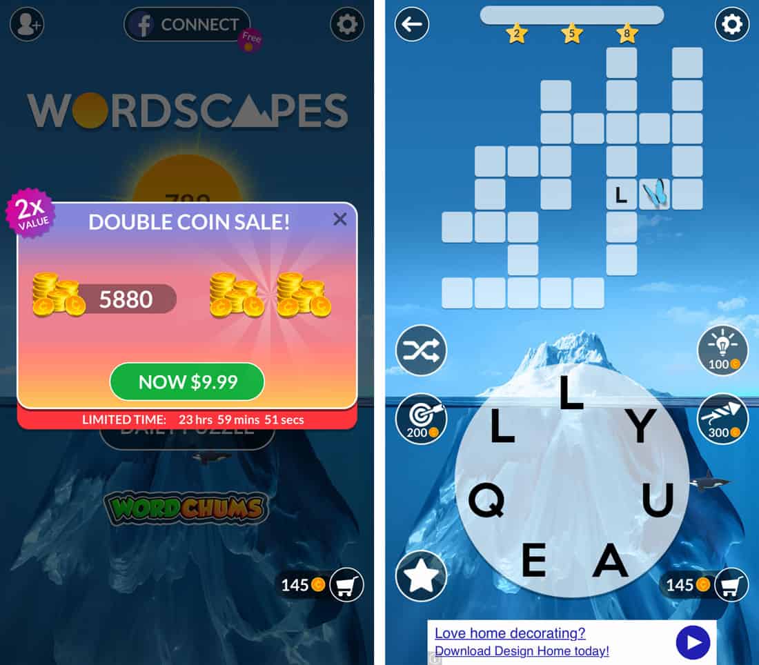
One of the most common dark patterns is the interstitial ad between plays in mobile games. Many free game apps are ad-supported, but you can’t actually close these ads because the “x” is too small or hidden and you almost always link out to the ad content. That’s a dark pattern.
But they don’t only appear on mobile devices. Sadly, dark patterns are everywhere.
Types of Dark Patterns


Brignull has identified 12 types of dark patterns. These seem to catch pretty much everything when it comes to tricking users.
- Bait and switch: When you try to do something, another less desirable thing happens. Try to close an ad and click on it instead, such as TurboTax, above. When you click “Close Ad” you get a dropdown of tiny options.
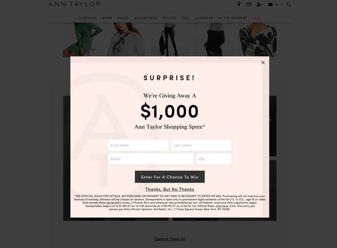
- Confirmshaming: This technique guilts the user into doing something. You’ve seen plenty of these such as signup forms that include choices such as “Yes, Sign Me Up” and “No, I Don’t Want to Save Money.”
- Disguised ads: This one is pretty self-explanatory; ads that look like content. (Note the link in the text example above; it goes through an ad network.)
- Forced continuity: All those free trials that aren’t free fall into this category. You sign up for a free service with a credit card only to find months later that you’ve been paying, but never got an invoice or bill.
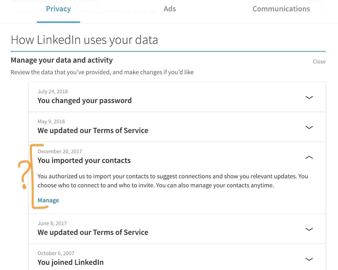
- Friend spam: Thankfully this one is getting less common as more people are in-tune with privacy concerns, but it happens when an app asks you to connect friends for a fun or social aspect of a game or service, then bombards them with spam.
- Hidden costs: The oldest trick in the book – a dark pattern even before online shopping – includes adding unexpected charges to an order.
- Misdirection: When the design draws you to look at one thing to distract you from something else. Whenever a website preselects an upsell item for you, there’s probably an element of misdirection happening.
- Price comparison prevention: When sites make it hard to compare prices. We’ve all seen this one.
- Privacy Zuckering: Websites that trick you into giving up more information about yourself than you would like. (Clever name, huh?) Pretty much every game you’ve ever played on Facebook does this. You aren’t just finding out what type of dog is perfect for your family, you are also sharing all kinds of personal information with the app developer.
- Roach motel: This technique makes it easy to sign up for something and really hard to unsubscribe. This used to be a huge problem with email newsletters, but changes to many regulations have made it illegal in many countries not to offer an obvious unsubscribe button. That being said, it still happens more than you might think.
- Sneak into the basket: Have you ever noticed an extra item in your shopping cart? That’s this dark pattern in action
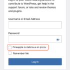
- Trick questions: When the user interface offers up a question to be answered, but it is worded in such a way that you almost always pick the wrong answer. Have you ever clicked a red button to stop only to find that red actually meant “proceed” and green was “exit”? That’s a dark pattern.
Why Not To Use Dark Patterns
Using dark patterns is a shady design practice.
Dark patterns will frustrate users and while you might experience quick gains, users will abandon your website or app in the long term. (Personally, I have straight up quit playing games I love on my phone when the ads became impossible to close/not click. This is the top reason apps get deleted from my phone.)
Using dark patterns is borderline (and sometimes) outright unethical. You can see from the types of dark patterns above that some practices have become less common because regulators caught on to them and have tried to ban some practices.
Do you want to gain followers, clicks or sales because you tricked someone? If you answer yes, then I don’t want to do business with your unethical company.
Dark patterns will give you a false sense of how well a website or app is performing. Users might click on an ad, but they don’t want to be there, resulting in high bounce rates. (They also might quit playing the game altogether.) This is an easy way to get false sense of security about a website or app only to watch it crash a few months later when users are frustrated with these practices.
Ethical Considerations
A lot of big brands and companies use dark patterns. While I don’t see as many egregious examples from well-known brands, dark patterns are still there. (Confirmshaming is widely used.)
But don’t let clients talk you into if it makes you uncomfortable. There’s always a user-friendly and more ethical solution to the design problem you are trying to solve.
If you are a member of a professional organization, think about the oath you took. I bet there’s something about design/advertising/marketing/development ethics and best practices. Go back to that statement and apply it to dark patterns.
Conclusion
The takeaway here is that if you know what dark patterns are, then you can avoid them. Don’t resort to tricks to create user conversions; create content that engages users naturally.
After reading this, you might start seeing dark patterns everywhere. If you see them in any of your projects, it might be time for a redesign. Want to see plenty of them? Follow #darkpatterns on Twitter.


