Any time I see a new block-ready WordPress theme, I am like a toddler in a toyshop. I cannot wait to bring it home, rip off the packaging, and play with it. Sometimes it is the type of fun that will create lasting, years-long memories. Other times, the toy is not all it is cracked up to be. It does not deliver on the promises on its packaging. It is too hard to play with or just not what you expected. You discard it and move on to one of your other trusted toys, ones with guaranteed fun built-in.
The latter feeling is where I am at with Guten Blog by Avid Themes. I want to love it. It has many elements that could make for a great theme. At first glance, I even believed it could be one of only a handful of quality, block-supported themes in the directory.
 Guten Blog default demo homepage.
However, I was that kid all over again, let down by the shiny veneer of colorful packaging. The upside is that there is potential. It has all the elements needed to be among the great blogging themes. With more work, it could go from mediocre to top-10 material.
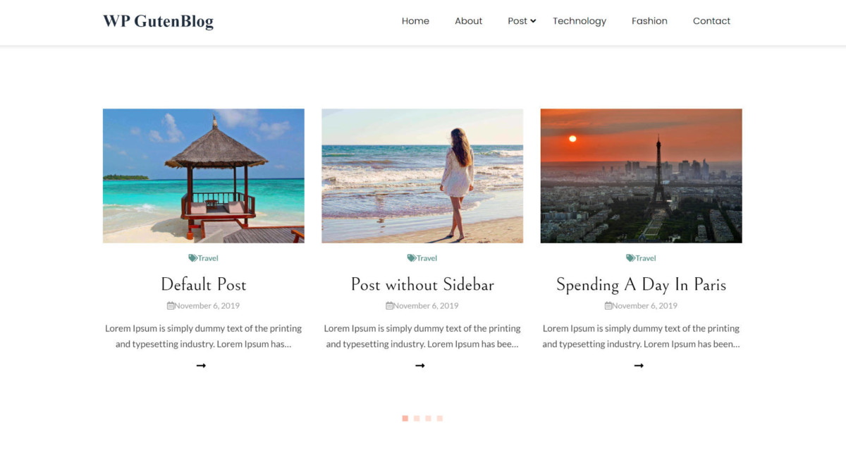
The most disappointing thing about the theme is the following homepage section:
 Common three-box design pattern.
It is a typical design on the web today — a section containing some intro text with three boxes. I do not dislike the design. The problem is how it is handled by the theme. It relies exclusively on the Gutentor plugin to build this, and there are zero reasons to do so. The block editor is capable of handling this on its own.
This would have been an easy win for the theme to package this section design as a custom block pattern.
For some blocks, I get it; WordPress’s built-in blocks do not cut it yet. For example, the various post-related blocks do not exist yet. Of course, the Query block is slated to land in WordPress 5.8. That would be an opportune moment to make the switch.
However, the above section is representative of all the imported demo content. Everything from columns to quotes to paragraphs — yes, paragraphs — is built with Gutentor’s blocks.
One of my primary fears with theme developers is that they will continue to over-rely on plugins for basic features that exist in WordPress. This teaches end-users to also rely on these plugins, and it is a shame. This creates less flexibility for users, tying basic content to a third-party tool.
There are some stunning pre-made demos that users can import. In total, the theme offers 18 options. Seven of those are available for free. The other demos are part of the “pro” package, ranging from $49.99 to $79.99 depending on the number of sites the customer wants support and updates.
 Pre-made, importable demos.
In particular, I am a fan of its third free option for lifestyle-type blogs:
 Lifestyle-type free, importable demo.
The importable demos are the bright spot of the theme, most of which showcase various homepage options. The development team simply bypassed the tools available in core WordPress. There are no block styles or patterns, and the demos offer a plethora of opportunities to flesh out custom designs for users to insert with one click.
The theme technically works without extra plugins. It is billed as a blogging theme, so the hope is that it holds up in that regard. With a content size between 730 – 800 pixels and text of 16 pixels, it does not. The text is practically unreadable when it comes to long-form content. It may as well be a jumbled mass of words where you continually lose your place from line to line.
This is not Justin-is-having-a-bad-day-so-let’s-dump-on-a-theme. I genuinely love the potential Guten Blog has. I want it to be better. The overall design is something I could imagine myself using on various websites I am involved with. Its font choices, minimalist layout, and generous use of whitespace are right up my alley.
However, it has some issues. For example, it updates a database option for a third-party plugin on every page load (I am not sure how that made it through the review process). It also missed a lot of opportunities to showcase the core block editor.
Other issues are with the theme’s primary admin notice. The small text that reads “Clicking on get started will activate Advanced Import” felt shady. Literally, the text was intentionally styled with a 10-pixel font size, which was incredibly difficult to read, so tough that I did not catch it until I unwittingly began installing a third-party plugin. It also installed Gutenblog Demo Import and the Gutentor plugin without authorization at that moment.
These are fixable issues. I hope the theme development team can take my complaints and build something that eventually exceeds my expectations. The potential is there.
Update (April 26): I did not notice during the initial review, but I have since confirmed that this theme changed my site title to “WP GutenBlog” at some point in the process, likely during the demo import.
Disclosure: This theme makes use of a library I built for breadcrumbs. It is using a version that is at least three years out of date.
Like this:
Like Loading…


